Review: Deadhorse #1
I actually got sent the first issue of Deadhorse for review a while back, but it must have somehow slipped through the cracks. But it’s resurfaced, now under the banner of indy darlings 215 Ink. Anyone who reads my reviews know that I’ve been a fan of a lot of the quality work being published by 215 Ink, so their association with Deadhorse helped make bumping this title to the front of my review queue a priority. But does it deliver?
In terms of story, what writer Eric Grissom gives us is pretty slight. We have an ominous flashback to the past, and then the very early stages of setting up a main plot for the present, with a whisper of an antagonist, and our protagonist only just getting round to starting on their quest by the time the first chapter wraps. In a strict narrative sense, there isn’t too much of a hook to bring readers back for the next instalment.
Fortunately, Grissom more than compensates with his characterisation. Our unlikely hero is William Pike, a neurotic shut-in who seems to have difficulty leaving his apartment, never mind dealing with even basic conflict. Not the most likely choice to be handed the keys to a Macguffin of Fearsome Power. But that’s what makes him so fun to watch, and gives the rudimentary plotting enough spice and color to become invested in what happens next. William already feels like a compelling underdog figure, quite clearly out of his depth when it comes to the action hero stylings of fighting bad guys and leaping from burning buildings.
It’s not just William who enjoys some nice development, though. The highlight of the issue for me was the extended sequence where William visits the apartment of the Vogels, a friendly old couple who live down the hall from him. This sequence becomes increasingly surreal as the old couple’s behaviour becomes ever more bizarre, and one moment made me literally laugh out loud.
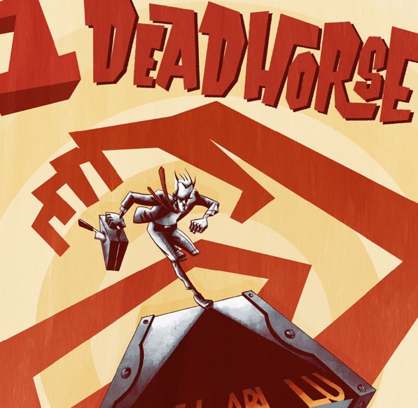
The artwork of Phil Sloan is pretty interesting. At first, I thought I was getting a Gabriel Ba/Fabio Moon Casanova vibe, but as the story went on I ended up picking up a more unexpected reference. It seems like Sloan is taking some visual cues from the art of Tintin. I could be reading into something that’s not there, but in a few ways Deadhorse does feel a bit like a twisted reimagining of an old Tintin adventure, what with the secret keys, old mysteries, the promise of globetrotting adventure, oddball supporting characters and such. David Halvorson’s sepia-toned coloring further enhances this strange effect.
Overall, I enjoyed Deadhorse. I’m not sure if this first issue gave me enough of the story to make me want to rush to read chapter 2, but I like the characters enough that I’d certainly be opening to revisiting them should this story eventually be collected as a graphic novel.
***
Artist: Phil Sloan
Colorist: David Halvorson
Letterer: Eric Grissom
Publisher: 215 Ink
Price: $3.99
Synopsis: A reclusive man receives a strange key from his deceased father and wants answers. His neighbors want lunch.
Deadhorse #1 will be released through 215 Ink next month. To pre-order it online, go here.
Related Posts:
Category: Comics, The Creator-Owned Zone


