Points of Impact – Week 12: Then and Back Again
June 2012 – Week 2
ADDENDUM
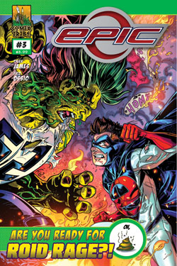
Raffaele Ienco gets an HONORARY BULLSEYE for one of the best and classiest responses I’ve ever seen to a negative critique. Not only did he acknowledge the remarks he’s received here, but he also went all the way and tweeted a link to this column. I don’t know many creators who are as eager to share their bad reviews as much as their good reviews. For this, I salute you!
What a glorious Saturday this is! It’s no wonder since we’re about to go through some new Points of Impact!
Once more:
- The BULLSEYE! section presents something that really wowed me. That’s usually when a writer does something unique among his peers.
- The HIT! section picks up on a cool trick that gets used pretty often – mostly because it works – but of which I’ve found a prime example.
- The MISS section however isn’t about praising a good shot but – as you guessed it – pointing out where a writer stumbled so you don’t put your feet in the same hole.
WARNING! This column is stuffed to the gills with spoilers! Go read your comics first!
BULLSEYE!
The recursive narrative in Scott Snyder’s SWAMP THING #10
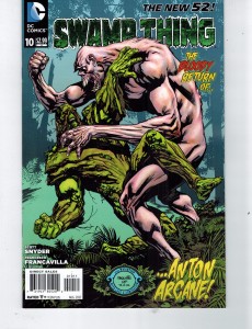 Writer: Scott Snyder:
Artist and colorist: Francesco Francavilla
Letters: Travis Lanham
Associate Editor: Chris Conroy
Editor: Matt Idelson
By now, most of you know I get bored easily.
I’m the difficult kind of reader who’s always asking more from comic creators, always looking for the next big thrill. For me however, it’s not as much about sweeping epic storylines as it is about clever devices. Every time I crack open a new comic, what I’m looking for is a novel way of telling the story.
Indeed, if every story has already been told, what else is there to innovate if not the way we tell them?
If you look back at the previous Points of Impact, you’ll see that a lot of the BULSEYEs have been awarded to comics that have pushed the envelope when it comes to messing with the usual delivery of the narrative. Mainly, it was about jumbling the sacrosanct trinity of START – MIDDLE – END. For example, let’s think back to the hypothetical scenes in REBEL BLOOD or the consistent framing device used in THE PUNISHER.
When it comes to fiddling around with the bolts and gears of a story, I know I can always count on Scott Snyder. In fact, the man has been awarded so many BULSEYEs and HITs that it’s starting to get embarrassing to not call this column Why Most of You Should Write Like Scott Snyder! The fact is that the man knows his way around the engine of a story and is comfortable enough with all the machinery involved to constantly be customizing his hot-rods.
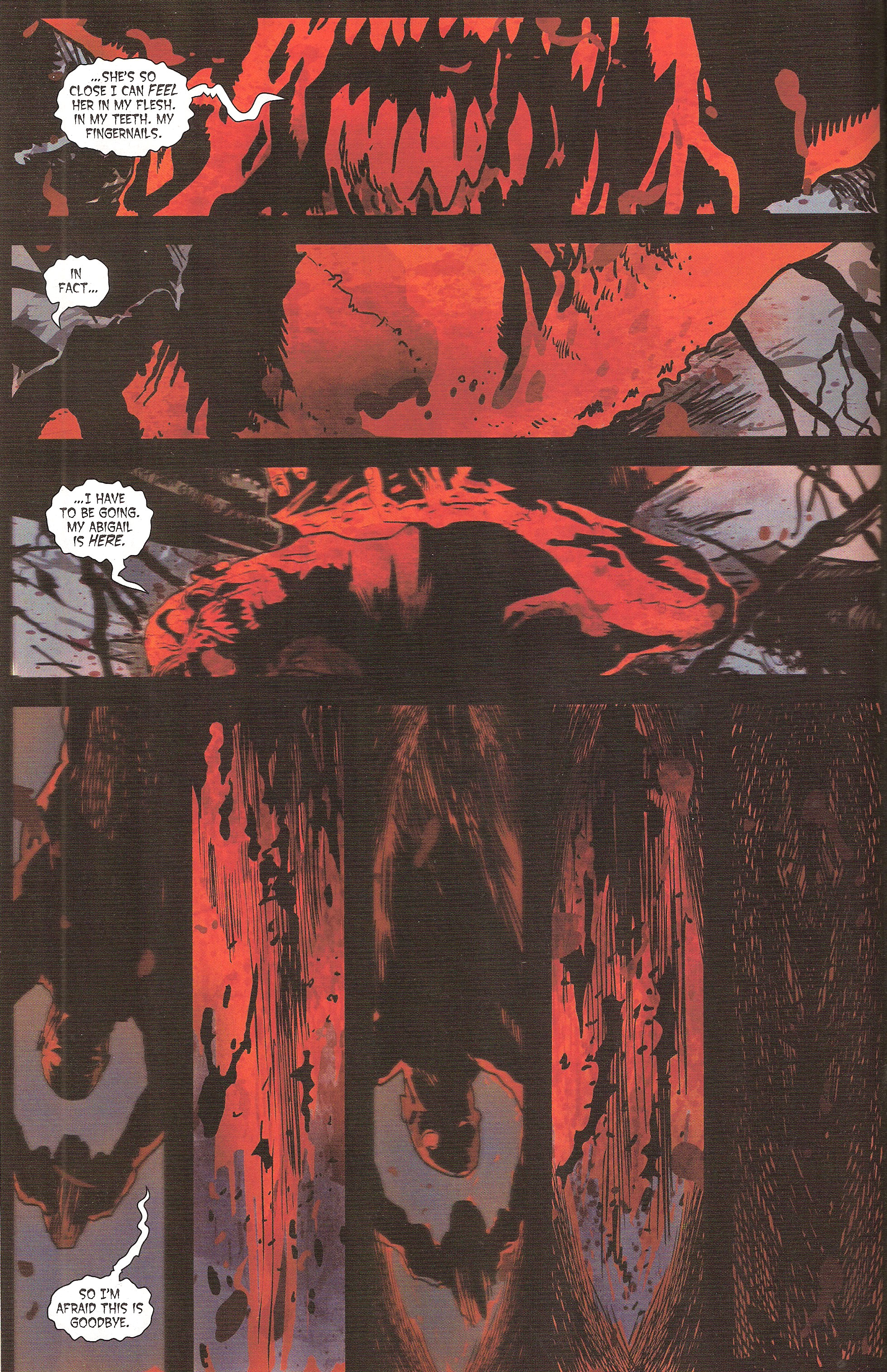
He proves it once more in SWAMP THING #10. Taking the appearance of an epilogue to the previous story arc, this issue constitutes in fact the beginning of a new arc. Following his victory over the Rot, a battered Swamp Thing is brought back to his beloved swamp by Abigail Arcane for some much needed rest. The comic starts with a chilling scene: we’re in a first person view of… something talking to us.
This one-sided conversation goes on through several pages, mostly in voice-over captions during the journey from where the Swamp Thing battled the Rot in the last issue to the swamp where he’ll rest. We do cut back twice to the first-person view scene, the second time abruptly ending on our apparent demise at the end of our interlocutor. So much for getting a word in…
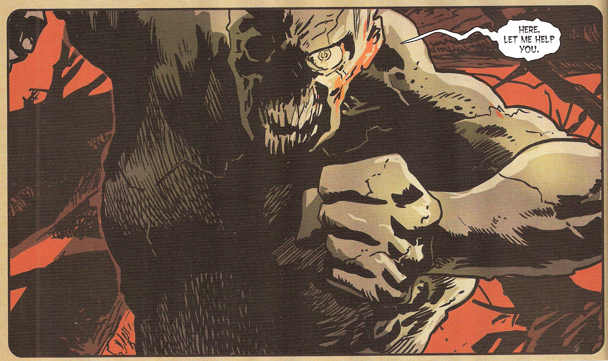
The next scene then switches to Abby and Swamp Thing arriving at the swamp and sharing a tender moment. However, as our hero is lying down in the murky water, recuperating from his many wounds, a shadow falls upon him. The page-turn reveals it to be our cruel conversationalist from the beginning: Anton Arcane! And that’s when he utters those familiar words…
We’ve gone full-circle.
This is what is called a recursive narrative structure. It occurs when the story loops back on itself, bringing you back at the beginning. In this case, Snyder achieves this by starting his narrative in the middle. He then goes back to a time pre-dating his opening scene and goes on until he reaches the beginning scene again. At that moment, he makes sure to underline the recursive structure by using the same dialog, thus heightening the effect.
For a better understanding of how this works, let’s have a look at he real sequence of events:
1. After the battle with the Rot, Abby brings Swamp Thing back to the swamp.
2. They arrive at the swamp and share a romantic moment.
3. Swamp Thing starts regenerating.
4. Anton Arcane attacks Swamp Thing.
5. Anton Arcane speaks to Swamp Thing about Abby.
6. Anton Arcane “kills” Swamp Thing.
7. Anton Arcane attacks Abby.
By using a recursive structure, Snyder gets this sequence instead:
4. Anton Arcane attacks Swamp Thing.
5. Anton Arcane speaks to Swamp Thing about Abby.
1. After the battle with the Rot, Abby brings Swamp Thing back to the swamp.
5. Anton Arcane speaks to Swamp Thing about Abby.
6. Anton Arcane “kills” Swamp Thing.
2. They arrive at the swamp and share a romantic moment.
3. Swamp Thing starts regenerating.
4. Anton Arcane attacks Swamp Thing.
7. Anton Arcane attacks Abby.
Not much of a change is it? Now consider this: when number 4 plays out the first time, we have no idea it’s Arcane who is talking. Furthermore, we don’t even know whose point of view we’re using; we don’t know that we’re in Swampy’s boots. It’s only near the end that we realize the significance of these “conversation” scenes and that the real stakes of the depicted action are revealed.
Snyder essentially uses the recursive structure to build up tension where it was minimal in the original structure. He can then engineer a reveal that wouldn’t exist if the narrative was presented in its chronological sequence.
Essentially, he’s using a narrative device to create a greater the emotional response than what was possible with the story itself.
Lesson Learned
Want to build tension into a straightforward story? Then consider using a non-linear narrative structure like the recursion. The trick is to pick an event that occurs in the middle of your story and to place it at the beginning. The reader, lacking any sort of the references that come with seeing the scene in the context of its original chronological sequence, finds himself wondering and eager to unravel this little enigma. When the story finally catches up to your first scene, the tension is released and the reader can not only enjoy the scene for what it was originally meant to be, but also as a mystery that wouldn’t have happened if you didn’t fabricate it from essentially nothing.
HIT!
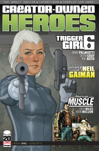
The overlaid exposition in Steve Niles’ American Muscle in CREATOR-OWNED HEROES #1
 Written by Steve Niles
Artwork by Kevin Mellon
Designed and lettered by Bill Tortolini
Ah, exposition! It seems like we’re talking about exposition every week now. I have to admit it’s a very large part of every comic and for cause: no reader could be expected to follow a story where the dialog doesn’t reference anything outside the immediate action. Without exposition, a reader would constantly be guessing who the characters are, where they’re going and why they’re doing what they’re doing. As you can rightly surmise, such a kettle of pop-corning interrogations would quickly lead to titles dropping from pull lists.
So exposition is a necessary evil. Not only is it necessary, it’s also not free. Exposition takes up panel space, clutters up dialog lines, slows down pacing and – in the worst cases – sticks out like a sore thumb. Badly executed exposition deters from the pleasure of reading a story. It reflects badly on the writer as clumsy info-dumping is often seen as an evident mark of amateurism.
So you can’t avoid exposition nor can you risk doing it wrong. What to do?
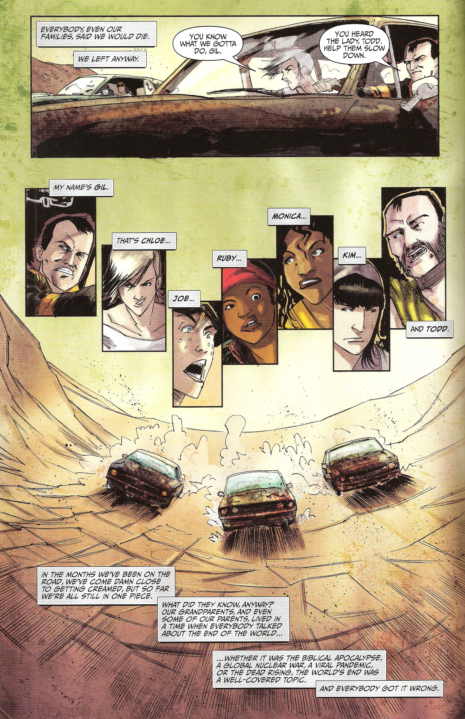
Well if you’re Steve Niles and you’re writing American Muscle , you just distract the reader with action! It’s an effective technique as the opening pages of his story in CREATOR-OWNED HEROES can attest. As it begins, we join Gil, Chloe and the gang as they’re already in trouble from the get-go.
As you can see, this is some pretty hardcore tension right from the start: Joe’s brakes are done for and the group needs to find a solution before they’re as done for as the uncooperative brakes. The captions however tell another story. Completely independent from the scene, they’re actually recounting background information on the series itself. It becomes even more apparent on the next page when the characters get a quick introduction:
By the time we reach the top of page 5, the presentation of this brave new world is complete, just in time for the dramatic situation to be resolved as well.
Notice that during all this time, the comic isn’t stalled. We’ve started with a high-tension situation, a solution was devised and applied, there was a scare when it looked as if it wouldn’t work and then a resolution. Five pages of nail-biting action, yes, but also five pages of exposition at the same time. Now the story proper can start, unburdened by the obligation to constantly stop to explain everything.
What Niles did is in fact very simple: when faced with the challenge of getting readers interested in a a new property in the space of eleven pages, he chose condensing over cutting out.
Let’s think about it for a second: the secret to hooking readers’ interest with a new series is to dazzle them with captivating action and to present them with a new interesting concept. The problem however is that these two goals take some space to set up properly. As such, they’re often seen as mutually exclusive propositions: either you spend your panel space doing a car chase, a kung fu fight or a snow avalanche, or you line up establishing shots and conversations showcasing both your setting and your characters. If you do one, you need to cut out the other.
Niles wants his cake and eat it too – and he succeeds. He does this by laying his exposition over his action scene. The panel space is thus divided into two separate tracks: one for the action – depicted in the art and the dialog – and one for the exposition – relegated to the caption boxes. The reader is thus able to follow both tracks simultaneously, which means Niles is able to grab him with the two aforementioned hooks at once.
Not bad for five pages of work, isn’t it?
Lesson Learned
Action and exposition don’t have to be contradictory terms. By overlaying them, you can manage to not only reduce the number of panels you need to burn through, but also attack the reader’s interest from two different fronts. In order to achieve this, you need to compartmentalize your storytelling: one part for the action and another for exposition. It’s then only a matter of running the two racks side by side in their own designated compartments: art and dialog for the action, caption boxes for the exposition.
MISS
Characters as hero PR devices in Raffaele Ienco’s EPIC KILL #2
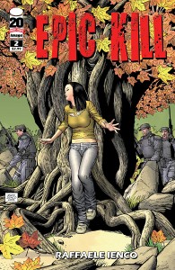 Created, written and drawn by Raffaele Ienco
When you’re good, you’re good. You don’t need anyone bragging for you; your actions speak louder than anyone could ever do.
Guess what? It goes for comic characters too.
This was a little reminder for Raffaele Ienco whose EPIC KILL #2 is a veritable buffet of praise for his protagonist, young killing machine Song. The comic opens on her apparently cornered by the police and the military. As we settle down for some hard-hitting fight scene or at least an edge-of-your-seat chase, what we get instead is the equivalent of a blurb list on a dust jacket:
“Don’t worry, I’m right on her ass. And from here it looks pretty sweet.”
– Faceless humvee driver
“She’s doing a hell of a job on that bike, let me tell ya.”
– The faceceless humvee driver again
“Or she may be laughing at us right now. Who the hell is this chick?”
– Silhouette of a soldier
“Tough freakin’ woman.”
– Out-of-uniform soldier
“Even so, you are the best warrior I’ve ever seen.”
– A caption box
“Are you sure she’s eighteen? For chrissakes, she’s got a rack like Tomb Raider.”
– A soldier who doesn’t go out a lot and spends way too much time interacting with two-dimensional ladies
“Now that may sound highly douch-baggery [sic] of me but let me assure you this target is a killer and a threat to national security.”
– The President of the United States of America or, as another soldier calls him, “the fuckin’ Prez”
“And she’s a lot tougher than she looks. You don’t want to be on the receiving end of what she can deliver.”
– The President again (that girl is getting some nice references for her resume, I tell ya)
“They’re dead! They’re all dead! She’s too strong!”
– Yup, da Prez
This wouldn’t so bad if we saw Song doing half the deeds these people claim she’s capable of. Oh sure, she kills a guy with an antler (don’t ask) and shoots three others while upside down in the air, but do all the other characters have to fawn over her for it non-stop?
The heart of the matter resides in that time-honored principle: show, don’t tell – or rather in this case: stop telling if you’ve already shown. The dialog is supposed to either advance the plot or reveal character. In this case, none of the lines quoted above advance the plot. Do they reveal character? You’d be tempted to say yes. After all, all they’re doing is talking about the protagonist. Let me rephrase the question then: do they reveal character for the characters speaking the lines? The answer is no, no they don’t.
Lines like these reduce characters to the level of mouthpieces for the author to praise his protagonist. It’s redundant, it’s grating and it belies a slight insecurity pertaining to the narrative’s efficiency at propping the character up on its own. It’s as if it wasn’t enough that we see Song ride a motorcycle down a steep incline and through a forest, it’s not enough that we see her survive an explosion, it’s not enough to see her escape pursuit from Special Forces and it’s not enough to see the President himself oversee her elimination.
No, you have all of these chatty unprofessional soldiers lusting after her curves and whoa-ing over her mad skillz like rutty teenagers at the mall.
All this achieves is make us doubt Song’s capacities. We’re hearing so much praise about her abilities (and charms) that it completely overshadows her actual accomplishments on the page.
And that’s a shame because it is an EPIC comic.
Lesson Learned
In comics as well as in real life, actions speak louder than words. If you want the reader to admire the protagonist for his prowess, have him succeed at a difficult challenge. If you want to establish that another character admires your protagonist, let him mention it in passing. Do not however turn your whole secondary cast into a chorus whose only purpose is to praise your hero. You’ll only succeed in grabbing attention away from the hero’s actual deeds.
Honorable Mentions
- Jeff Lemire keeps on building a consistent and complex world in ANIMAL MAN #10.
- The Best Line of the Week Award goes to Simon Spurrier’s EXTERMINATION #1: I was with the Obscenity Oligarchs while you were still brooding in your shadow-diapers.
- Jonathan Hickman’s foreshadowing creates a very interesting bookending effect in SECRET #2.
- THIEF OF THIEVES #5 by Nick Spencer and Robert Kirkman present us with some quick and nifty character introductions.
Dishonorable Mentions
- Some typos again this week. I’ve found some of those pesky bugs in both Jimmy Palmiotti and Justin Gray’s Triggergirl6 (CREATOR-OWNED HEROES #1) as well as in David Liss’ THE SPIDER #2.
- Remember when we talked about bad French translations last week? Ennis manages to do even worse this week in FURY MAX #3. A part of me keeps hoping it was deliberate.
That’s all, folks! Now remember: to leave comments now, you have to go to our new forum. Registering not only grants you the ability to leave me questions, comments and insults pertaining to this column, you’ll also be able to chat it up with other comics-obsessed people. Give it a whirl, will ya?
Related Posts:
Category: Columns, Points Of Impact

