Points of Impact – Week 13: Cutting Through
NOTE: As I announced on the forum this week, we’ll be doing things a little differently from now on. I hope you like the way it turns out!
AND ANOTHER NOTE: It’s been brought to my attention that I’m not giving all of the credit where it’s due in this piece so I’ve done some edits. Since it’s impossible for me to know exactly who did what for the specific elements I usually examine on Points of Impact unless the creators come forward themselves to set me straight, from now on I’ll assume that everything in the comic stems jointly from the artist and the writer. I figure I’ll get it right most of the time if I give each 50% of the credit. I apologize in advance if I’m off from time to time, but I’d rather give too much credit than not enough where it’s due.
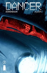
The Narrative Shortcuts in Nathan Edmondson and Nic Klein’s DANCER #2
 Story – Script: Nathan Edmondson
Art – Colors – Design: Nic Klein
Letters: Jeff Powell
As I’ve often said before, panel-space is one of the most precious commodities you get to use when writing comics. There are only so many panels an artist can cram onto a page before the whole thing turns into an illegible mess. At the same time, you can’t really limit yourself to two or three-panel pages all the way. That’s called decompression and it’s apparently a bad word now.
The problem as always is that you have a very finite number of pages to fill, a number that dwindles at an alarming rate as you move forward with your story and plug in all of those deliciously clever ideas. You end up with so many plot points that you’re actually running out of room to let the ordinary matter-of-fact events take place in the space they require. Opening a door, climbing up a flight of stairs – just plain ending a scene can eat up a panel here and there. However, these panels end up amounting to a sizable chunk of real-estate in the overall tally.
The solution? Shave off a few of these panels when you can. How? Let’s take a look at how Nathan Edmondson and Nic Klein do it.
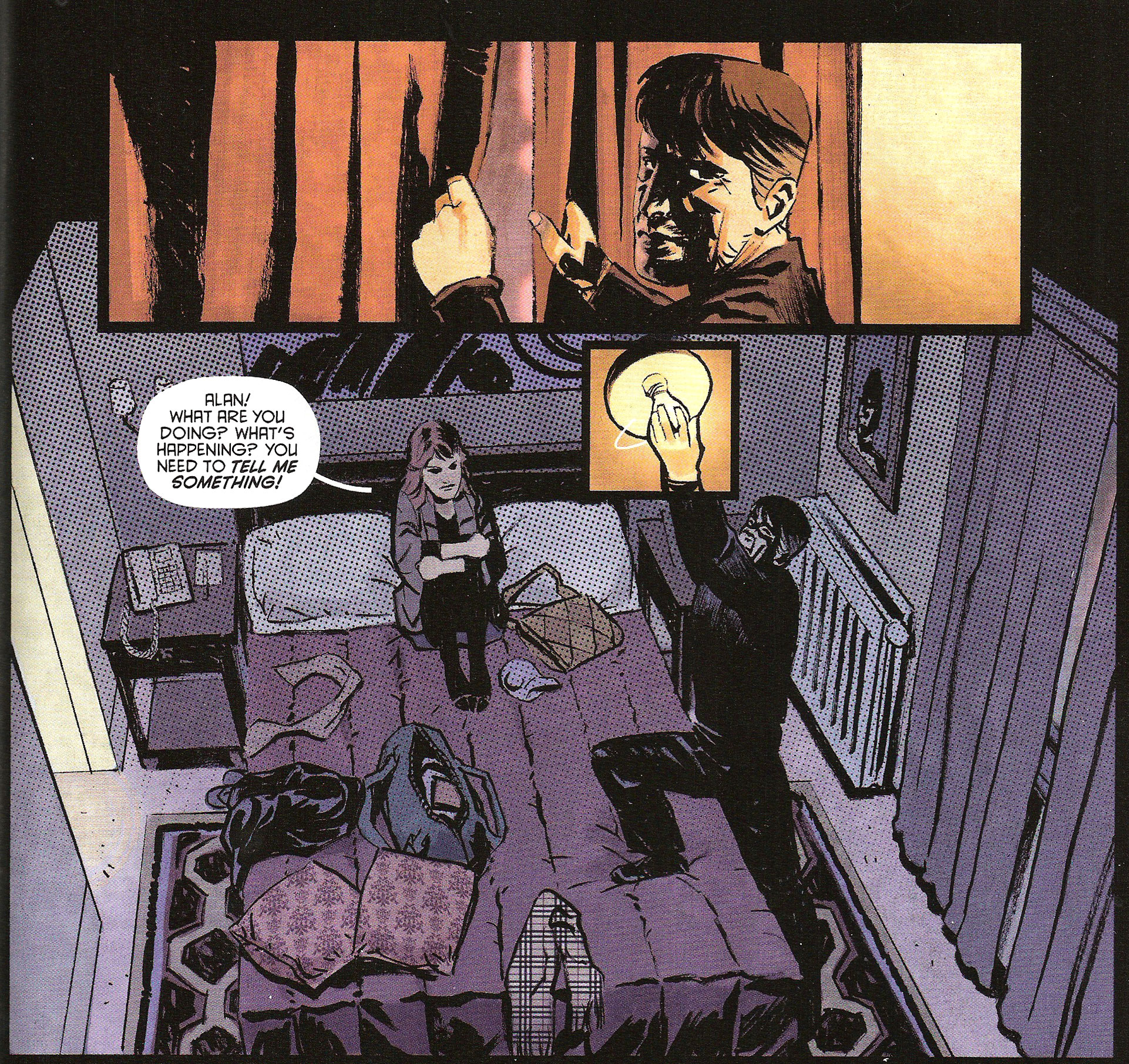
DANCER #2 opens on Alan and his girlfriend Quin hiding from an assassin, a man who inexplicably looks like a younger version of Alan. They’re holed up in a hotel room and, to make sure they keep as low a profile as possible, Alan unscrews the light bulb in the overhanging lamp.
Notice how the action of unscrewing the light bulb occurs in an inset panel. Furthermore, notice how that inset panel is actually more of an overlay that sits on top of the larger panel. Inside the inset, Alan is just about to unscrew the bulb. Outside in the larger panel however, the action is already over and we can see its effects.
What we can see here is that time moves when passing from the inset to the larger panel. Even better, since the inset is nothing more than an overlay, it can be said that time actually moves inside the same panel. In a sense, it’s about the only time that we can say having a moving panel is a good thing. Somebody call Steven Forbes!
What this also does is shave a couple of panels off the page. By using this simple trick, Edmondson and Klein can use the space of a single panel for an action that would normally take two or three panels to depict. But this isn’t the only example in the comic
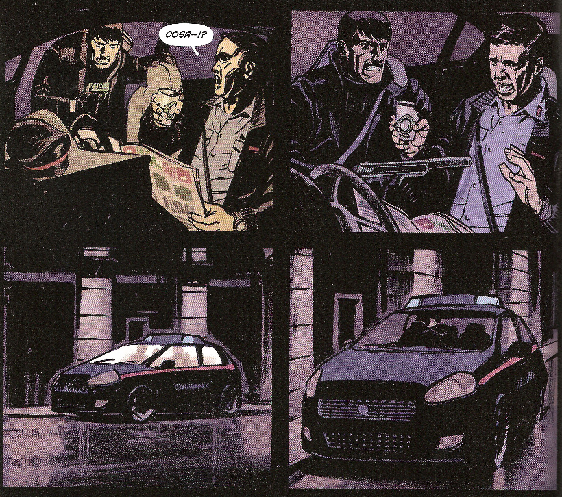
Let’s turn a few pages and join Young Evil Allan (YEA) as he approaches a police patrol car. He gets in and presses his gun against the chest of a very surprised policeman. Think we’re gonna get a panel of the shot? Think again
Granted, this is also a discretion shot as well as a shortcut, but it still serves the same purpose: it replaces more explicit panels. In this case, Edmondson and Klein choose to forgo showing the policeman getting shot. We’re spared all of the unpleasant business: the gun going off, the sound of the gunshot, the policeman’s pained expression, the blood, the yelp of surprise as well as the subsequent moving of the body. We don’t even see YEA getting into the driver’s seat.
What we do see however is two exterior shots of the car: one with a flash of light illuminating the cab – the muzzle flash – and the other with indefinite figures moving inside. Not only do we find here an economy of panels, but also an economy of detail as the same basic panel is repeated twice, the muzzle flash being the only indication of the grim business that went on inside the car. This economy of visual means also has the effect of leaving a lot more to the reader’s imagination. These panels appeal more to his active participation in building the narrative than would merely showing him the actual actions. As such, they rely upon the same process at work between panels, closure*.
*Closure is the automatic semi-conscious process that lets the reader make sense of the transitional space between panels, according to Scott McCloud (Understanding Comics).
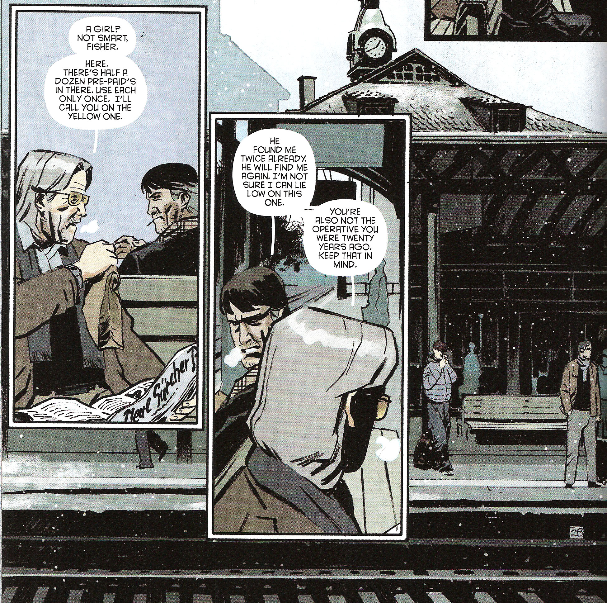
Now the next example shows a little bit more subtlety: Alan has met with an old informant nicknamed the Fox . Both men are sitting back-to-back in a little train station in Berne, Switzerland. Their conversation ends as tersely as it was occurring:
Once more, Edmondson and Klein are skipping panels that would have been included by other creators. In this case, there are no drawn-out farewells between the two men. One panel, they’re there exchanging information, the next there are only empty benches in the busy train station. But are we really missing something? What more could these hypothetical goodbyes have revealed about the characters? Not much, if you ask me. Instead, the cut to the empty benches is a lot more effective way of using panel-space here.
It also has another advantage: it underlines the clandestine aspect of their meeting. The empty benches surrounded by the bustling people, unaware of what has just transpired, become a symbol of the invisible parallel world that Alan and the Fox are part of. Their sudden disappearance coupled with the empty space left behind come to represent the almost otherworldly nature of the two men, much more than would have demonstrated a couple of panels of them shaking hands and exchanging parting pleasantries.
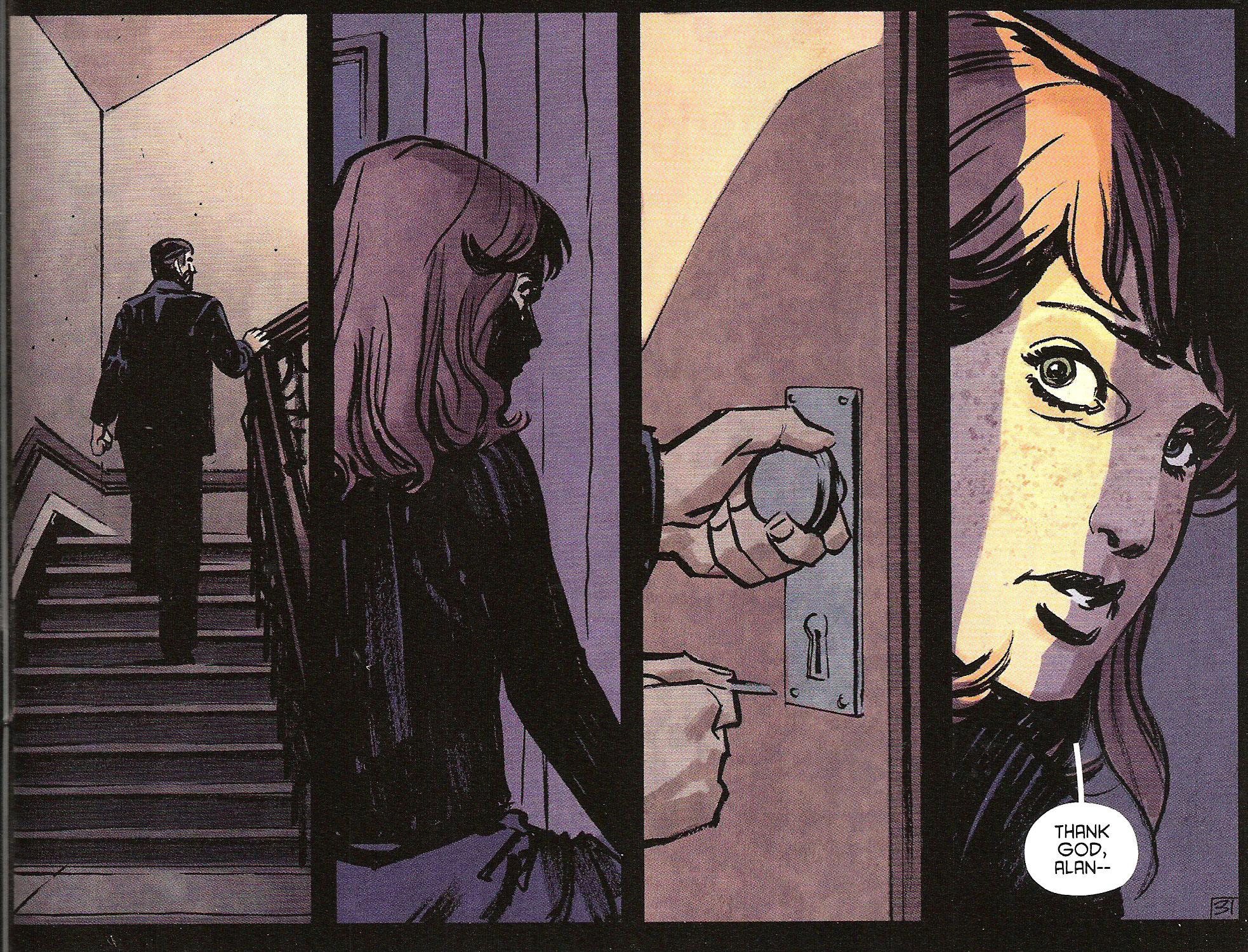
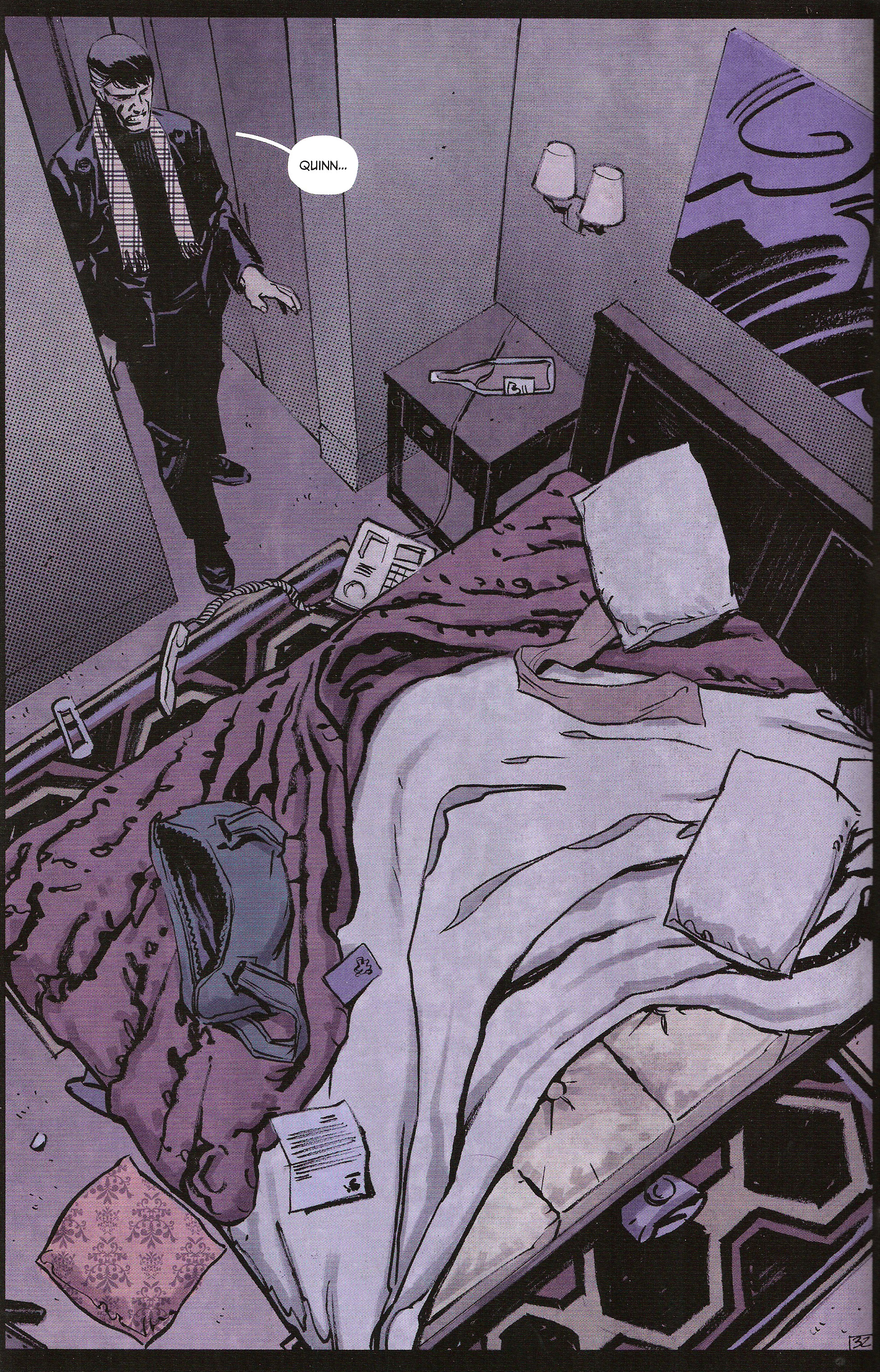
But these three examples pale in comparison to what Edmondson and Klein have kept as a climax to this second issue. Quin had been instructed by Alan to answer the door for no one but him.
So when the door opens and Alan steps in – well, I think you see where this is going
Major gap in border time! We should have Steven Forbes on speed-dial by now!
Here the shortcut doesn’t skip panels, it skips pages – heck, it skips half a scene. Naturally, as you probably guessed, the Alan that Quin got as a visitor first was YEA. There was a struggle until he finally subdued her and dragged her out of the room. Of course, we don’t see any of this. Instead, we’re left to see the remains of the room as the real Alan walks in and it’s from the visual clues left by YEA that we can understand what went down during the page-turn separating the last two panels.
Also of great interest is the moment at which Edmondson and Klein decided to jump from one scene to the other. The cut coincides exactly with the moment that both characters, Alan and YEA, enter the room. Just after YEA has opened the door, we switch to Alan standing in the doorway. This is what’s called a match cut in movie editing: a transition from one scene to another through an element in the ending scene that graphically matches another in the starting scene (in fact, it’s also called a graphic cut). Borrowing that type of transition from cinema, Edmondson and Klein are able to eliminate multiple panels of the story – that still occurs in the reader’s head! – by virtue of two graphically matching elements: the two Alans!
This effect is even further reinforced by the dialogue. When YEA enters the room, Quin calls out to him: Thank God, Alan– When Alan returns to the room too late to prevent the kidnapping, his line seems to be in reply to Quin’s. Hence, not only do we have a transition that is eased by the visual, but also by dialogue components.
Thus, for their use of so many examples of narrative shortcuts,
Nathan Edmondson and Nic Klein score a BULLSEYE with DANCER #2.
Lesson Learned
Let’s have a look back at the different shortcuts taken by Edmondson/Klein and their effect:
- By using an overlay inset panel, it’s possible to condense time into a single panel and thus show both an action and its effect.
- By focusing on the effects of an event instead of their detailed sequence of actions, it’s possible to shorten a scene.
- By cutting out parts of dialogue, it’s possible to focus the story on atmosphere instead of plot points.
- By using a match cut, it’s possible to infer large parts of the story, but only if you leave enough visual clues to permit that inference to take place.
But most of all, by using these techniques, you can save up on panel space and have a better time of fitting everything you want inside of your allotted page count.
Honorable Mentions
- There’s a very nice use of a subjective viewpoint concerning a character who might be either a ghost or an hallucination in Nunzio DeFilippis and Christina Weir’s BAD MEDICINE #1 and #2.
- Brian Wood uses a character as a visual thread while making us tour the city of Messantia in CONAN THE BARBARIAN #5. (In case you’re wondering, it’s a dove.)
- And Wood gets another Honorable Mention for his terrific backup material in THE MASSIVE #1.
- Bobby Curnow’s NIGHT OF 1,000 WOLVES #2 shows us how to properly pace a fight scene.
Dishonorable Mentions
- There was some confusion concerning dates that don’t add up in Scott Snyder’s AMERICAN VAMPIRE: LORD OF NIGHTMARES #1.
- Adam Glass throws us right out of the story with a looong shoddily wedged-in flashback sequence in SUICIDE SQUAD #10.
And that’s all you’re getting this week! Let me know on the forum what you think of the new direction Points of Impact is taking – I’m curious to know!
Please click here to make comments in the forum!
Related Posts:
Category: Columns, Points Of Impact

