Points of Impact – Week 20: Play With Matches
1st Disclaimer: Points of Impact contains so many spoilers it can practically replace reading your comics. Know what that means? Read your comics first!
2nd Disclaimer: For the sake of simplicity and since it’s impossible for me to know exactly who did what for the specific elements I usually examine, unless the creators come forward themselves to set me straight, from now on I’ll assume that everything in the comic stems from a joint decision by both the artist and the writer. I figure I’ll get it right most of the time if I give each 50% of the credit. I apologize in advance if I’m off from time to time, but I’d rather give too much credit than not enough where it’s due.
The many uses of match cuts in Matt Fraction and David Aja’s HAWKEYE #1
 Writer: Matt Fraction
Artist: David Aja
Colorist: Matt Hollingsworth
Letterer: Chris Eliopoulos
Editors: Sana Amanat & Stephen Wacker
Slow week again this time around so we’re taking a trip back in time, way back into the antediluvian mists of last week to fish another comic out of unforgiving history and talk about transitions.
Transitions are tricky things. Basically, they’re essential for the reader the make sense of your story every time you pluck him from one scene in one location with one set of characters doing one thing and dropping him back down into an entirely different scene farther down the road with another bunch of people doing something else. The classic way to do this is to use omniscient narrator captions and an establishing shot to set the context of the new scene, but that’s far from being the only way.
Some creators will use other tricks like having the dialogue trail off from one scene into the next; sometimes it’s the new scene’s dialogue that starts early in voice-overs. Other creators will even play with the implied consequences from one scene to another, linking each to the next by a thin thread of implicit causality.
Worst case scenario? Transitions occur almost at random. Despite each separate scene being structurally sound, there’s no effort made to link them into an overarching structure, to the point where the plot becomes practically unintelligible. It’s what I like to call a clusterplot, or if you’d prefer a Bat-whoa-man .
Best case scenario? We get that rare comic that ties everything together perfectly, each idea reverberated through motifs and foreshadowing and almost every scene transition eased through by a match cut, making the whole book appear as a sort of harmonious echo chamber. That comic is HAWKEYE #1 by Matt Fraction and David Aja.
Even though it’s coming hot on the heels of a movie you might have heard about – AVENGERS or something like that – HAWKEYE takes the surprisingly good decision to focus on the man behind the moniker – in fact, he’s never called Hawkeye once in the entire comic – giving us a superbly constructed street-level adventure. As the creators announce in the beginning’s title page: This is what he does when he’s not being an Avenger. That’s all you need to know. And it really is.
So instead of continuing this fascinating discussion on Clint Barton’s identity, we’ll use the comic to delve deeper into the transition technique known as the match cut since Fraction and Aja demonstrate how it works at almost every scene switch.
As a reminder, a match cut* occurs when the similarity between two images is used to bridge the gap between two scenes. I like to use an example from a movie everybody but me seems to hate: Hudson Hawk. After Bruce Willis and Danny Aiello steal the Sforza from the auction house, they get discovered by the clumsy fat guard and need to escape which leads to them falling off the roof of the building. Instead of seeing them land in the street, we see them being roughly sat down in armchairs in Bruce’s crooked parole officer’s apartment. The falling motion is what was used to transition from the end of the heist scene to the beginning of the next scene.
*For a more in-depth discussion of match cut theory and telling examples, have a look at Tyler James’ article.
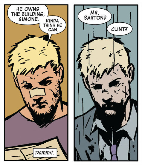
Now, as I read HAWKEYE #1, I noticed there were four types of match cuts being used by Fraction and Aja. The first of these is the purely visual match cut – the classic one we’re always talking about when we mention this technique. That’s when the transition relies only on the similarities between the images on the last and first panels of consecutive scenes. Here’s our first example:
We go from Clint reading his neighbor’s lease to him waiting outside the veterinary clinic where he took to dog who saved his life. As you can plainly see, the framing, position of the body and expression are the same, but we’ve actually moved from one location/moment to another. If the rest of the panels didn’t make that clear enough, Matt Hollingsworth’s incredible color work helps drive the point home even further.
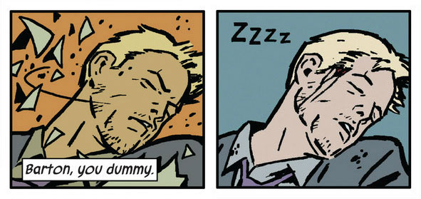
On to our second example:
As the underground casino brawl scene ends, Clint gets hit by a bottle. An almost identical panel is then used to take us back to the vet clinic where the protagonist is now sleeping off a very long day. Once again, the images are practically the same even though the scenes have changed. However, this time the action and emotion shown in each scene are different – yet they use the same depiction! As we can see by this example, it’s really not the action in the panel that’s important for the match cut but rather the image itself used to convey it.
But we don’t have to stay at the basic level since that’s not what Fraction and Aja do. Sometimes, they’ll have not only the image on both sides of the transition fit but also the dialogue as well; either it’s essentially the same or it uses the same motif. That’s our second type: the visual match cut supplemented by dialogue.
For example:
Here we first have Clint being asked by the vet what happened to the dog he’s just dropped on the poor guy’s front counter. It then switches to Clint being ask the same question by the nurse who just saw him kick his $200-wheelchair into a busy street. Again: two different scenes whose boundaries touch with the same image except this time, we also have some dialogue that is – for all intents and purposes – identical. The addition of the dialogue to the match cut makes for an even stronger tie between the two scenes and thus a more aesthetically-pleasing transition.
Let’s complicate things a bit for our next example:
We got a tight side shot of Clint in silhouette apologizing to the vet for his outburst that segues into the same shot of Clint, this time explaining to the other tenants of his building how to do a coin-toss trick. The images are quasi-identical except that we can really notice here the way color helps in establishing in which time period of the story the scenes are taking places. However, the dialogue is different: not only does it not use the same words; it’s not even uttered with the same purpose. Despite this, the match cut still occurs through the dialogue because both lines revolve around the same operative word – snap – and even though it doesn’t mean the same thing in each situation, there’s still here an occurrence of small-scale motif that operates and eases the transition along.
But dialogue isn’t the only component that can assist the visual to create a match cut; actions can play that role as well. More specifically, this third type still relies on identical panels as their basis but we’re adding the fact that both panels seem to represent two consecutive phases of the same action sequence when they’re in fact part of two entirely distinct sequences. Actually, it’s that exact same mechanism at play in my Hudson Hawk example above: the falling and the landing seem to be part of the same action but they’re no link between them beyond the fluidity that’s created by their arbitrary juxtaposition.
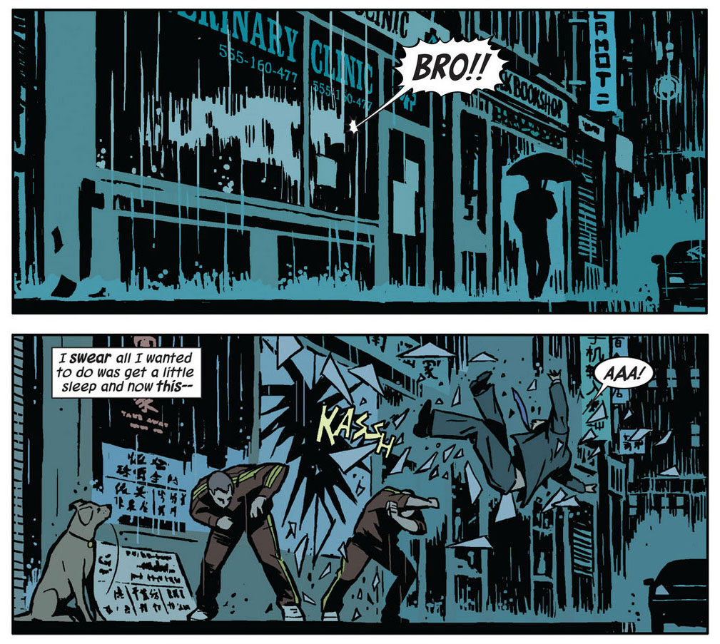
In HAWKEYE #1, we have this:
We first see the front window of the vet clinic in which Ivan, our friendly neighborhood crooked landlord, is trying to shout Clint awake (off-panel dialogue). This transitions into another building, the Chinese restaurant that serves as a front for the underground casino, through which window Clint is being thrown. Once more, the visual is practically the same: the façade of a commercial building. The difference with what we’ve seen up to now is that the transition is also largely based on the illusion that the action is continuous from one panel to the next. It’s so strong in fact that you might be tricked into thinking Clint is being thrown out of the vet clinic instead at first.
Another example, but this time the transition effect gets intercepted:
At first, Clint shields his eyes as the car is about to hit the dog. And then he snaps them open again, except now he’s back in the waiting room where Ivan just woke him up. Thanks to the similarities of the art as well as the natural tendency of all readers to deduce that someone who just closed his eyes will also open them at some point – especially with the panels so close to one another – the match cut effect occurs, even though there’s a panel showing the dog smack in the middle of the cut. The effect is strong enough to jump over the intercepting image.
As it’s apparent through these examples, this type of match cut relies on the apparent causality between actions taking place in two separate scenes; it’s not because of what happens to the dog that Clint opens his eyes but because of Ivan shouting at him. Thus, the trick is to exploit this apparent causality between unrelated actions based purely on their visual depiction and to juxtapose them in order to realize that illusion and thus execute the cut.
The final type of match cut we’re going to examine shows a lot more subtlety than the others above because it relies on the ideas behind the narrative rather than on their visual depiction. As such, it’s an abstract approach to a trick that’s usually explicit visually. In order to pull off what I like to call a thematic match cut, you need to have a notion from one scene carry over into the next without actually relying on any visual similarities.
A couple of examples will make this clearer. First take a look at this transition:
As Clint is leaving the hospital, his thoughts go towards a well-deserved rest, to a slumber so deep as to be likened to death. Next panel: a close-up on the head of a seemingly dead dog. You’ll concur that the two images couldn’t be any more different: different framing, different character in focus, different time of day. However, the same idea can be found in both panels, that of sleep/death. Even though it’s very subtle, the match cut still operates on some almost subconscious level, thus providing that aesthetically-pleasing effect that makes the transition so much smoother for the reader.
Here’s a second example:
Once more, the panels couldn’t be more dissimilar, going from a tight shot on Clint to a wide shot in front of the Chinese restaurant. It’s the idea of petting a dog that acts as a thread between the two scenes. But Fraction and Aja aren’t content to leave it at that and do a little something more: they have the dialogue from the second scene start in voice-over in the first one, thus reinforcing even more the transition between the two, in a way folding space as Kurtis Wiebe and Riley Rossmo did in DEBRIS #1.
However, despite all of the cool tricks one can pull with match cuts, it would seem up to this point that this technique doesn’t serve any important function pertaining to the plot itself. After all, you could very well take it out of the equation and the story would still stand on its own. Yet, in a fractured narrative such as this one, the match cuts act not as much as a cement holding the scenes together than they do as a shock absorber, lessening the impact of the abruptly changing course of the plot by offering something that pleases both the senses and the intelligence of the reader every time the story takes one of those deadly sharp turns.
Of course, doing so many match cuts requires a great deal of complicity between the writer and the artist. In this case especially, we must not forget the invaluable contribution of the colorist – Matt Hollingsworth – to allowing these mechanisms to function without a hitch. If nothing else, HAWKEYE #1 demonstrates how far a comic can go, how high it can aim and how hard it can hit – if you’ll permit this volley* of archery metaphors – when you attain perfect synergy in a collaboration between creators.
In the end, perhaps the greatest lesson that we may learn from HAWKEYE #1 is that greatness is, more often than not, a child with many parents.
*That was another one!
Thus, for their remarkable use of so many types of match cuts, Matt Fraction and David Aja – AND Matt Hollingsworth! – score a BULLSEYE for HAWKEYE #1!
Lesson learned
Match cuts are a technique that can be used to soften transitions between scenes. To do a match cut, make sure the last panel of the ending scene contains a graphical element that is similar to one found in the first panel of the following scene. Still, match cuts don’t need to be purely visual; you can supplement them either with similar dialogue lines or by depicting actions that seem to persist from one scene to the other. For the more abstractly-minded, you can also use ideas as your matching components. Be advised however that this technique requires a great deal of collaboration between members of the creative team to pull off since it relies heavily on both the story structure and the art appearing in the panels.
Honorable Mentions
- In AMERICAN VAMPIRE: LORD OF NIGHTMARES #3, Scott Snyder and Rafael Albuquerque not only use a match cut (!), but that also replace what could have been a boring talking heads affair with a whole savage wildlife scene that matches the voice-over captions on the symbolic level.
- Scott Snyder again, this time with James Tynion IV, Becky Cloonan and Andy Clarke, put the moment-to-moment type of transition to good use in BATMAN #12.
- In CONAN THE BARBARIAN #7, Brian Wood and Becky Cloonan again use a flash-forward to hook the reader in at the start of the book and thus tease him into reading the rest of the story arc.
- Match cuts are really fashionable this week as John Arcudi and Jonathan Case use one to great effect in THE CREEP #0.
- Brian Wood gets a second mention this week as he and Kristian Donaldson use flashbacks and captions to interweave past and present in a narrative that needs both to move along and provide a lot of exposition in THE MASSIVE #3. Flawless victory on both counts!
Dishonorable mentions
- THUNDA #1 was a pain to read this week since Robert Place Napton and Cliff Richards give the protagonist a constant running inner monologue that border the monolsyllabic in its staccato-effect. Jarring and off-putting since because it’s practically the only text we get to read.
And that’s it! A final word before I let you go: I’ll be on vacation for the next two weeks and I promised the missus I wouldn’t be spending all of that time in front of the computer. Hence, I’ve prepared a couple of pieces in advance which I’ll release in the following two weekends. Be prepared for something out of my usual beaten track as well as the fulfilling of an old promise
See you in three weeks!
Please click here to make comments in the forum!
Related Posts:
Category: Columns, Points Of Impact

