B&N Week 9: Panel Descriptions & Camera Angles
Wait, is it Tuesday? Already? Wasn’t it just Tuesday yesterday? Isn’t it going to be Tuesday tomorrow? That’s how it feels, sometimes. But it’s Tuesday, I’ve got Cream by Prince playing [Prince’s advice: sing the song to yourself in the mirror. It’s a great song for you to feel good about yourself!], so I guess it’s time for some Bolts & Nuts!
I’ve had a few requests to go over camera angles and panel descriptions, so that’s what I’m going to talk about this week.
Let’s talk about panel descriptions for a while. Last week, I said that this is where you put what’s happening in the panel. Tyler spoke about establishing shots, but there were some things missing there, which I’ll come to soon.
Like I said last week, panel descriptions are still images that get described to the artist for them to draw. Here is a still image:
Jack is running down the highway, a look of fear on his face.
As long as the artist knows who Jack is and you have already set the scene [which I’ll talk about soon], then this is perfectly acceptable as a panel description. This is an image that can be drawn.
Here is a moving panel:
Jack is running down the highway, pulling a gun from his pocket and shooting ahead of him, a look of fear on his face.
That cannot be drawn. That is not a still image.
And I see it all the time.
Don’t do that. Moving panels are NOT your friend, and I’ll ding you for it every time.
Panel descriptions can be as detailed or as sparse as you like. The first example is pretty sparse. It gives enough information to evoke a scene, which is what it should have done. I didn’t give any angles, because I really didn’t care. If Jack is running toward us, that’s fine. If Jack is running across the panel, that’s fine. If Jack is running away from us, that’s fine. I purposely left it loose so that the artist could flex their muscles. You can do this, too, once you know what you’re doing.
I’m not a fan of panel descriptions that are overly long and complicated. You can write them, but when you’re done, I suggest you re-read what you wrote, and decide what is and is not important. Cut what’s not important, keep what is, and condense. Over time, you’ll start to condense without putting the kitchen sink in there.
What makes a good panel description? This is a great question. Here is a mediocre answer: Who’s in it, What they’re doing, and a Camera Angle that works.
In scouring the ‘net, seeing what other people were saying and if I had anything different to add, I came across this site by Joe Edkin. Joe is a comic writer and editor, and has written a few essays on writing for comics. I suggest you all head over there and read what he has to say. Start from the beginning [where I linked], all the way to the end. I’m certain you’ll find a useful nugget or two in there. But, there is something important I want you to understand.
When you’re writing a script, you HAVE to use a camera angle that works.
There are a LOT of scripting terms when it comes to Camera Angles. High Angle Shot, Worm’s Eye View, Close-Up, Extreme Close-Up, Bird’s Eye View, Top Down, Overhead I can go on. Will it behoove you to learn the terms (and some of them are doubled)? Yes. Yes it will. Because you’re going to be using them over and over again, and if you’re consistent with your terms, then everyone will know what you’re talking about.
Here is where I really suggest you study Joe Edkin’s site, and dig back into the DC Guide for Comic Writing. Just remember that Joe has a theater background, and comics scripting has some overlap with screenplay writing. Some of the terms may overlap.
Anyway, most of the angles you’re going to use are the following:
Point of View (POV): this is a character’s point of view. You see what they’re seeing.
Reverse Angle: You’re going to reverse the angle of the panel immediately preceding this one.
Over the shoulder: You’re looking over the shoulder of a character. You can probably see a decent part of their body, too.
Close-Up: Something that’s going to take up most of the panel.
Extreme Close-Up: This is a detail of something. If we’re talking a person, then we’re generally talking about a single body part or two.
Medium/Mid-View: This will get a significant portion of a scene in the panel.
Those are the six views you’re going to use the most when you’re just starting out.
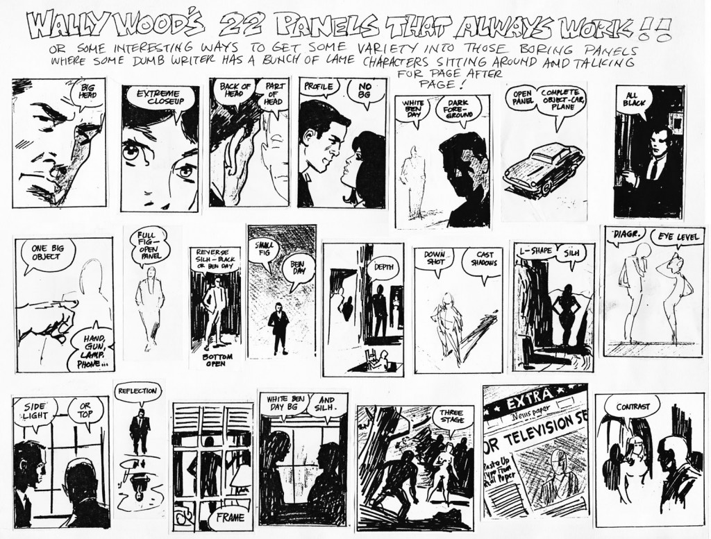
There is something else I want you to study. It is Wally Wood’s 22 Panels That Always Work. It looks like this:
Do this, right now:
Print it out, and tape it someplace important. Then study it. Become familiar with it. Start seeing your conversations in these panel types. Once you do that, you’ll be ahead of the crowd.
When you’re scripting, if you aren’t thinking visually, then you aren’t thinking. Harsh? Maybe. But true. Because if you’re thinking visually, you’re going to be thinking about a camera angle. If you’re thinking about a camera angle, then you’re thinking dramatically. And that’s what the above is all about. Helping you to think visually.
Camera angles, when you get down to it, are all about drama. How much drama can you inject into your script? How can you jazz up that boring conversation and make it sing? What angle can you use to spice it up? Think visually. Think visually.
There’s one other things I want to focus on, though. The Establishing Shot.
Like I said, Tyler did a pretty good job, but there were some things missing. I’m going to go over those.
Establishing shots HAVE to answer the four W’s: Where, When, Who, and What.
- Where are we?
- What time is it? [When]
- Who is in the panel?
- What are they doing?
If you start outside, like on a building or something, then you only have to answer Where and When. It’s giving a place and time. However, you’re going to have to re-establish everything when you actually get inside the building. You’re still going to have to answer the four W’s. [You might not have to answer When.]
But if you don’t answer the four W’s, then you don’t have an establishing shot. It doesn’t get much simpler than that.
Generally speaking, establishing shots are going to be at the start of every scene. You change locations, you’re going to have to do an establishing shot. The only time this won’t be true is if you go back to a previously established scene.
(Wait, Steven. What do you mean when you say I might have to re-establish the scene when I get inside the building? I don’t really get that.)
Okay. Let’s use Tyler’s example of Invincible.
From a scripting perspective, all Kirkman has to do is say is this:
Panel 1:
Daytime, at the Grayson home.
Easy peasy, right? Since it’s the same shot used over and over again, all he had to do was describe it once in the script, and bam, he’s done for the rest of the series.
However, what happens when he has to describe what’s going on inside? You have to do another establishing shot, re-establishing what’s going on there. It could look like this:
Panel 2:
Inside the kitchen, Mark and Oliver are eating a cold breakfast of cereal. Both of them are looking down into their bowls, scowling. Their mother is standing in the background, hands on her hips, looking annoyed. The air in the room should be tense.
That’s what I’m talking about. I’ve answered the four W’s.
Where are we? The kitchen.
Who’s in it? Mark, Oliver, Mom.
What are they doing? Eating, feeling tense.
And in the previous panel, I answered When is this happening? During the day.
(So, if I start outside, I have to re-establish the Where when I go inside?) Yep. Every time.
I never said this was easy. Lots of moving parts, folks. Lots of ‘em.
And that’s going to do it for this week. Your homework?
Print out the Wally Wood panels. Study them. Write them out as panel descriptions, complete with camera angles. Post 5 of them here, so we can compare and contrast.
Next week, we’re going to talk about Pacing. Then, we start talking to ourselves. Or putting words into other people’s mouths. I’m talking ‘bout Dialogue! See you then!
Related Posts:
Category: Bolts & Nuts













Wally’s 22 is hanging up over my art table. Of course, the suggestion that it’s just as valuable a tool/resource for writers is certainly valid. Good stuff, Steven!
Thanks, Tyler.
And yes, it’s definitely an invaluable tool for writers, because they can then say, “I want you to do it like THIS,” and then point (direct) the artist to the appropriate panel.
Printed Wally’s 22 and now hangs on the wall next to my drawing desk.
Thank you for most valuable tool to improve my works.
Thank you once again,
Josh
Always happy to help, Josh!
I saved it as my computer background image. Will that work? 😉
Was wondering if you were able to look at the scripting assignment I posted on the chapter before this one?
It will be the first thing I do when I get home.
Thanks for your patience.
Hey I know this article is old but I would like to study the panels and make a submission of my what I thought the panels angles and shot was.
Sorry for the mistakes in the previous post but I’m typing on a phone. Let me try again.
I know this post is old but I would like to submit my guess on what the view points and shots are, to help build my understanding of scripting and angling.
Hello, Keith! Welcome to the Tribe!
Go for it! Looking forward to seeing what you come up with!
Also, don’t forget to register for the forums!
Good article. This is just as helpful for an artist as well as a writer. I’m printing up the wally 22 now! Good resource!
Thanks
Just a quick question, or maybe a request for clarification, on the Wally Wood 22. What is meant by “white ben day” or just “ben day”? Also, what about SILH? I’m assuming it’s an acronym but I doubt it’s what Google thinks it is … Studies in Irish Lit and History. 🙂
Hey, Ken.
Great questions. Thanks for asking them.
The cop-out answer is “I’m not Wally, so I don’t know,” but that doesn’t help any. Let’s give it a shot.
Personally, I think that “white ben day” is an accident. I have no real idea, but it probably should read “white WHEN day.” Just my own interpretation, don’t quote me on it.
SILH? More than likely that’s for silhouette.
Hope that helps!
Regarding “white ben day” I think he meant a backgriund without black shadows, only ben day. See this Noel Sickles daily: http://www.comicartfans.com/GalleryPiece.asp?Piece=729159&GSub=108330
Or like this one, where there are no outlines at all in the background: http://www.comicartfans.com/GalleryPiece.asp?Piece=141685&GSub=21286