The Kickstarter Laboratory: 7 Experiments in Crowdfunding a Floppy
While much has been written about the “rules” of crowdfunding (including a number of articles on this very site), it’s important to realize that those so called “rules” are still being written. Think about it, if Kickstarter (started in 2009) were human, it’d still be eating paste and learning the ABCs. The fact that the rules and best practices of crowdfunding are still being invented is one of the things that make those platforms so darn exciting.
Last year, I took the plunge and crowdfunded my first project, an ambitious 100+ page anthology. Before the campaign launched, I detailed my approach and crowdfunding game plan in this space. More than a year later, I’ve launched my second Kickstarter project, this time for a 32-page single issue of a new series. As it turned out, my first campaign was far more successful than I could have hoped. I’d be an idiot not to replicate some of the campaign strategies I used in that campaign with my new one. That said, this is a different project, and I’m older (and presumably wise), as is the Kickstarter platform. If you’re not moving forward, you’re falling behind, and as such, there are new strategies and approaches I’m going to experiment with this time around.
Now, by no means am I saying that the following 7 strategies are entirely original. They’re not. But they are new to me, and as such, I’m excited to see how they play out over the next few weeks. So, put on your goggles and white coats, if you please, and step into the Kickstarter laboratory with me!
1) Emphasize Day One Backers
Hypothesis: In a crowdfunding campaign, early backers are more valuable than later ones. Therefore, they should be acknowledged, and rewarded.
I think most Kickstarters know that getting their campaign off to a fast start is important. After all, crowdfunding is stressful, even more so on an all-or-nothing funding platform. So, the sooner you hit your target to guarantee your funds, the better. But one thing I’m not sure most people realize is that a fast start is also important to how Kickstarter displays and promotes your project. Remember, Kickstarter only makes money when projects get funded. Thus, it’s in their own interest to promote “winners” (by featuring higher on the page in search queries or making a featured project) and bury “losers.” Clearly, coming out of the gate with a lot of activity day one is a good way to distinguish your project as a winner.
So, in effect, a Day One Backer is more valuable to a campaign manager than one who signs on later in the campaign. Not only does their financial backing help your project get out the gate fast, but the earlier they join in on your campaign, the more they’ll be privy to your messaging throughout, and the greater their ability to help evangelize your project.
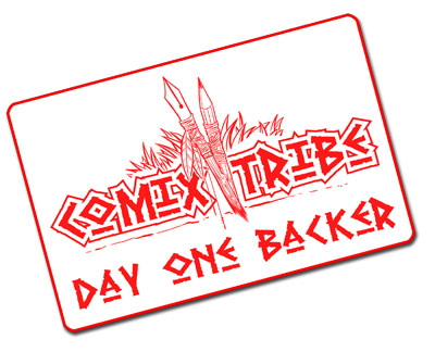
If we can agree that a “Day One Backer” is more valuable than one later in the campaign, doesn’t it make sense to acknowledge that, and even reward it? Well, that’s one thing that I’m going to be experimenting with in this campaign. My plan is to stamp all Day One Backer’s packages with a special stamp (see above), acknowledging their support. I’ll also be providing an exclusive digital reward to all Day One Backers after the campaign. I’ve also seen many other campaigns employ an early incentive system by releasing a limited number of their main product at a discounted pledge level, encouraging early bird backers. While that sort of incentive might work for a premium graphic novel, I don’t think the margins support it for a floppy campaign. But it is another way to incentivize early backing.
We’ll see if putting an extra emphasis on Day One Backers helps EPIC get out to a fast start.
Pros: It’s always a good idea to provide your super fans and early supporters with a little extra something. It can encourage acting immediately, and help the project be seen by Kickstarter as an early winner.
Cons: Tracking Day One Backers is another thing you need to manage , and potentially makes fulfillment a bit more complicated, depending on how you’re rewarding things. There might be a concern that it could backfire, and make people who discover the project after Day One resentful that they missed out on something, costing you a pledge.
2) No, You Can’t Get Just One
Hypothesis: When crowdfunding a floppy, the single issue physical reward is lousy value for both backer and creator, and thus should be eliminated.
This is probably the most “controversial” strategy I’m employing. Here’s the thing that bugs me about most Kickstarters that are trying to fund a single issue (aka “a floppy”)…it’s the pricing of the reward that gets you a single physical copy of the comic.
What exactly are you supposed to charge for a single issue? At conventions and in comic shops, the most the market will bear, seems to be around $4. But obviously, you can’t charge $4 on Kickstarter, because the cost of packaging and shipping a book is close to $3. After Kickstarter takes their cut, you’re left with less than a dollar to print your book….and most projects can’t print a book for that. So, inevitably, you have to raise the price. And if your campaign is also trying to raise funds for the book’s creation (art, color, lettering, pre-press), you need to charge even more. (Thankfully, my latest project is already complete and paid for, I’m I’m just trying to offset the cost of the printing with this run.)
I’ve seen the price for a single issue on Kickstarter run $7, $10, even $15. The higher you go, the more likely that reward will help you hit your goal, but it also has the effect of turning off potential backers. Altruism or no, no one likes to pay significantly more than $4 for a floppy.
It’s the cost of shipping that is the real challenge. As I explained previously in my shipping primer, shipping and packaging of a single floppy costs ~ $2.75 to ship to the US, ~ $3.75 to ship to Canada, and ~ $7.65 to ship internationally. So, if a floppy is worth $4, it costs twice that to ship north of the border and nearly three times the price of the product to ship internationally. That, quite frankly, sucks.
On the other hand, the cost to ship TWO floppies, in the US using Media Mail is only ~$3.00, just a 9% price increase for twice the product. To ship two comics to Canada, the cost is ~$4.35 (16% more) and internationally, the cost is ~$10.20 (33% more.) By shipping two books with every pack, and pricing accordingly, a greater percentage of each backer’s pledge can go toward product, rather than shipping. This helps me, the campaign manager, and potentially should make the backer feel they’re getting more value out of their pledge.
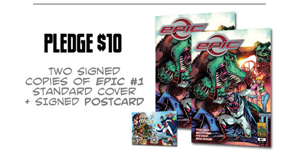
And, as a bonus, I get to put two books in every backer’s hands. ComixTribe is committed not just to competing in the comic market, but expanding it. I think the “collector culture” has gotten a little out of hand. In “the good old days” a single floppy would get passed around five, ten, a couple dozen times. But now, I feel like most books end up read, hopefully enjoyed, and then tossed in a long box. By giving every EPIC backer at least two copies, I’m trying to encourage sharing. I’m thrilled with how the issue came out, and I think it has broad, general appeal to a wide audience — current comic fans, lapsed readers, and anyone who’s ever felt a little weak in the knees around the opposite sex. So, yeah, I want to encourage backers to keep one copy for their collection, and share one with someone else.
Pros: A lower per book shipping cost to all backers, and a better chance readers will share the book with others.
Cons: Backers might resent not being able to order a single book. Might be confused as to why that isn’t even an option.
3) Get your Animated GIF on
Hypothesis: The real-estate on your crowdfunding page is valuable, therefore animated GIFs are a great way to conserve space and dynamically tell your project’s story.
Animated GIFs? Hey, Ty, 1993 called and it wants its advice back!
Okay, bear with me on this one for a minute. One of the best things about the Kickstarter platform is that they really do a good job of limiting design options for creators. (Trust me, this is good thing!) There is a uniformity to the standard Kickstarter page, with controlled font and color and embed options, which makes sure that even the laziest of campaigns are legible and generally attractive.
But, within these limited options, it’s the savvy creator’s job to tell and sell their book in the most effective way possible. In general, that means a strong balance of clear, concise text, and attractive images that help tell your project’s story. At the same time, a potential backer’s attention span is limited, and you can only expect them to do so much scrolling on your page.
Animated GIFs, when done well, have the potential to hold a person’s attention. And unlike video, which requires action on the part of the viewer (pressing play), these suckers can just roll. So, this time around, I included two animated GIFs on my project page:
This one, to show some of what’s inside the pages of EPIC, and answer the question, “Who is this book for?”

And this one, which is a rotating set of blurbs from fellow comic creators singing EPIC‘s praises. (Of course, because this book was completely finished, securing these blurbs was another thing I was able to do, which wasn’t the case with my last campaign.)

Pros: An eye-catching storytelling device, which doesn’t take up much space on a Kickstarter page.
Cons: Uhh…people might not like them, or have the patience to watch.
4) Promote in the Real-world
Hypothesis: Promotion in the real-world can effectively compliment an online crowdfunding campaign.
Now, this one I’ve never been a big believer in. Just as I don’t think comic book conventions are a great place to generate traffic for a webcomic, in general, I don’t think physical appearances are the best place to promote a crowdfunding campaign. I often see creators trying to line up their crowdfunding efforts with big shows, and I think they’re probably wasting their time…people who come to conventions are looking to buy stuff they can leave the show with, they’re not walking around artist alley to find products they can pledge for online, and then hope to get months later.
However, it just so happens that I’m attending two conventions, Granite State Comic Con and New York Comic Con, over the next three weeks, so why not put this little theory to the test? The difference for me is that the primary focus of my efforts at those shows will not be to promote the Kickstarter, but to put books we’ve already created in the hands of fans. But, what does it hurt to also put a postcard in their hands pointing them to the EPIC Kickstarter at the same time?
And the other benefit of doing real-world promotion is that it shows backers that you’re actively working at your campaign. Take a look at this update from Jules Rivera, currently Kickstarting her new series Misfortune High, announcing a signing event to promote her campaign. That update shows current and prospective backers that Jules is taking initiative. She’s not just sitting on her bum waiting for dollars to flow in, she’s getting out there to spread the word about her book. And the fact that she’s being hosted by Nostalgia Comics also gives a tacit endorsement for her work.
Pros: In person promotion of your campaign to people in your target market. Shows you’re hustling.
Cons: No guarantee people in the real-world will ever make it to your page, and perhaps time would be better spent on other marketing approaches.
5) Freshing up the Lead Image
Hypothesis: A project’s lead image is powerful, and cycling that image throughout the campaign will keep the project fresh.
A project’s main image, the image that shows up on the Kickstarter page in searches, and the image you click to play your video, is the most important image on your whole page. One thing that I don’t think everyone pays attention to is the fact that you can change that image throughout the campaign. Updating that image to announce stretch goals or other developments throughout the campaign, can keep things interesting for frequent Kickstarter browsers.
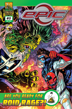
One thing I’m going to do, is cycle in different images throughout the campaign, and see if I can track which image seems to be the most effective. One of the strengths of the EPIC campaign is that I have a LOT of attractive, pin-upy art for this property, that would make good potential lead images. So rather than just use one, I’m going to cycle the following images throughout the campaign:
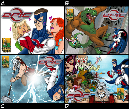
Got a favorite? Tweet me!
“Hey, @tylerjamescomic , the best EPIC banner is clearly [A, B, C, D]” (Click to Tweet)
Pros: Keeps the Kickstarter page “fresh” throughout the campaign, and I might stumble on the image or images that are the most effective at generating pledges.
Cons: Chance project brand awareness takes a hit, by changing the image so frequently.
6) Promote That Original Art
Hypothesis: Original art is one of the best higher tier rewards you can offer, and you should make every effort to sell it during a crowdfunding campaign.
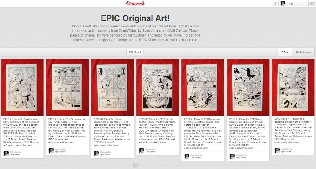
In my last campaign, I had some great original art to sell as pledge rewards…yet, only a few of those pledges sold. This time around, I’m going to try to do a better job promoting them. I’ve set up a Pinterest page showcasing all of the art available, and will be adding additional pages to the gallery throughout the campaign. I will also let backers select their own pages on a first back, first serve bases. Hopefully, visualizing these premium rewards, and pricing them affordably, will be too enticing for some backers to resist.
Pros: Selling original art is a great way to raise funds, and because the work is already complete, it doesn’t require additional effort on the creative team’s part.
Cons: None that I can see.
7) It’s (Not Just) All About the Benjamins
Hypothesis: Focusing only on the total dollar amount raised for stretch goal milestones is a missed opportunity to keep momentum throughout a campaign.
Let’s talk stretch goals for a minute. On the one hand, crowdfunding stretch goals were the magic breakthrough that has allowed many projects to maintain, and even accelerate momentum long after initial goals have been reached. On the other, poorly planned and budgeted stretch goals have been a major reason for the collapse of what would have been successful projects. Kickstarter itself has recently expressed concerns about the stretch-goal tactic:
“All-or-nothing funding is simple and clear: a project has a single goal, and backers support the project in its pursuit of that goal. Stretch goals muddy the waters. What if someone got in early and helped a project reach its funding goal, but now the creator is focused on stretch goals? What if someone backs a project for a stretch goal-related reward, and that goal isn’t met? Both are bad experiences for backers.”
When my EPIC campaign went live, (and the Oxymoron campaign before it), there was no mention of stretch goals on the project page. I see many projects posted on Kickstarter talking about what they might do with thousands above their goal, before they’ve even raised a nickel. That’s way too presumptuous for my tastes. Certainly plan what you’ll do should you hit your goal with time on the clock, but wait until you hit that goal before talking about it.
That said, should the EPIC project be successful, I’m going to experiment with having stretch goals that reward some things other than campaign financial milestones. Don’t get me wrong, tying stretch goals to campaign dollar amounts raised is still a good practice. After all, that big number is often the first thing anyone sees. But the Kickstarter platform provides a ton of metrics, and I’d argue that if you can easily measure something, you can also reward it!
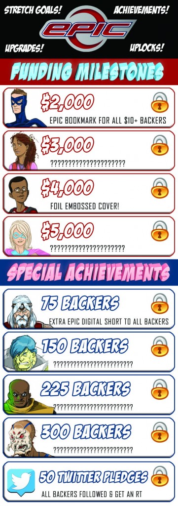
So, rather than focus solely on the project’s dollar total, I’m also going to celebrate milestones related to the number of backers. To get to a $1,000 goal, would you rather have one person give you a grand or 1,000 people give you a dollar each? If you’re focusing on the financial goal alone, it doesn’t really matter. But if you’re thinking about Kickstarting a career, it’s far better to have a large number of backers with a little bit of stake in your project, than a few with a lot riding on it. My goal is to get read, and to build a fanbase that will allow ComixTribe properties to compete (and win) in a crowded marketplace. I certainly love and am humbled by our super-fans, willing to make large pledges for premium rewards…but to really make waves, we need an ocean of backers, not a pond’s worth.
And one of the other things I’m going to experiment with in this campaign is promoting and rewarding the performance of certain channels. Take Twitter, for example. Kickstarter will tell you how many backers come directly from Twitter to make their pledge. For the Oxy campaign, Twitter and Facebook were very powerful at drawing backers and raising funds. So, again, why not incentivize that activity? Doing so encourages more sharing on those platforms, at least in theory. Either way, I’m going to give it a shot.
Pros: Encourages and rewards the quantity of backers as well as the quantity of their pledges. More opportunities to celebrate the campaign and reward backers.
Cons: More stuff to keep track of.
The Rookie Mistake I Made This Time
To date, I’ve written some 20,000 words on the subject of Kickstarter and crowdfunding, but as my wife was quick to remind me, one successful campaign does not a guru make. And to bring that point home, I almost totally botched the EPIC Kickstarter’s launch!
Last week, I announced that the project would be launching on Monday, 9/23/13, and all of my preparation had been leading up to that launch date. However, I waited a while to get my project page and video just right, and submitted it for review Thursday night. For the Oxymoron Kickstarter project, the KS folks approved it the next day, so I wasn’t worried at all about submitting a project four days before go time.
Imagine my horror to see that their stated approval turn-around time was 2-3 business days! AGHH! That meant it could be Monday or Tuesday before I heard back from them, totally botching my launch plans.
Luckily, the fine folks at Kickstarter approved my project on Friday, a turn-around of only 20 hours, likely in an attempt to clear their project queue before leaving for the weekend. Some have speculated that approval times for previous project managers is faster than for newbies, but I don’t have confirmation on that. Either way, getting a quick approval was a big sigh of relief. But yeah, I should have known better.
Crowdfunding Pro-Tip: Don’t announce your project’s launch until it’s been approved from Kickstarter.
So, there you have it…I’ve laid out another set of crowdfunding strategies I’m going to try with the EPIC campaign. Will they be successful? We’ll find out over the next 25 days or so.
Now, I’m sure there will be a few other things I’ll try during this campaign…as the best ones are truly dynamic endeavors. So, if you want a front row seat, I’d love to have you back the EPIC campaign.
Crowdfunding Pro-Tip: A great way to learn crowdfunding tips is by backing successful crowdfunder’s projects. Costs as little as $1.
If you’ve found this article informative, please share it:
“Great ideas for crowdfunding your comic book via @comixtribe #kickstarter” (Click to Tweet)
DISCUSS THIS ARTICLE AT THE NEW COMIXTRIBE FORUMS, HOSTED BY DIGITAL WEBBING
Keep Reading!
If you found this article useful, you may want to read one of these three articles next:
DIY Crowdfunding Fulfillment Part I – What To Do BEFORE You Launch?
DIY Crowdfunding Fulfillment Part II – Ship Like a Boss
My Approach to a Kickstarter Campaign
Related Posts:
Category: Comix Counsel








Be careful with project image changes. Kickstarter has started a policy of not promoting (that is, removing from the staff picks and so on) projects that put things like “LAST WEEK” banners on their images. Once the project ends, they don’t want the project to be forever claiming to people passing by that it’s in its last week, only for them to find out that it ended long ago. The image changes that you have shown here should be fine, though, i think.
Great tip, and great point. Thanks for sharing!
Thanks for writing this—so much great advice, especially the part about stretch rewards based on number of backers. Really smart way to approach stretch goals that stands out from the pack.
Tyler did you post a follow up to this with the results of the experiments?