Kickstarter Page Design
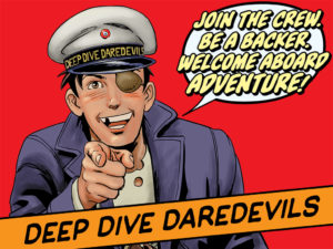
Hello! My name’s Matt Heistand, 1/3 of the writing team known as the ThreeOneFive. Our short comic, Baby Girl, was published as a back-up feature in Image Comic’s HELL YEAH, and currently our weekly Golden Age adventure webcomic, Deep Dive Daredevils, is in the middle of a drive to fund a print edition on Kickstarter.
When Tyler James asked me to write about the design of the Deep Dive Daredevils Kickstarter, the initial feelings of flattery were quickly replaced with a creeping dread. You see, A LOT of the strategies that my collaborators and I utilized in putting together our KS came STRAIGHT from articles written by Tyler. So, what could I possibly have to offer of value on the subject? Well, we’ll see, I guess…
————————————————————-
Here are a few principles that guided the design choices on the DDD Kickstarter:
 1. LEARN FROM YOUR BETTERS
Paying attention to advice from people who know their stuff like Tyler definitely fits under this category, but more specifically, as a writer, when it comes to design you MUST take cues from the more graphically inclined members of your team. They know better than you. No matter what you might think, trust me, they do and the sooner you embrace that fact the better.
I’m lucky enough to work with one of the best designers in the comic business, Fonografiks A.K.A. Steven Finch – best known for his work on Image Comics titles like SAGA, TREES, and LUTHOR STRODE just to name a few. Steven and I have been friends/collaborators for nearly a decade. I NEVER start a comic project without him on board to handle the lettering and design, and I’ve learned to trust his design instincts pretty much without question.
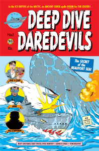
Once again, my faith was rewarded when Steven turned in the final cover for Deep Dive Daredevils No. 1, a spot-on homage to the Golden Age aesthetic.
2. THERE’S A REASON THEY CALL IT A CAMPAIGN
As you might imagine, Steven is a very busy guy, so after he turned in the cover the remainder of the design associated with the KS was a big question mark.
Dan Fifield, Evin Dempsey (my co-writers in crime) and I put our heads together, and after a few false starts we came to a realization that shaped all our subsequent design choices – a KS campaign is really nothing more than an ADVERTISING campaign for the project you are attempting to fund.
The question then becomes what is the key design element to a successful advertising campaign? We surmised that it must be BRANDING. Basically, if your products and the advertising that promotes them are all part of a recognizable whole then you’re tapping into the same methodology that has made a can of Coca-Cola familiar to pretty much every person on the planet.
So, with the cover as the template, we set out to create additional rewards and design that all added up to a brand.
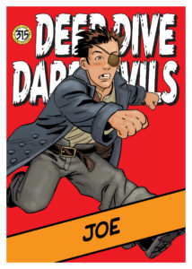
Caption: Trading Card Design
Caption: Project Image Design
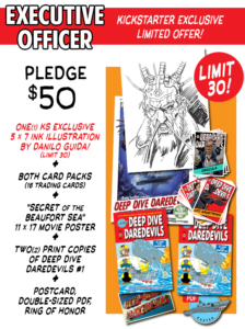
Caption: Reward Graphic Design
3. DON’T BE AFRAID TO BREAK YOUR OWN RULES
This one’s simple. During the design process you’re bound to come up with ideas or images that don’t fit within your branding scheme, but that doesn’t necessarily mean you need to throw them out.
Though our scheme was all built around the throwback Golden Age aesthetic of the cover – bright blocks of cover and classic looking fonts – at one point in the process we toyed with a design that was much more modern.
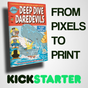
And, while we didn’t use it on the KS page itself, that image has been used to great effect on social media to spread the work about the DDD KS campaign.
————————————————————-
Well, that’s all I got. Maybe all the stuff I’ve just ruminated on is old hat to a lot of you guys/gals out there, but these are all things we had to learn along the way.
By the way, if I didn’t make it clear enough above, our secret weapon when it comes to design is Fonografiks. And, it just so happens that we still have a reward level available that gets you a 1-on-1 consultation with Steven Finch about YOUR comic’s design. I can tell you from experience, picking the brain of the go-to-designer at Image Comics could be a game-changer for your project.
Go check out the DDD Kickstarter now!
Related Posts:
Category: Trenches
