Draw Over #4: Jules Rivera
This Week’s Artist
Jules Rivera, writer/artist of the popular new sci-fi webcomic Valkyrie Squadron, is up this week in Draw Over! Jules submitted four sequential pages from Valkyrie for review. Watch the recorded critique, and read the review summary below.
Page 1
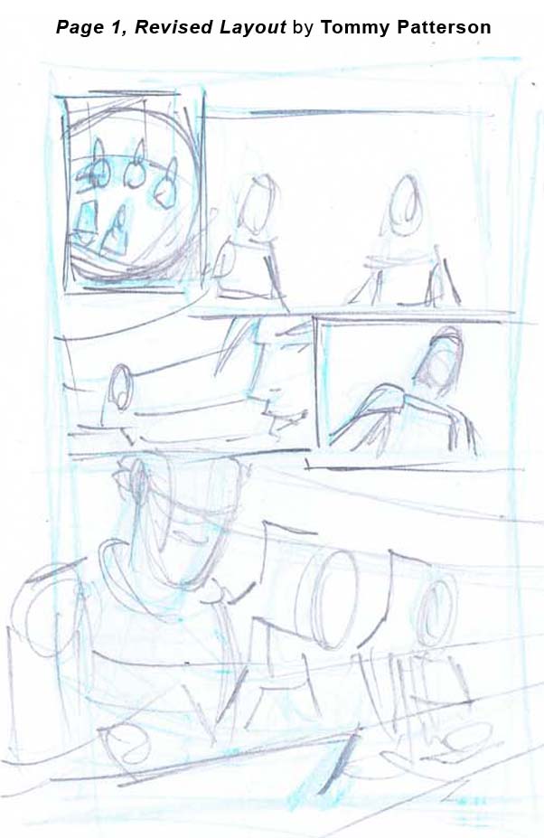 The biggest problem with this pages is that at first glance, I can’t tell where anyone is in relation to one another. I’m assuming in panel 1, it’s the captain upfront. I would say this page needs establishing shot to show where everyone is in relation to one another. Try panel 1 establishing shot, showing where the characters are located in space. (See Page 1, Revised Layout.)
You have an all talking head page, and there are a lot of medium shots. Make it more interesting by pushing, pulling and panning the camera.
Jules needs to do a diagram to show where all the characters are. A revised panel one will fix this.
She needs to work on having something in the foreground, middle ground, and background. Her page is a little flat.
Might make panel 4 more of an upshot, again to move the camera and make the page more visually interesting. Let’s add some more perspective to punch the shots up, and make a bit cooler.
Overall, Jules has a pretty good style, with very clean line work. Her figure work doesn’t bother me. Not bad at all. Anatomy wise, I would focus on the head. Find the center line forehead plane, and be conscious of perspective. It’s all geometry. Her brow on the bottom character gets away from her, and nose is a little low. Pay attention to girls face in the mask on panel 1, and then compare to page 2…
Page 2
In Panel 1 here, her face gets pulled up. Jules is tricking herself that the eyes are going to be in the same place from this perspective as they were on page 1. Pay attention to the geometry of it. Her face got pushed up too far. She tricked herself with the goggles.
I like the layouts on this page, no complaints.
Not 100 percent sure what was going on in the bottom left panels, but like the beat.
Good expression on the characters. Good face in panel 2. Like the odd shaped panel, I think it livens it up.
Page 3
Biggest problem with this page is that we don’t know where the bots are coming from. She needs to let us know where they are coming from, what direction.
Panel 4 – Right here, she drew the helmet and then drew the face into the helmet. Don’t do that. Draw through, draw the head first, then draw the helmet. The character needs a lot more cranium, so the helmet will need to be bigger. Good nose though. Tough angle, but looks good. The pitch of the eyes a tad off. Let the figure dictate the costume. She’s missing a little bit of a shoulder.
PRO TIP: Always construct figure first, then put the stuff on it.
Panel 3 – It looks like they’re running. Wouldn’t mind a few speedlines. (I’m a sucker for diagonal panels.)
Going to establish what I would do with the top half of the page.
Let’s have some scale. If you focus on a pincher in the foreground of the first panel, you’ll anchor the transition in the second.
Add a shadow.
Not sure why so much space between borders. Shrink it up, simple as that.
Page 4
 Panel 1 -3 have a beat going. Based on a perception of how people run, you’re missing some dynamism. I hate when people are scared away from doing story telling tricks. Panel 1 I’d put one of the characters closer to the camera, to get some depth and perspective. Jules has them running straight up and down like Forest Gump. Bend ’em foreward a little, even though they’re in a space suit, they should be hauling ass.
Panel 2 – We see she hits the door in panel 3, so let’s have her arm reared back in panel 2.
Panel 3- Let’s have her leaning a little more in panel 3 for more impact. All about the gesture, move leg back. Dislodge the panel, just like she dislodged the door. Don’t let anyone tell you not to do panel tricks like that.
There’s another Really wide panel gap on this page. Jules is missing a chance to blow the figure in panel 4 and make it super cool. Let’s steal some of that real estate.
It’s a good camera angle in panel 4, I’d crop in on it a bit more, and really pump up how big the front leg is. Force the perspective even more. Really good with the pose, but let’s pumpt it up, Travis Charet style. I’m assuming these girls aren’t complete wimps.
Panel 5 is fine. Maybe consider adding some different decals to their helmets to help differentiate the girls. Color will help distinguish them, but do it in the art work.
Panel 6- Here’s a trick for drawing eyes…Try drawing them with the side of your pencil. There’s a fluid ness, especial with drawing female eyes that drawing that way gives you.
In summary, there’s good work here. The problems are a few too many medium shots, a few facial construction anatomy issues, and unnecessary panel gaps. If Jules fixes those, and pushes and pulls the camera a bit more, she’ll Punch the drama up, and craft some solid pages.
Read more of Jules Rivera’s Valkyrie Squadron and follow her on Twitter @JulesRivera.
***
Tommy Patterson is the artist on the upcoming Game of Thrones comic book adaptation from Dynamite. Viewhis online portfolio here, and follow him on Twitter @TommyFPatterson. And of course, tune in for the nextDraw Over!
If you’re an artist interested in submitting your sequentials for a future Draw Over! column, send an email to DrawOver@comixtribe.com.
Related Posts:
Category: Draw Over!

