Review: The School of the Damned #1
Funnily enough, I read this first issue of The School of the Damned – the new series from independent Scottish publisher Black Hearted Press – in the same week that I finally got round to reading the first volume of The League of Extraordinary Gentlemen, the famed work by the powerhouse pairing of Alan Moore and Kevin O’Neill. The School of the Damned is very much a spiritual cousin to Moore’s passion project. While that series began as an ode to Victorian pulp literature, this series debut from writer John Farman and artists James Devlin and Dave Alexander is very much a love letter to 1930s horror cinema, the period when Universal – with its iconic monsters and exotic foreign locales – ruled the genre roost. Both titles play with the notion of having all these stories from the same era and medium exist in the same continuity to allow for a comic book team-up, though in some cases the characters from those stories that show up are not the ones you might expect. Perhaps the biggest compliment I can pay School of the Damned is to say that, when reading both in such quick succession, this new comic doesn’t suffer in comparison to the widely-revered series.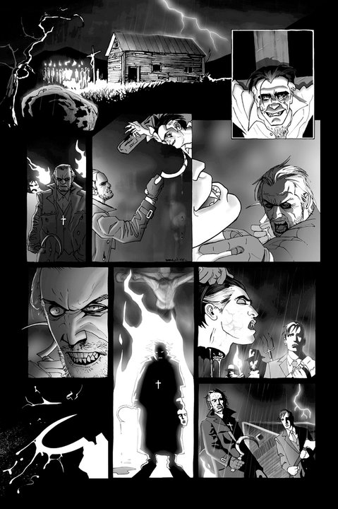
The first thing to note about this comic is just how good it looks. Right away, you are struck by an instantly iconic cover, one that would stand out on the shelves even if placed amidst stuff being published by Marvel and DC. It features a group of Nazis confronted at the doors of a castle by demon child Moloch, and Count Orlok – partially cast into shadow – towering behind him, arms oustretched. It’s a clever pastiche of the famous House of Mystery cover, complete with a Dare you enter tagline above the title, but also works on its own merits if you’re not familiar with comics history.
Indeed, pastiche plays a big part of the visuals, provided by the talented art team of James Devlin and Dave Alexander. Devlin – who provides the cover and the comic’s feature story – is an artist I first became aware of during the voting process for the SICBA awards. He was nominated for Best Artist for his work on Dark Ascension, and I was blown away by the quality of his art then. But the pages he provides for The School of the Damned could be even better. Some artists – even deservedly acclaimed ones – need a lot of space to make an impression, with plenty of splashes or 2-4 panel pages to give them a nice vista to craft their images. The narrative here, however, is rather dense, and as such the average panel count per page is roughly 7-8. Not a problem for Devlin. He manages to cram detail into every panel, each image packed with depth and detail, with the meticulously rendered backgrounds often attracting as much attention as the slickly-designed characters.
But perhaps Devlin’s biggest triumph comes not from his stylish pencils, but from his inks. The interiors of this comic are entirely black-and-white, but this never feels like it’s due to budget or any kind of creative compromise. As rendered by Devlin, this story feels like it could only ever have been told in black and white. The grayscales expertly mimic the atmosphere of an old black-and-white horror movie, from the stark blacks of shadow to the eerie glowing whites of flame. With the way Count Orlok is often lit in scenes, it looks like the pages have been lifted directly out of Nosferatu. This is like reading an old horror movie, which I’m sure is exactly the effect that John Farman was aiming for.
In addition to this feature story, Times Like These , School of the Damned also has a 4-page backup story, The Curious Fate of Gabriel Utterson : with the comic also featuring a letters page, you certainly feel like you’ve got your money’s worth with all the content provided. The art in this backup tale is provided by Dave Alexander, and is a sharp change in style. This is appropriate, given the shifting nature of the story. Here, we get an origin story of sorts for the new status quo of Mr. Utterson, who keen readers of Victorian literature will recall was the good friend of Dr. Jekyll. John Farman writes this in the style of a Victorian novel, the story unfolding through diary extracts, and in turn Alexander’s art takes the form of etchings you might have found in books of that time. Alexander’s thick lines and cross-hatching really help to age the look of the art, making it look like something from the 19th Century. As was the case with Devlin’s art, the visuals take us back in time, recalling a bygone era.
Here, it would also be worthwhile to note the lettering of Jamie Grant. Perhaps better known as a colorist on titles such as All Star Superman, he proves equally adept when switching to his lettering hat. His letters in the first story are effectively understated, but it’s in the backup that Grant gets to have some fun, adopting a handwriting font and caption style that makes the narration literally look like excerpts torn from the pages of a diary. I’m sure I’ve mentioned before in earlier reviews that handwriting-style lettering fonts can be a real pet peeve of mine, as they can often be hard to read. But Grant manages to pull off the tricky balance by making his letters here perfectly legible, while still maintaining the desired stylistic effect.
But The School of the Damned wouldn’t merit all the praise I’m lavishing on it if it was just a great-looking comic with no depth to it. So I should also acknowledge the major contribution made by writer John Farman in bringing the story together. It never feels like he’s coasting on the recognition factor of putting these characters together, which it would have been easy to do. Instead, Farman takes the time to re-introduce them all as if they were brand new characters (indeed, some of them pretty much are), and shapes what should prove to be a fascinating ensemble.
I won’t go into too much detail about the story, as part of the fun comes from the surprises held within. But I will say that this is an expertly paced book, with slow-building dread, a well-placed touch of dramatic irony as we figure out where things are going a couple of pages before the characters do, then a high-octane dramatic finale. And, as gorgeous as that cover is, it’s a little bit misleading, as the unfolding narrative leads us to question who the real monsters of this story are.
Apparently, The School of the Damned is to be an ongoing series: an ambitious undertaking in the independent market, to be sure. But I’m optimistic the creative team will be able to pull it off. Over the course of this issue, John Farman skillfully introduces a cast of characters that I’ll be excited to learn more about in the months to come, and it all remains an easy, accessible read thanks to some classy artwork from James Devlin and Dave Alexander. Highly recommended!
***
Artists: James Devlin, Dave Alexander
Letterer: Jamie Grant
Design: Sha Nazir
Publisher: Black Hearted Press
Price: £2.95
Synopsis: An exploration of love, life and death during the begining of Nazi occupied Europe as one School resists the threat of extermination. Dare You Enter… The School of the Damned!!
The School of the Damned #1 will be released in the coming weeks. For more info, visit www.blackheartedpress.co.uk.
Related Posts:
Category: Comics, The Creator-Owned Zone








Comic is now available from Forbidden Planet Glasgow, City Centre Comics Glasgow, Comics by post and cultempire.com 🙂
Awesome! Everyone should definitely check it out.