B&N Week 121: Lettering Pt 1
It’s Tuesday yet again! We’ve got warming trends, we’ve got longer days, we have people working out to shed the winter weight. Know what else we’ve got? Con season ramping up. Sometimes, the convention season seems very much like the tennis season: you play and play and play all year, with only a few short weeks that constitute a break, and then you start it all over again.
With convention season really getting into swing, creators are looking to get their books done. Know which creator becomes the most in demand at con season? Letterers. Without them, you don’t have any words to read. You just have a picture book. So what we’re going to do for the next few weeks is talk about lettering, and give you some tips and tricks in order for you to help yourself.
Let’s start.
Remember that comics have a visual language, and that is especially true of lettering. We have to approximate visually what film does with sound and books do with description. If you have Edna behind a door, wanting to come in, in film you can hear her speak through the door, and in prose you can describe how Charles hears her through the door. In comics, we have to do special tricks—use visual language—in order to achieve the same effect.
Now, the very first thing I’m going to tell you [and I’ll tell you every week I talk about lettering] is to never, ever, EVER ever never use Comic Sans as a font. Want to be a laughingstock? Want to waste lots of hours in putting in your letters, only to find you have to do it again? Use Comic Sans. That’s all you have to do.
Okay, with that said, let’s take a few steps back. You know me. I like to get to the base, and then work my way up.
Modern lettering consists of a few things: word balloons, a font that works, and possibly sound effects. Back in the day, letterers were also responsible for inking the panel borders, but that is no longer the case. Hell, most comics aren’t hand lettered anymore, which is an art form in itself.
Word balloons are simply that: balloons that hold the words. They’re pretty basic, and you can find them everywhere nowadays without looking too hard. For our purposes, and for this column only, we’re going to lump captions and thought bubbles into word balloons. Let’s talk about the roles each one plays momentarily before moving on.
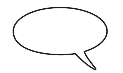
Word balloons [the actual ones] are for words characters are actually speaking. If a character is on the panel [or off panel but in the scene] and can be seen talking, their words are in a word balloon. The word balloon is often in the shape of an oval, and has a tail coming from it that points to a character’s mouth. It should look like what you see just underneath here.
Where the tail points is very important. Lots of bad comics will have the tail pointing to the person, but not to their mouth. You speak from your mouth, not your elbow, ear, eye, or toe. Have the tail point appropriately.
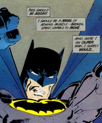
Captions are a little different. Captions can be used in three ways: there’s the omniscient narrator, there’s the internal monologue, and there’s the voice-over. Captions have no tails.
Just to be thorough, the omniscient narrator will give information about a scene, setting, how a character is feeling, or information pertinent to the story. Think of it as reading a book. Most of what you’re reading is from the point of view of the omniscient narrator.
The internal monologue is from the point of view of a character. This gives their intimate thoughts. The thing about an internal monologue, though, is that there’s something of a barrier between the reader and the story. You can do an internal monologue where the characters never actually speak in panel. It’s all about their point of view. It’s a trap to fall into. The other trap is what I call the dropsies: you start an internal monologue, but since you don’t have enough to say, you drop it off without picking it back up again, or you use it in spurts over a few pages. Neither is good. Anyway, for the internal monologue, the character does not have to appear in the panel, although a lot of times they are.
The voice-over caption is where you have a character talking, but they aren’t in the scene. They’re at a different location, more than likely the next location you go to. Voice-over captions are marked by the use of quotation marks, telling the reader that this is being said out loud.
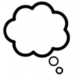
Thought balloons are fluffy clouds that give the character’s immediate thoughts. This is different from the internal monologue in that there is no barrier for the reader to overcome. An internal monologue could be done [and most often is] for a story that is already finished, and this is just the telling of it. Thought balloons don’t have that problem. The character will always be either on the panel or in the scene. Thought balloons have tails that are a series of circles, and those circles point to a person’s head.
The word balloon is basic in form and function. It doesn’t start to get interesting until you start thinking about fonts.
The word font is a word used to mean typeface, which basically means how the letters themselves are shaped within a group. Here are two fonts that most people know: Times New Roman, and Courier or Courier New. If you use a word processing program such as MS Word, it defaults to Times New Roman. It’s a good, steadfast font for typing almost anything you want. Courier New is something you’ll find when you step outside of word processing and into a place like screenwriting.
When you talk about fonts, there are four things you want to consider. [One of these is something you’ll want to consider for word balloons, too, but we’ll come to that when we talk about actual construction of the balloons.] Those three are pitch, stroke, kerning, and serif. Let’s break these down, as well.
Pitch is simple: how tall/big are the letters? Most of the time, you’re using a twelve pitch. Again, a word processing program such as Word will default to this pitch for you. Then it follows logically that if you want a smaller pitch, you use a smaller number, and a larger number for a larger pitch. Most of this is typed in twelve pitch.
Stroke is also simple: how dark do you want the letters to appear on the page? Most of the time, you’re only going to get two options for this: regular, and bold. Again, very easy. [This is also the term you’re going to have to be more mindful of when constructing your word balloons.]
Last but definitely not least is kerning. Kerning is the space between letters in a word. If you look, most letters don’t take up the same space in a word. Look at the word word. The letter r is pretty close to the letter o, and actually curves over the bowl of the letter d. However, if you were to use Courier, then every letter would have the same spacing in a word.
A serif is a small line that trails from the edge of a letter. Times New Roman is a serif font, as is Courier New. Sans serif, or sans-serif, is a font that doesn’t have that line. Berlin Sans FB [which is what this sentence is typed in as an example] doesn’t have the line. Neither does Arial, which is what this sentence is typed in.
These four things are all going to be taken into account in one form or another when you’re lettering a book. [And the reason why you don’t use Comic Sans is because the letters aren’t formed consistently, nor is the kerning isn’t consistent. It is a very unprofessional look, and most people find it ugly to look at.]
Now, when lettering a book, you have two types of fonts to contend with. The first type of font is for your word balloons. This is going to be for basic speech. The fonts can differ depending on the type of character that’s speaking. A robot may have more of a sans-serif font, while a character such as Thor may have very extravagant serifs in his. Those are two extremes.
The second kind of font is the sound effect font. These fonts tend to be larger in pitch, because sound effects aren’t meant to be read in balloons, they’re meant to represent sound as onomatopoeia. They also tend to be shaped very differently. A chilling font may have icicles along the bottom of it, a hot one may have flames at the top. A lot of them are big, bold, and sans-serif.
Just a few more of the basics, and then I’ll let you go. We’re going to talk about hand-lettering and computer programs.
Hand-lettering is basically that: lettering that is done by hand. What this means is that you have to have a physical page in order to hand-letter on. In today’s age, that is not always a given. More and more artists are working digitally, and more and more letterers are doing their job on a computer, so hand-lettering is slowly becoming a dying art. [The secondary market of selling original pages is also suffering due to the advent of digital drawing. It might be faster on the production side of things, but artists are also cutting off a revenue stream by doing it.] There aren’t many hand-lettered books around anymore. The only book I can think of that has been consistently hand-lettered is The Savage Dragon.
That leaves the computer, and most letterers use two programs to do their job: Illustrator, and Photoshop. They use Illustrator to create guides for their lettering, and then Photoshop for the output of the completed pages. I know of letters that only use Photoshop, and I know of a letterer that uses InDesign.
Now, there’s the question for why two programs. If some use only one, why do most use two?
Here’s the answer, and I don’t think that most new letterers know the reason why. They’re just following in the footsteps of those before them. Or, maybe they once knew, but then forgot.
Adobe Illustrator is a drawing program, using a vector-based [math, or in other words, theoretical] system, and Adobe Photoshop is a painting program, putting color in individual pixels. Vectors can be reduced or enlarged as needed, or changed in myriad ways, without any loss in quality. A little technical jargon, just for clear understanding: for our purposes, vectors are describing an outline as a mathematical [theoretical] border, or vector path. Vector paths cannot be printed, because they’re theoretical. They’re just an idea. Only when they’re converted in a painting program or something similar can they be printed, which is where Photoshop comes in.
You do all of the lettering in Illustrator, usually in layers, and then you save the file and open it in Photoshop for printing. If you only do it in Photoshop, you could run into problems.
A word about cost: Photoshop and Illustrator will set you back a couple of hundred dollars apiece. For some, that is very cost-prohibitive. There is also the Adobe Creative Suite. Adobe has followed in the footsteps of other companies and is now allowing us to access their program in the cloud for a monthly subscription. You can also download and own the thing for a cost of about $500 or so [which is a bargain, considering all the programs you’re getting, but you’re also paying too much because you won’t use most of them].
And that’s it for this week. We’ve gone over definitions of what types of dialogue are in regards to lettering and how they’re used, which will give some insight as to what to do with the elements of the script when you get them; we’ve gone over definitions of fonts and their makeup; hand-lettering and computer lettering; and finally, the programs used for computer lettering, and why. I call that a good start.
Homework: go read some comics! Pay attention to the lettering. You’re going to be looking for font usage [different types of fonts, whether they’re upper or sentence case, serif or sans-serif], balloon formation in all forms, placement, and readability. Some of this I haven’t gone over yet, but it will be good to get used to it now. I suggest looking at both professional quality lettering, such as Marvel/DC, as well as lettering from extremely small self-publishers. See if you can tell a difference in quality.
See you in seven.
Click here to make comments in the forum.
Related Posts:
Category: Bolts & Nuts, Columns

