B&N Week 60: Page Sizes
Every time I turn around, it seems like Tuesday is here again. And every Tuesday, I tell you how grateful I am for you. This Tuesday is no different. Thanks for spending time with me. I appreciate it.
This week, I thought we’d take some time and talk about something that should be near and dear to your hearts as a creator. I’m talking print sizes.
First, let me state that there is no standard when it comes to the size at which you’re going to print your comics. The standard is whatever the dictates of the editor or the publisher are. This is the only standard you need to worry about.
That being said, there is what has become an accepted standard for American comics. That standard has been set by Marvel/DC, and it is followed by every American publisher that follows. Others may do something different, but when they do that, it is a conscious decision. All those bags and boards you buy in order to protect your comics? They hold more than just Marvel and DC’s books, yes? You generally don’t have a problem with those until you get to older comics, because there wasn’t much uniformity.
(Steven, why do I care about print size? I’m a writer! I don’t care about any of this. It’s got nothing to do with me.)
Wrong. It’s got everything to do with you. You refuse to hire an editor, so you take on the production headaches yourself. This is stuff you’re going to need to know in order to cut down on those headaches. [Because they’re coming.] As always, this is for you.
Okay, first, let’s talk about page setup. This is from an American comics perspective. This is subject to change depending on the format of your book.
The first thing to talk about are terms. Terms you’re going to need to know are Trim, Bleed, and Live Area. These are all simple terms. I’m going to work from the inside out on this, so that it makes sense. Then we’ll talk about dimensions.
The Live Area is where you see everything, and nothing is cut off. In a regular comic, you’ll see a lot of white from the panel border to the edge of the paper. Everything within that border is the Live Area. The Live Area is where the letterer [YOU, if you’ve been putting in the work and gotten good at it] will put all the dialogue (Words, sound effects, and signage—see? I’ve been paying attention!). Dialogue should NEVER go to the Bleed, because there is the great chance some of it could be cut off. Paper and plates can and do move during the printing process, and you could lose important info that way.
To reiterate, ALL DIALOGUE GOES IN THE LIVE AREA. (Inside voice much?) [Hey, this is important. You’ll be sure to remember it this way.]
Next is the Bleed. The Bleed extends from the Live Area to the edge of the page. This is when art can take up the entire page of a book. There was a company called Full Bleed Studios that was around in the early 90s. All the pages of all their books had art that extended to the edges of the page. Exciting times, experimenting with format.
Here’s the important thing to know about the Bleed: if even one page has art that extends to the Bleed, then the ENTIRE book has to be printed full bleed. Something to keep in mind.
Last is the Trim. Simply put, this is where the printer is going to cut the page. THE TRIM LINE IS BETWEEN THE LIVE AREA AND THE BLEED. In order to get the artwork to the edge of the page, the page has to be cut where the art is.
Again, don’t put anything that is important anywhere except the Live Area. If you put dialogue into the Bleed and it gets trimmed, then you deserve what you get. (Hey! Harsh much?) [Nope. Just telling it like it is.]
Now, some dimensions.
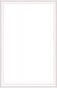
Generally, your comic dimensions are going to be 6.875 x 10.5. This is going to be the Bleed part of the canvas when the page is set up in Photoshop. The trim edge, a lot of times, is going to be around 6.625 x 10.25. The Live Area is going to be a nice, safe 6 x 9.
Here’s a template that can be used:
Going from the inside out, the dashed line is the Live Area, the next one out is the Trim Line, and the last area is the Bleed. Simple.
Next, we’re going to talk about dpi, dots per inch. The more dots per inch, the better the resolution of the art. There are pros an cons to a high dpi.
Most of the time, you’re going to hear that art should be scanned at 300dpi. Usually, that’s enough for the work to get done. However, the higher the resolution you scan it at, the better off you’ll be if something goes wrong. If you scan at 400dpi, you should be covered in almost all eventualities. 600dpi will cover you in every eventuality.
Again, there are pros and cons. The pro to 600dpi is that every line will look crisp and clear when blown up or when condensed down. The con is that you’re talking about pretty big file sizes.
Let’s look at it a different way. Let’s look at it from the standpoint of music. MP3 is a standard format, but due to compression, a lot of information is lost. MP3’s are considered lossy. There’s a lossless format that isn’t used much, because the files are so much bigger. The bigger the file, the fewer can be fit on an iPod or iPhone.
300dpi could be considered the MP3. It’s enough for the bulk of users out there. [Apple is going to a newer format that doesn’t lose as much info, so that music will sound richer. There will still be some compression and thus, some loss, but not much.] I want you to use 400dpi, because you’ll be covered almost every time while not having files be huge on you.
The simplest, best way to make sure you’re in compliance on your project, though, is to ask: ask the editor if you’re going through a publisher, or ask the printer if you’re self-publishing. It never hurts to ask, and it’s better to ask than to have incorrectly sized pages.
(Can those be fixed?) Sure can. If penciler messes up, the inker should be able to fix it. If the inker doesn’t fix it, then the colorist should fix it. If the colorist doesn’t fix it, you’d better hope you have a good, capable letterer on the team, because that’s the last place it can be fixed. [The letterer should also be doing other pre-press aspects, and while fixing page sizes can be a pain in the butt for them, it kinda falls in line with what they have to do, anyway. Keep in mind, though, that some letterers charge extra for fixing incorrectly sized pages. If you’re hosting this shindig yourself, you could inherit an extra charge you didn’t see coming.]
No homework this week. Enjoy the time off. See you in seven.
Related Posts:
Category: Bolts & Nuts









I am a tremendous formatting Nazi when it comes to this because I got burned pretty hard converting my first webcomic to print. I had no idea how any of this worked so I had to do A LOT of edits when it came time to print. Same went for my eventual GN print. Holy mother of monkeys, that was a mess. Lots and lots of edits.
Lesson learned: figure out your format from day one. I like to do full bleed art in my books so on my pencil boards I draw all the way to the bleed. I will say this again for emphasis: if you want art to bleed to the edge of the page YOU DRAW ALL THE WAY TO THE BLEED. In my first project I only drew to the trim line. That resulted in much sadness and heartache doing edits. The only two lines any artist has any business drawing to are the live line and the bleed line. The trim line is just there to inform you where stuff gets cut off. THAT’S IT.
Pro Tips:
1. When pencilling, every board you work on should have these lines on it. If you’re not using preprinted boards, that’s okay. (Those get expensive.) You can just keep a template board around and trace it whenever youre ready to start a new board (invest in a lightbox for this method). If you pencil digitally (I do) use a digital template file for your board much like Steven shows you up there. Either way you go, you’ll always be working to those guidelines which will save you time editing.
2. When lettering, use the same digital template as your penciller uses. If your penciller is just using pre-printed comic boards, ask him which size he’s using. Is it manga size? Is it American standard? Is it American pro? There is a difference. The “Standard size” boards are printed to 10″x15″ where as the “pro” size is 10 3/8″ x 15 3/4″. The ratio is slightly off. VERIFY. In case you’re wondering, I use pro size templates in my digital files.
3. If you’re doing a book that will eventually be printed as a graphic novel, that’s an additional consideration. I always leave extra padding on the side of the page (right side for even, left side for odd). This is because in perfect bound books, text that falls too close to the spine can get eaten up. You don’t want that. How much padding you put here depends on your final print size. For the American Marvel/DC standard print size up there, I’d say this needs to e an extra 3/4″ from the trim line.
4. If you’re doing a webcomic, this still applies to you. There are a lot of webcomics that get collected in print. When drawing/lettering a webcomic, it’s a good idea to take all these factors into consideration. It can make conversion to print a whole lot easier. TRUST ME ON THIS.
Everybody needs to be sync. The more communication happens on this subject, the less likely there will be huge editing headaches later.
Jules,
It’s rough learning the hard way. Isn’t it?
Everybody,
Listen to that advice. It’s critical to format first. You need to know what will fit your needs before you start working. If you have similar templates from the pencil stage, it helps everything, BUT it is imperative your line art is cleaned up to fit the DIGITAL FORMAT you’ve set up in your layout software (i.e. InDesign).
A lot of times a new publisher won’t know what they eventually want to accomplish with their book. The good news about working in digital is that YOU CAN EDIT to fit any SIZE. And produce the same content in different formats. (But, yes, it can be very time consuming. So make sure the format switch will be worth it. (Say converting an existing book to be more readable on iphone or ipad or Kindle Fire) May be worth it if you can regenerate the same content to a different audience.