Draw Over! #2 – Sequentials by Igor Glushkin
Welcome back to another round of Draw Over!, ComixTribe‘s sequential art critique column.
This Week’s Artist…
This week, we have four pages of sequentials by artist Igor Glushkin. Igor is a graphic designer and illustrator looking to improve his sequential storytelling. Let’s get right to it! (Click on the images to see in full size.)
Page 1
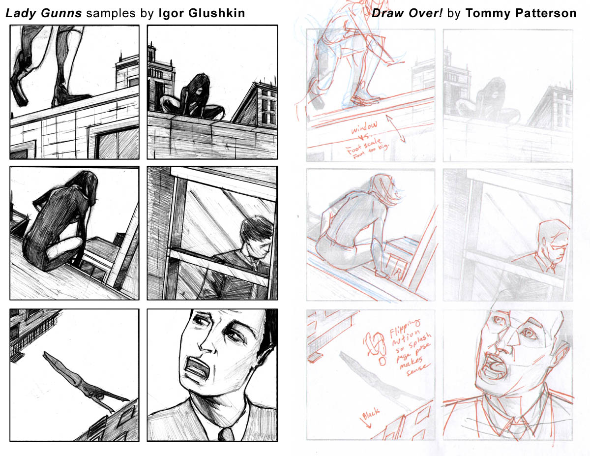
Panel 1 – Draw through. Go outside the panel to make sure your body parts are connected. Here the knee is right above the ankle. If that is the case then we would see her rump come into view because she would be crouch walking.
Panel 2 – Nice panel.
Panel 3 – I’m fine with the composition. Maybe add a hint of the figure in the distant window. Again DRAW THROUGH. It will help you see the figure. Construct simple parts first. Use reference even if you are stylized.
Panel 4 – Tighten up the pencils a bit (more on this at the end.)
Panel 5 – Love this panel for some reason. I would have the bottom right building all black with lit windows and the upper left building have SOME surface visible. Just so the figure doesn’t look like she is super long.
Panel 6 – Take the time to study how the mouth wraps around the face. The teeth should be set back into the head. Thick layer of skin covers the teeth.
Page 2
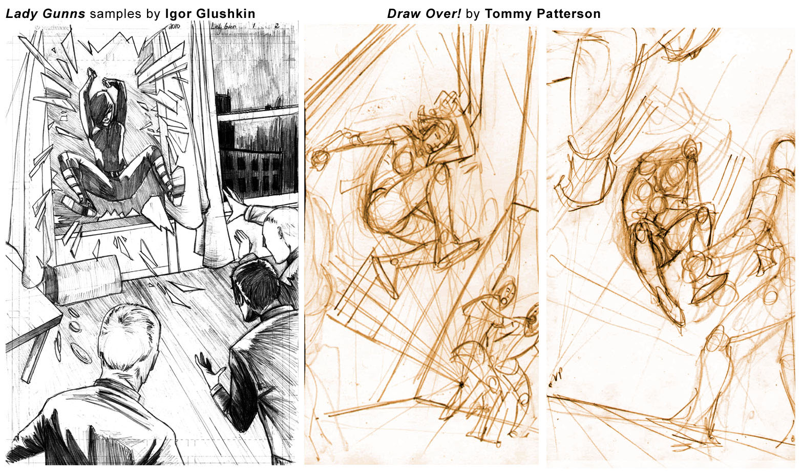
Splash – You need to learn how to defeat perspective. You’ve gotta study up on this. Check out the Gnomon Workshop. Scott Robertson has a great into to perspective video and Feng Zhu has a video on setting up interesting shots. Print some photos and find the vanishing points so you can translate real life into a formula.
The idea is fine. Just need to work on the execution. Study my thumbnails. See how I have perspective even at this size. It’s easier to handle. Now you need to figure out your method of transferring it to full size. Projector, copy machine, over sized inkjet and print out a grid created in photoshop from your thumbnail, these are all options.
Page 3
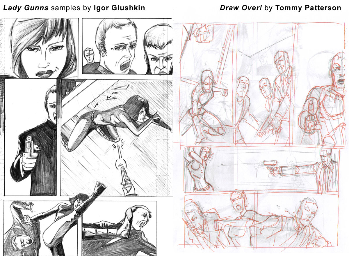
This page feels a bit less thought out. Maybe you didn’t take the time to really solve all the design aspects you attempted. I want to stress to those reading that it takes MASSIVE amounts of time to draw a page. Sometimes you get yourself into trouble trying to make a page cool. I love the desire to take a page further. Editors harp on it but I love a well designed page that you can still read. You will learn a lot IF you take the time to make it work. Just know that sometimes pages take double what they should. It happens.
Thumbnail, analyze, correct, transfer to the page, UNDERDRAWING (I use blue. When I finish with graphite, it’s like doing one of these draw overs. The different color is like looking at someone else’s drawing.), analyze again, finish.
Panel 1 – I would have shown her landing and the expression. Just so you don’t have so many talking heads back to back.
Panel 2 – Work on those mouths. Leave room for balloons!
Panel 3 – Fits nicely with the redrawn panels. We have a boom, boom, boom and…..
Panel 4 – BOOM! rhythm established. Panel 4 layout is not very well done. With the new layout I think a side angle with speed lines would be dramatic enough. Too over the top kills the coolness of panels 5 and 6.
Panels 5 and 6 – So much action not much room. The splash crowded this page so I think a single panel divided and time lapse kinda thing would get the point across, especially since she is out numbered. Gotta take ’em out quick!
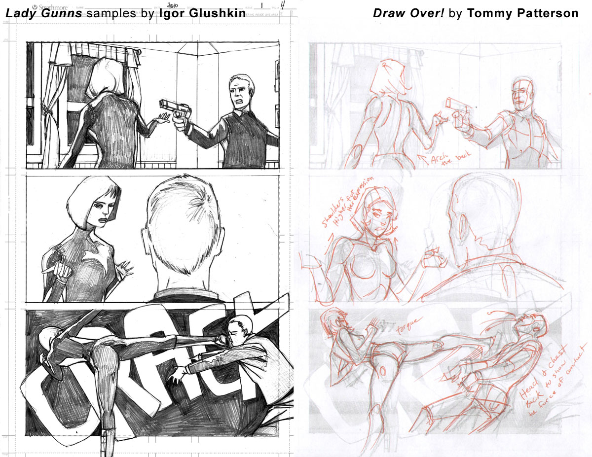
Page 4
Layout is fine on all the panels so I’m going to fix the anatomy with notes.
Panel 1 – Arch the back. Sex appeal, yo!
Panel 2 – Don’t phone in the hands! After the face the hands are second most important part in acting. Her head is set too far back on the shoulders. It comes out at the top of the chest. Draw a circle where the neck starts and that will help place it.
Panel 3 – Kicked in the face not the stomach! Huzzah!
The style used would benefit from being inked by the artist. He leans toward an almost 2d graphic kind of style. It’s cool, but to pull it off he needs to ink it. (Just my opinion.)
That’s all for this week! Thanks again to Igor for submitting these samples. To view more of Igor’s work, visit his website. And be sure to follow him on twitter @igordesign23 and watch him develop as a comic artist. (Writers, I hear he’s looking to collaborate!)
If you’re an artist interested in submitting your sequentials for a future Draw Over! column, send an email to DrawOver@comixtribe.com.
Related Posts:
Category: Draw Over!









Glad to see this feature back!
It’s amazing how little changes – a slight shift in an angle here, a more nuanced facial expression there – can transform a page. This will be a great resource for artists, and I hope many take this opportunity for quality critique.
I agree 100%. I might try and work up the courage to submit some work soon, but it might take a while for me to recover from TPG 😉