No Go on the Logo
Logos are important.
That should go without saying. However, I see way too many independent comic books (and a few from the major publishers) with poorly conceived logo designs. What makes a logo design bad? You want a laundry list? Here goes:
- Poor choice of font.
- Use of too many competing fonts.
- Illegibility.
- Clashing color combinations.
- Too many colors.
- Poor use of Photoshop font effects.
- Ill-conceived negative space.
- Overly complex.
- Too similar to an existing comic logo.
- [What else guys? Help me add to the list in the comments section below]
Why does this happen? Plenty of reasons. In a lot of cases, the logo is an afterthought, and not nearly as sexy a task as drawing an action scene, crafting witty dialog, or plotting your magnum opus. So, the creator(s) wait until the last minute to finalize that logo, and find themselves just slapping the first design they don’t hate on their books and calling it done. Another reason may be that the creative team doesn’t see the value in investing in a proper logo design, and decided to D-I-Y it instead of turning to someone with graphic design talent.
To give your books an honest shot in the market, however, we all need to do better than that. Afterall, the logo will probably be the most re-used piece of artwork (and yes, logo design IS art) you’ll use for a given series. While I can’t say with any certainty that people will buy more of your books with a great logo, I can say they will buy less of them with a poor one. So how about we work at making better logos?
What makes a good logo? In truth, I’m not a branding expert, so I don’t profess to be an authority on the subject. So, let’s instead go an expert, Eric Stephenson, publisher of Image Comics, who has this to say about what he’s looking for in a logo, ripped directly from the Image Comics submissions page:
A good logo can be EASILY read from across the room. We DO make people change their logos OFTEN. Don’t be fancy or artistic — be CLEAR.
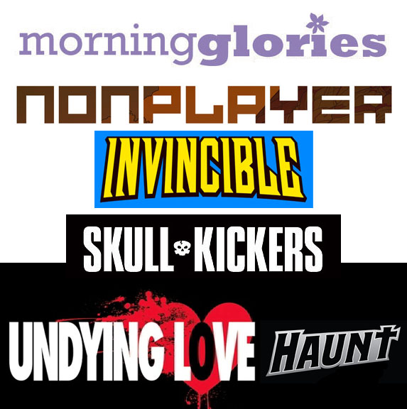
Does Image practice what they preach? You bet they do. I pulled together a sampling of Image’s popular recent creator-owned titles. Check out these:
These are all solid logos. They’re clear. They’re legible. They get the job done. Now take a look at your logos? Can you say the same thing?
Here’s a test: Shrink your logo down to 100 pixels wide. Is it still legible? Really?
Notice these Image logos still are.
But comic book logos will never have to print that small, you might argue. And you’d be right. However, when people are 50 yards away at a convention, or on the other side of the comic shop looking at the racks, they’ll appear to be that small. If you want a shot at attracting their attention, your logo better be able to be read at even a small size.
 If you’re browsing for books on the Graphic.ly desktop app, this is the actual size of how they might appear. (Even smaller on phone/iPad.) You’re going to want a logo that is legible even at this size. (It’s worth noting that this is one reason you should favor shorter titles over longer, clever ones. Long clever titles can work well for books, but are rarely ideal choices for serialized fiction like comics.)
Remember, a great logo will turn a pin-up into a killer cover. A bad logo, on the other hand, can spoil even a great piece of comic art. In next week’s column, I’m going to show the many iterations I went through to get to a finalized logo for The Red Ten.
***
![]() Tyler James is a comics creator, game designer, and educator residing in Newburyport, MA. He is the writer and co-creator of EPIC, a superteen action comedy, and Tears of the Dragon, a swords and sorcery fantasy. His past work includes OVER, a romantic comedy graphic novel, and Super Seed, the story of the world’s first super powered fertility clinic. His work has been published by DC and Arcana comics.
Tyler James is a comics creator, game designer, and educator residing in Newburyport, MA. He is the writer and co-creator of EPIC, a superteen action comedy, and Tears of the Dragon, a swords and sorcery fantasy. His past work includes OVER, a romantic comedy graphic novel, and Super Seed, the story of the world’s first super powered fertility clinic. His work has been published by DC and Arcana comics.
Tyler is the publisher and co-creator of ComixTribe, a new website empowering creators to help each other make better comics.
Contact Tyler via email (tylerjamescomics@gmail.com), visit his website TylerJamesComics.com, follow him on Twitter, or check him out on Facebook
Related Posts:
Category: Comix Counsel










As an aside, I just want to commend the great logo Kel Nuttall did for Steven Forbes on “Runners”. Simple, clear, but effectively conveys the content of the story and is artistic in its own right.
Yeah, John, I absolutely friggin LOVE that logo!
Kel is also the letterer for the series, and of course, he had access to all the art and the script. I also gave him some notes as to what I’d like to see in the logo.
He didn’t ignore the notes, but he felt that he couldn’t get what I was going for without it being too cheesy. Then he came up with his logo idea, which is clear, has great use of negative space, and can fit anywhere.
Did I mention that I LOVE that logo?
Yeah, I’m a fan of the Runners logo. And John, I think you guys did a solid job with The Standard as well.
The Standard logo was another Kel Nuttall creation. That guy is great.
Tyler, I could not agree MORE with you one this one. I will either read or not read a comic just because of the logo. It would do many artists good to take a graphic design class or something and learn about fonts and such.
When I’m creating a property, before I even write the story, I try and get the character design down, and THEN the logo. I feel that for me it helps shape the story.
http://harmonillustration.blogspot.com/2011/04/properties.html
Here’s some personal properties and their logos if it tickles your fancy to take a look. Now, I will admit that some of them break your rules up there, like, being too complex or not legible at 100 pixels wide, but I do feel like the logo shows you what kind of story it is before you read it.
Anyways, good post. I whole-heartedly agree. The logo can make or break your comic or story.
That’s a solid approach, Mark. And you make a good point about artists (or comic creators in general)looking into graphic design classes. The fact is, many of those skills are transferable, and would come in handy especially with comic book creating.
“[What else guys? Help me add to the list in the comments section below]”
Style of logo inconsistent with genre of comic
Come to think of it, what do you think of all those comics that seem to have *no* logo? Comics like:
– All comics from Marvel’s Ultimate line
– All comics from Marvel’s Crossgen imprint
– All comics from Marvel’s Fear Itself event
– All comics from Boom! Studios’ Stan lee line
It seems that in these cases the cover design is geared towards the recognition of the line/imprint/event rather that of the hero whose adventures are told under that cover.