Points of Impact – Week 11: Just Shut Up and Say It
May 2012 – Week 5
I’m back! Welcome to yet another Points of Impact! Have you been reading your comics? Of course you have!
As always:
- The BULLSEYE! section presents something that really wowed me. That’s usually when a writer does something unique among his peers.
- The HIT! section picks up on a cool trick that gets used pretty often – mostly because it works – but of which I’ve found a prime example.
- The MISS section however isn’t about praising a good shot but – as you guessed it – pointing out where a writer stumbled so you don’t put your feet in the same hole.
And of course: read your comics before reading Points of Impact! Don’t blame me if you get spoilerized!
BULLSEYE!
The eloquent silent scene in Terry Moore’s RACHEL RISING #8
Once again: what’s the purpose of dialog in comics? Everybody now: to reveal character and to advance plot. That’s a mantra that has been drilled into us by countless legions of books, authors, editors and other comic-crafting gurus. In a medium where every bit of panel space is a precious commodity, it’s a principle that is seldom neglected as any line of dialog will be scrutinized in order to examine if it fulfills these stringent criteria. Any line deemed inefficient should be expunged for the crime of being “fluff”.
But of course character and plot are not dependent on dialog. Even if the characters keep silent for a few panels, we can still discern their personality through their actions and expressions. We can still understand the plot through the events being depicted. Surely a comic can survive a few scant panels of silence? And what if I told you that in skilled hands, a comic could go for four pages and still present an impressively rich narrative?
Terry Moore undertakes that challenge in RACHEL RISING #8 and shows that not only can it be done, it also can be done in a way that makes you forget why you ever needed dialog in the first place.
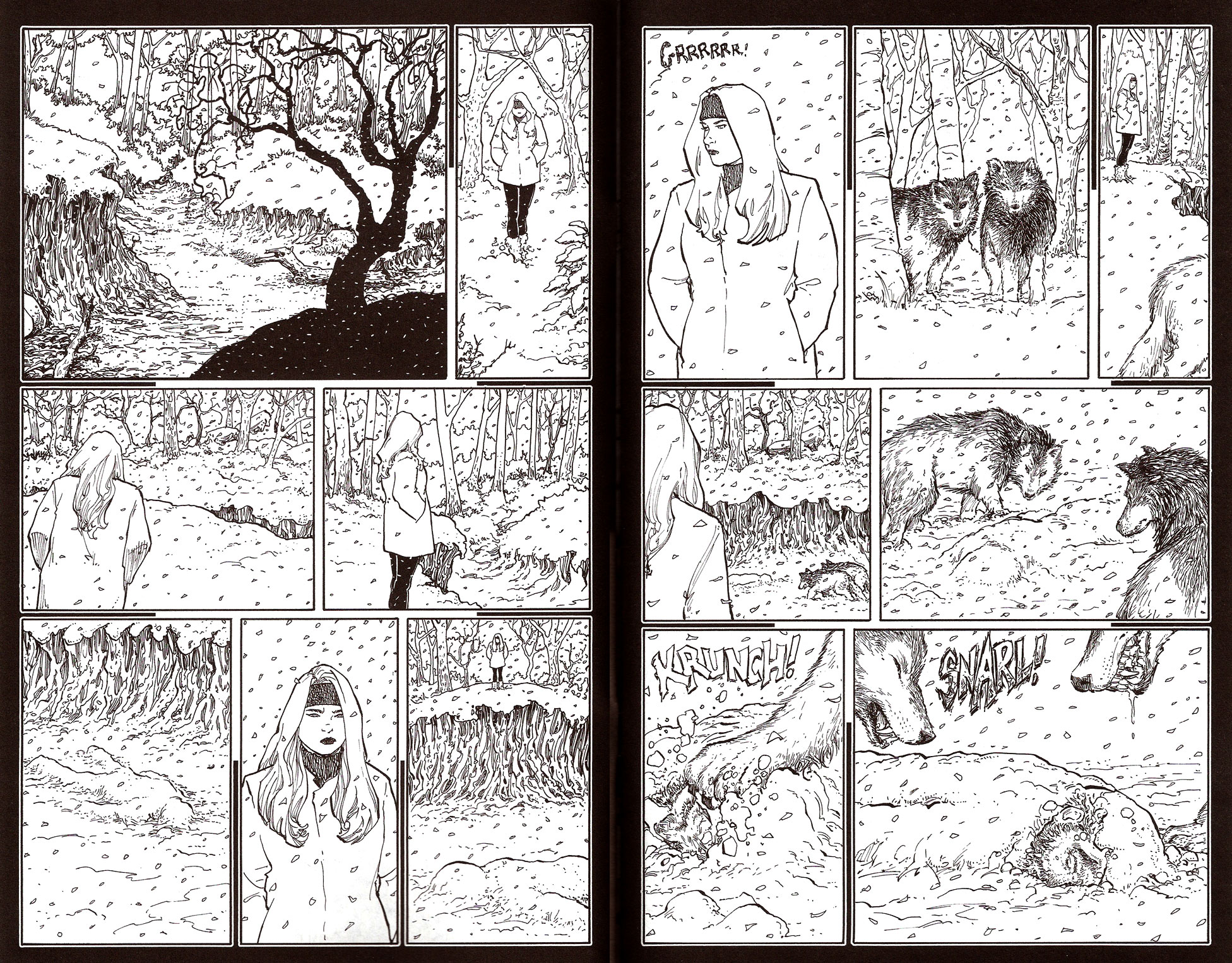
First, let’s have a look at those pages. The scene shows a mysterious recurring character watching over a dry riverbed where the body of a man lies. Usually, the bodies she leaves there come back to a life-like state (hence the titular “Rachel Rising”). This time however, the magic didn’t operate and the wolves get to chow down on the results of the failed experiment.
Now, mechanically-speaking, what goes on in these panels?
Page 3
Panel 1 – Establishing shot of the scene with a very faint view of the body
Panel 2 – The woman walks in – establishing her presence
Panel 3 – The woman walks toward the edge of the riverbed – establishing her direction of travel
Panel 4 – The woman at the edge of the riverbed – establishing her position
Panel 5 – The body in the riverbed – this is what the woman is looking at
Panel 6 – The woman scowling – the character is displeased with the outcome of the events
Panel 7 -The woman at the edge of the riverbed with the body in foreground – establishing their relative positions
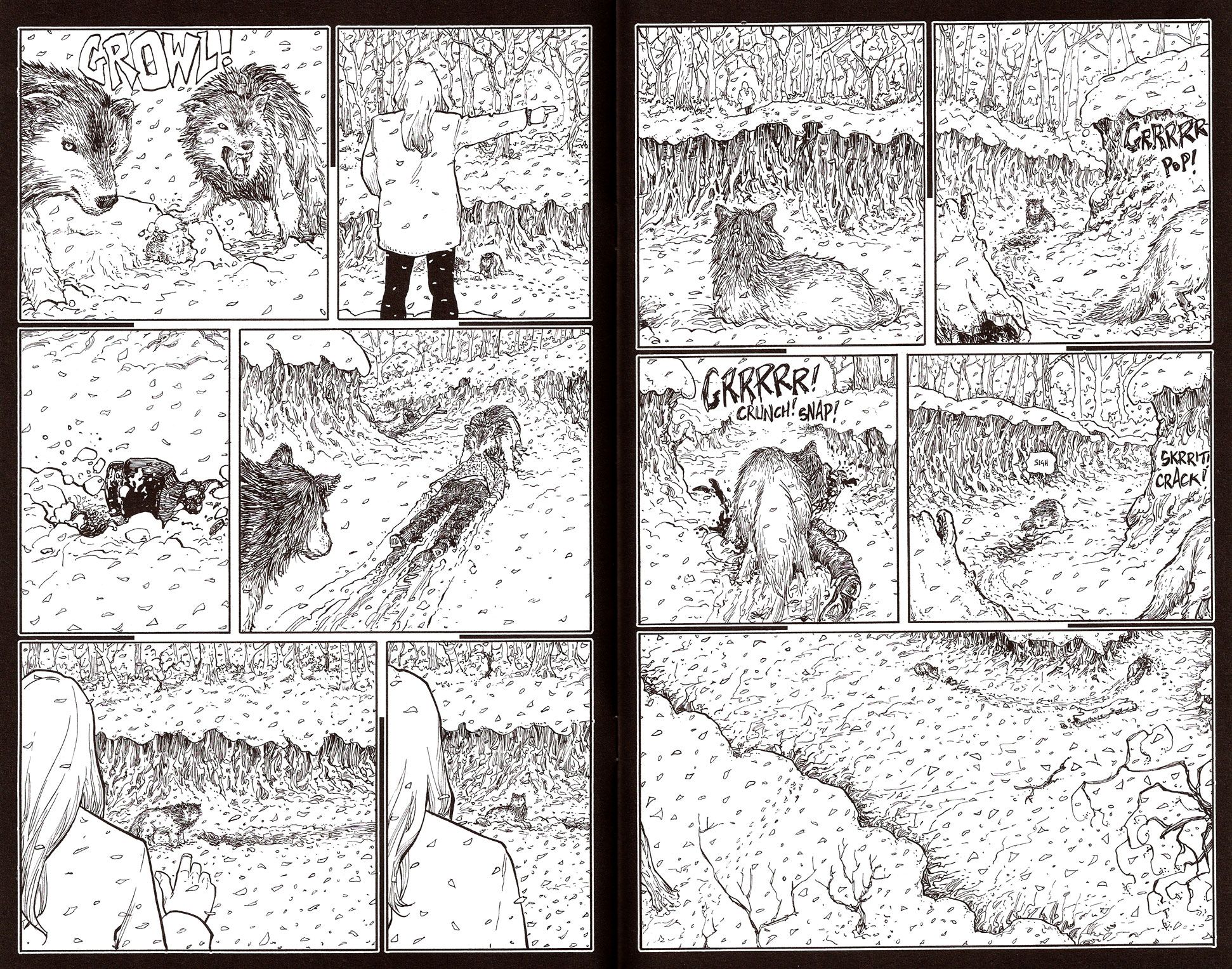
Page 4
Panel 1 – Growling sound effect with the woman turning her head in the direction of the sound – introducing the wolves
Panel 2 – The wolves in the forest – establishing their presence
Panel 3 – The wolves walking off panel with the women in background – establishing their relative positions
Panel 4 – The wolves approaching the body with the woman in the foreground – establishing their direction of travel
Panel 5 – The wolves near the body – establishing their relative positions
Panel 6 – The wolves pawing at the body with a crunching sound effect – establishing the frozen state of the body
Panel 7 -The wolves snarling – they are hungry
Page 5
Panel 1 – One of the wolves growling – it’s aggressive
Panel 2 – The woman pointing away with the wolves and the body in the background – she’s giving it an order
Panel 3 – Close-up of the body’s feet as it’s dragged away – the aggressive wolf is obeying the woman
Panel 4 – The aggressive wolf dragging the body away – establishing its direction of travel
Panel 5 – The woman gesturing to the other wolf – she’s giving this one an order as well
Panel 6 -Same shot but with the wolf now lying down in the riverbed – the other wolf is obeying the woman
Page 7
Panel 1 – The other wolf lying in the snow with the woman departing in the background – establishing her leaving the scene
Panel 2 – The other wolf lying in the snow with the aggressive wolf eating the body in the foreground – it’s tempted to disobey the woman
Panel 3 – The aggressive wolf eating the body – establishing the ongoing action
Panel 4 – The other wolf laying its head on its front paws, sighing while the aggressive wolf keeps on feeding – it keeps on obeying despite the woman’s absence
Panel 5 -Establishing result shot
A lot of these panels have no other purpose than to show entries, departures and movements. But there are also a lot of them that serve the purpose of establishing rapports between the characters – the woman and the two wolves. For instance, the way the wolves move past her and into the riverbed is as sure a mark of rapport as if there was an exchange of speech balloons. The same way, the silent orders given by the woman – orders that still maintain their full force even after her exit – speak a great volume about the relationship between the beasts and her. Once more, this is all left unsaid; Moore instead uses the power of the image to let us draw those conclusions ourselves.
But it goes farther than that: even before the wolves enter the scene, we can see very clearly what the woman’s preoccupations and mood are, without her uttering a single line of dialog. There’s a nice sequence at the end of page 3 where you can actually follow her eyes and see what she’s thinking, even though there’s not a single caption box to clutter up the beautiful art. It’s all done in the transitions, the camera angles and the facial expressions.
The point is that there’s an underlying visual grammar at work in panel art, one that can easily replace a lot of dialog – if only you give it a chance. As writers, we all want our opportunity to shine and if there’s one way we like to do it, it’s by showing off our dialog bling. We sometimes don’t realize that we’re working with another creator – the artist – who can be as eloquent with lines and shadows as we can be with words. All he needs is a script that takes into account what he can bring to the table.
Next time you write a comic, be on the lookout for those scenes where you can let the art speak for itself. That doesn’t mean splattering it with NO COPY mentions! Instead, craft your panel descriptions in a way that calls for the artist to do the heavy lifting when it comes to plot and character. Hence instead of:
Panel 4
Wide shot of the WOMAN standing at the edge of the riverbed, looking at the inert body down blow, covered in snow.
Caption (WOMAN): The body is where I left it, as dead as ever. It seems it didn’t work this time around.
Caption (WOMAN): This won’t do at all, damn it!
Try instead:
Panel 4
Wide shot of the WOMAN standing at the edge of the riverbed with her back to us, looking down below where the body is.
NO COPY
Panel 5
WOMAN POV shot of the body, covered in snow, immobile.
NO COPY
Panel 6
Medium shot of the WOMAN facing us. She’s clearly not happy to see the body still there; she’s frowning and twisting her lips into a scowl.
NO COPY
Of course, Moore has it easy because he’s both the writer and the artist. But that doesn’t make it less an interesting proposition to let the art speak from time to time. Just make sure your panel descriptions are clear and complete enough for your artist to understand what you’re trying to make the characters say without spoken lines. Ironically, you may find it actually requires lengthier descriptions to say things without words, but the extra work is worth it for working more closely with your artist in creating an engaging narrative. Let him do the talking for once.
After all, sometimes the best way to tell a story is to just shut up.
Lesson Learned
The absence of dialog doesn’t mean you’re limited to only setting up an atmosphere and moving people around. You can still advance your story and show the personality of your characters. The trick is to eliminate some of your dialog and to rely on the art instead to convey the elements you want to put forth, be it plot points or the change in rapport between characters. Of course, you’ll need to step up your writing game in order to accommodate this way of presenting the story. Thoroughness and imagination will be the key to writing panel descriptions that will result in panels as loquacious as if you had filled them with speech balloons.
HIT!
The integration of the flashback in Scott Snyder’s AMERICAN VAMPIRE #27
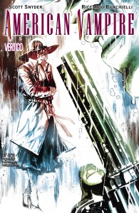 Writer: Scott Snyder
Art: Riccardo Burchielli
Colors: Dave McCaig
Letters: Jared K. Fletcher
Assistant editor: Gregory Lockard
Editor: Mark Doyle
Flashbacks. They take you back, don’t they? (I made a funny!)
Anyway, flashbacks are a wonderfully useful device for introducing a tightly-packed lump of exposition in a story without having your characters stand there, vomiting out an unending flow of unwieldy information. It also lets you sidestep the pitfall of butler-maiding, when you have two characters rehashing events they already know only for the benefit of the reader.
However, flashbacks present one challenge, and that is to find an unobtrusive way to plug them in. Of course, you could always slip them between two other scenes, start it up with a simple “long time ago” caption and you’re all set. Most readers won’t bat an eye when faced with this convention. Does that mean you couldn’t find a more elegant way to introduce your flashback, one that actually blends into the story being told instead of only fitting in between two other moving parts of the technical structure?
Scott Snyder is nothing is not an excellent story mechanic and he proves it once more in AMERICAN VAMPIRE #27. In this second part of the two-parter The Nocturnes, he inserts a short flashback providing us with some background information on Calvin Poole, our current protagonist, a short glimpse into his past shedding some light on his motivations for joining the ranks of the Vassals of the Morning Sun.
It’s a tragically beautiful interlude in this action-packed issue, which underlines even more the question: how do you cut into a high-paced narrative to deposit this somewhat smoother patch of story? Let’s have a look at Snyder’s solution before delving into the details. First let’s have a look at the panels just before the flashback pages:
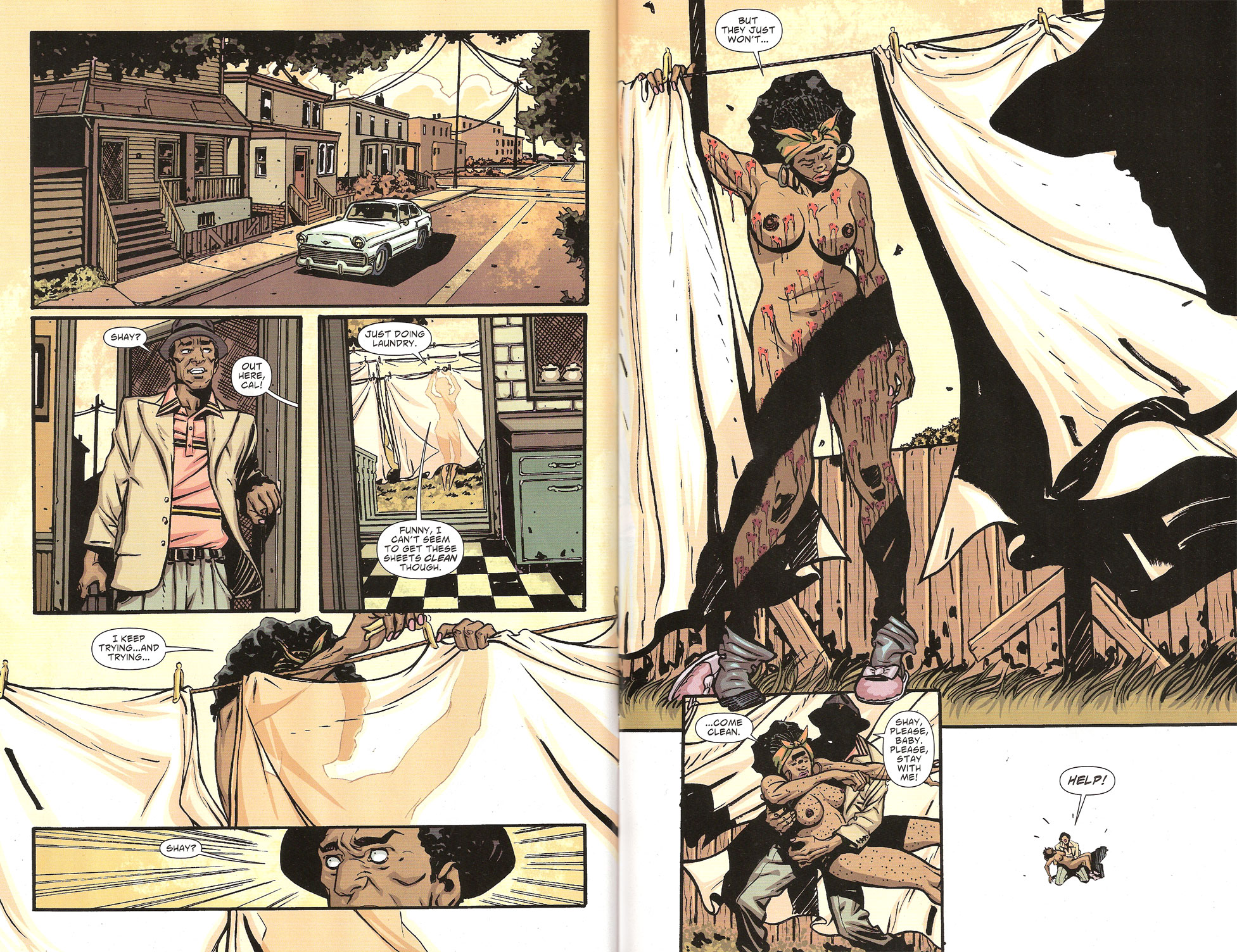
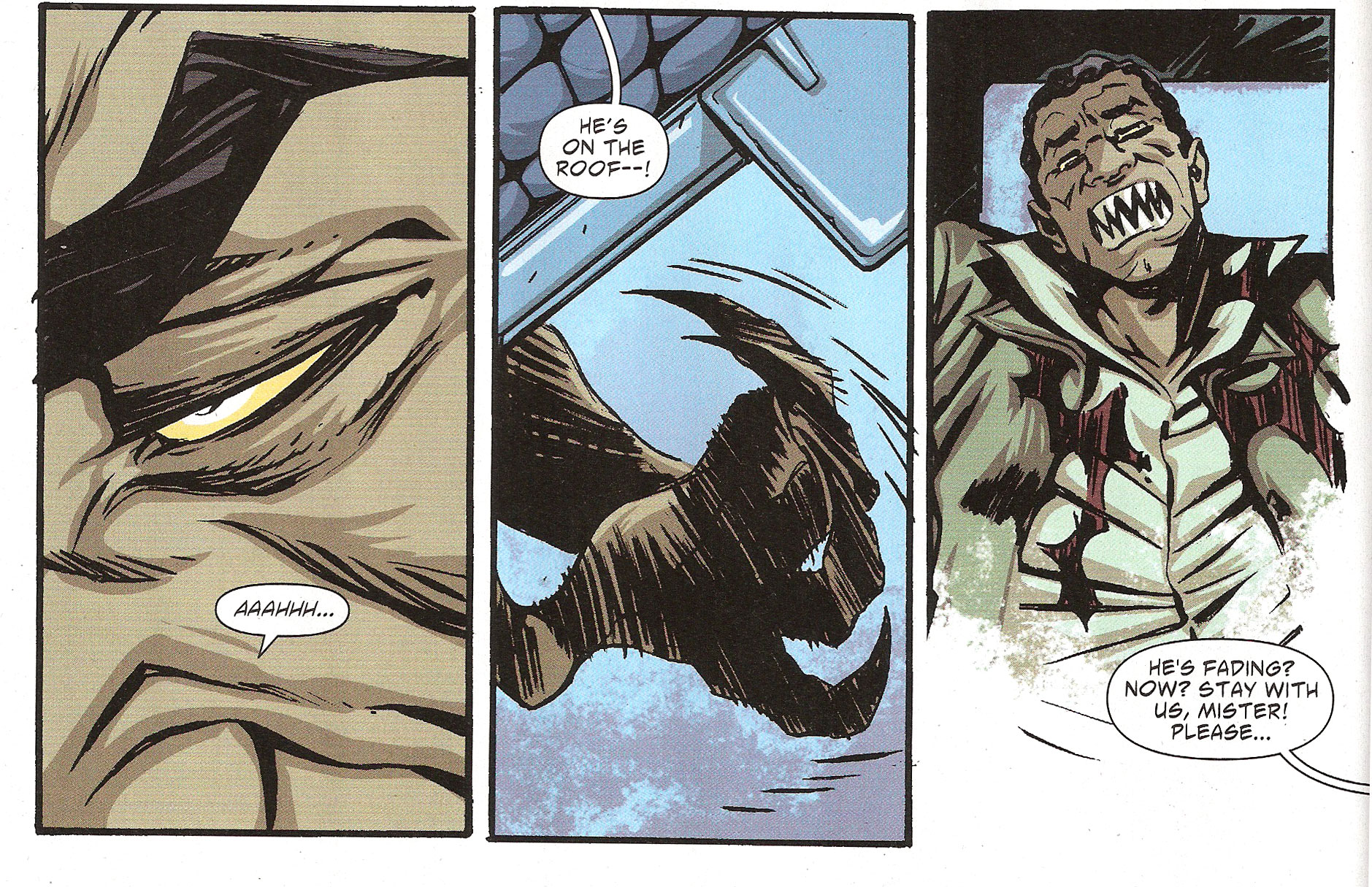
As we can see, before sliding into flashback mode, Calvin, our protagonist and POV character, slips into unconsciousness. Since he’s the POV character, Snyder allows us to continue following him into the haunting visions of his past. For that character, the scene effectively ends and a new one begins.
When it comes time to emerge from the flashback, Snyder borrows from a common experience: it’s the good old suddenly-wake-up-from-a-nightmare routine:
What’s interesting here is that in both cases – entry and exit – Snyder employs the same device: he makes his character slip in and out of the main narrative by way of an event that is part of the story.
In the first case, Poole has lost a lot of blood following the attack by the canine vampires. As his human allies drive off, our American Vampire falls into a torpor, providing a plausible way to switch the scene to the dreamscape of the flashback. The flashback isn’t introduced by some contrived manner, the most classic being: “Lemme tell you a story…” No, it’s introduced by an event that actually happens, not in the context of a conversation. That makes the flashback less exposition and more an actual part of the narrative.
There’s a great difference between getting told something and seeing it firsthand. Witnessing a live event engages the reader a lot more while listening to a story makes the reader sit back passively. Even in the case of these flashbacks that branch out from a conversation yet show you the action, there’s still this barrier standing between the reader and the narrative. You’re still reading a story about a guy telling a story.
Compare this with our AMERICAN VAMPIRE example: this is not a story being told, it’s something that’s being lived by a character. The way Snyder starts the scene and the way he ends it makes it clear that this is no second-hand account. Even though we’re witnessing events that have already transpired, for the character participating in the scene it’s as real as the rest of the comic.
And that makes it real for us too.
Hence, we can say that Scott Snyder succeeded in this way in elevating the flashback from an exposition device to an integral part of the action.
Lesson Learned
Flashbacks don’t have to be passive affairs where the reader sits back and is told a story. They can feel as much alive and part of the action as the rest of the “live” narrative. A good way to ensure that effect is to introduce the flashback by using devices that are part of that narrative and that follow the main protagonist’s point of view – for example: a dream, an hallucination, a virtual reality session – anything that doesn’t involve stopping the action for a second-hand account. Don’t forget to use a similar device to come back out of your flashback!
MISS…
The mangling of a foreign language in Kurtis Wiebe’s PETER PANZERFAUST #4
 Words: Kurtis Wiebe
Picture: Tyler Jenkins
Colors: Alex Solazzo
Letters: Ed Brisson
Edits: Laura Tavishati
I hesitated before nominating Wiebe’s PETER PANZERFAUST as a MISS. After all, here’s a book that delivers constant quality: month after month of its short run has brought clever storylines, engaging characters and a wonderfully imaginative world, blending perfectly together the delightfully magical and the horrifyingly real. Heck, we could say that of any of Wiebe’s books up to now: GREEN WAKE, GRIM LEAPER and the upcoming DEBRIS seems to be inheriting the same charming traits from its writing daddy.
If anything however, this entry will serve as a reminder that even though a comic might be immensely enjoyable and otherwise well-crafted, it takes only one mis-step to get a MISS. As I’ve often said in the beginning, a MISS doesn’t mean the comic is bad, it only means it provides a usable example of a mistake that we can sublimate into a lesson. The same way, we could say that a BULLSEYE doesn’t mean the comic was perfect; only that it showcased one near-perfect element that I judged worthy of study here.
So where did Kurtis Wiebe stumble this time? To be honest, it wasn’t his first stumble but I had let things slide in the past. PETER PANZERFAUST #4 however was particularly rife with the same mistake so I thought that it would be a great opportunity to discuss the issue.
In short: he killed the French language.
He left three pieces of the body lying around the comic, the grisly remains serving as a grim reminder of the danger of not doing proper research:
What was written: “Faire taire!”
What it was supposed to mean: “Shut up!”
What it meant instead: “To make someone shut up!”
What should have been written: “Tais-toi!”
What was written: “folle dans la tête”
What it was supposed to mean: “crazy in the head”
What it meant instead: The same thing but with the subject being a woman
What should have been written: “”fou dans la tête” (or just “fou” really – no one speaks in so contrived a way in real French)
And the worst offense…
What was written: “Incendier!”
What it was supposed to mean: “Fire!” (as in an order to shoot)
What it meant instead: “To set fire to something!”
What should have been written: “Feu!”
What seems inexplicable to me is that just after uttering that last insult to Molière’s tongue, the same French soldier has his line translated to English between brackets. I don’t get it. Why not use the same convention throughout all of the comic? And indeed it raises the question: what language do the Lost Boys really speak?
Let’s assume that they speak English when Peter is part of the conversation. That would explain their lines in which French breaks out from time to time. It doesn’t however explain why they keep doing it when they’re talking among themselves. And if they’re speaking French at that moment, why not put all of the text in English and let the reader assume that they’re actually speaking French, the same way any American cinematic adaptation of the classic novel has the Musketeers’ actors speaking English?
And what about the German? When the Nazi officer goes: “Beschuss!”, is he really giving an order to attack or is he asking for his pants back from the drycleaner?
But really now, how hard would it have been to track down a native French speaker – one who is also fluent in English – and ask for proper translations? That would have prevented the people who actually know that language from wincing every time a character does an Hercule Poirot of himself.
Hell, I’ll even put my money where my mouth is: any comic creator out there who needs help with French dialog, ask me and I’ll translate it for you, free of charge.
And this goes double for you, Kurtis, because I love this series and I want it to look good!
Lesson Learned
When writing a comic that broaches any subject you’re not entirely familiar with, pick up a book, watch a documentary, go to the Internet or just ask someone who knows what he’s talking about. Indeed, now that we’re all connected to each other 24/7 by several web-based social networks, there’s no excuse not to reach out and ask for help when you need it. Twitter is a wonderful tool for this; a single tweet can net you dozens of offers for help – if you just ask for it! Remember: better to look ignorant for an hour on Twitter than to have it collected in a trade paperback forever!
Honorable Mentions
- Jonathan Ross had a nice in-world recap behind the cover of his AMERICA’S GOT POWERS #2 of 6.
- The Best Line of the Week Award goes to Jeff Lemire who managed to plug into ANIMAN MAN ANNUAL #1 the sentence “This damn body has a bladder the size of a thimble.”
- Scott Snyder gets another accolade for having a character plan and act out a genuinely clever scheme to escape Arkham Asylum in BATMAN ANNUAL #1. Always good to see intelligent writers write intelligent characters!
- In GRIM LEAPER #1, Kurtis Wiebe carefully doled out his exposition throughout the whole comic, thus providing an excellent example of how to dodge the dreaded info-dump!
- Kudos to Matt Millar’s SUPERCROOKS #3 of 4 if only for using one sentence in French but at least getting it right.
Dishonorable Mention
- Kinda disappointed with the inconsistent ending of Joey Esposito’s backup in GRIM LEAPER #1. After all that buildup and the tone set by the main story (embodied in the subtitle “A Love Story to Die For”), I was surprised to see the two protagonists survive. I kept staring at the last page, trying to discern their mangled corpses in the wreckage of the cars.
Well that should be enough for this week. One last thing before I let you go: commenting is now done in the forum. Head over there and register if you must. It’s a one-time thing that barely registers as a hassle and it’ll let you shoot the breeze with all the rest of the ComixTribers. See you there!
Related Posts:
Category: Columns, Points Of Impact

