Points of Impact – Week 18: Folding Space
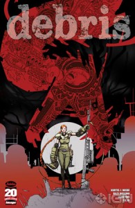
The space-saving voice-overs in Kurtis Wiebe and Riley Rossmo’s DEBRIS #1
 Writer: Kurtis Wiebe
Art: Riley Rossmo
Letters: Ed Brisson
Colors: Owen Gieni
Edits: Laura Tashivati
Comics are, at their base, an inherently physical medium. Indeed, despite the great advances made in digital formatting and distribution – just think about what Mark Waid is doing with Thrillbent – most of us are still stuck with the sheer materiality of comics. We have to contend with the rules and limitations that come with a physical book: number of pages, size of pages, number of panels per page, page-turns, format and even ad placement!
Of these, nothing further drives home the tyranny of the physicality of comics than the page count: once you’ve reached of end of the paper you were supplied, it’s over. Make do with what space you’ve been allotted by whatever printing arrangement took place or you’ll serve your reader a tale that gets abruptly cut short.
This limitation can often lead to some extreme measures in order to make optimal use of whatever space there is, further leading to some densely packed comics in the best cases, and blatantly skipped beats in the worst. That’s why you’ll often see me praise any creator such as Terry Moore and Nathan Edmondson who not only make the best of their page count but also find ways to insert long sequences of silent panels, a seemingly reckless waste that somehow actually improves the narrative when they do it.
This week, I’m adding new names to that list as Kurtis Wiebe and Riley Rossmo give us some patent examples in DEBRIS #1. Faced with the impossibility of adding more pages, they opted to make room from the inside , as we say around these parts. In other words: they’ve found a way to cram more story into fewer pages.
Set in a post-apocalyptic word, DEBRIS tells the story of young acolyte Maya and of her battles against animated heaps of scrap metal possessed by ancient mythological spirits. (That sentence started cliché but ended in a firework display of kick-ass, right?) I think I even once heard Wiebe describe it as Red Sonja meets Transformers. Anyway
Our first example of a scene that’s bigger on the inside – I should call this the TARDIS effect – occurs after Maya’s first fight against the mechanical Jormungand, a gigantic dragon-like serpent made of giant big-rig tires, metal plates and mining drills (and I’ve just sold the comic to a lot of readers with this description, I’m sure).
Voice-over captions are used to continue the conversation started in the first panel as the two women are walking away. More specifically, Maya and her mentor Calista are actually leaving the location of the scene, but the camera stays in that same location. Thanks to this lingering camera, we’re able to see the piece of snake-mech burrow into the ground – while still keeping tabs on the conversation!
So we have the audio track from one location and the visual track from another. What decides which scene contributes which track? Reader comprehension: what’s more important from each location: what we can see or what we can hear? The choice depends on what provides the best comprehension of the scene for the reader without having to resort to additional panels. The narrative is thus condensed to its essential components.
Our second example takes place once the two women are back to the village and asking the Council for permission to recruit more villagers for the defense of the settlement.
During the conversation, we’re treated to multiple shots of the villagers working with machines supposedly used to produce food and extract water from the ground. Throughout this exchange, we’re shown just enough of the Council to establish both their location and the characters: a wide shot of the room and a tighter shot of the members. The rest is all snapshots of the village, a classic example of constructing an establishing shot through the use of aspect-to-aspect transitions.
Once more, Wiebe and Rossmo choose to use the most eloquent component from each location: the audio from the meeting and the visual from the village. It makes perfect natural sense when you stop and think about it: the visual from the meeting would show nothing but silent people standing around and the audio from the village would yield a batch of undecipherable sound effects. By making the right choice again, they ensure that the reader gets to grasp everything that’s meaningful from both scenes, conflated into one denser yet terse narrative.
By the way, big kudos to letterer Ed Brisson for having the speech balloons spill over from the meeting panels into the village panels instead of using voice-over captions. It’s a great way to keep the reader engaged by presenting dialogue instead of narration boxes.
Our last example is taken from the end of the book: as we hear Maya speaking with the Council, we can see her lighting Calista’s funeral pyre (yes, she dies; I told you that you should first read your comics before reading Points of Impact) and preparing to set off for her quest for legendary Athabasca, where water can hopefully be found for her village.
The same principle is at work again: we get components from two separate locations merged into a single series of panels: the audio from the meeting with the Council and the visual of Maya’s farewell to her mentor. However, there’s a major difference to the way the sequence has been constructed this time: instead of conflating the action from two locations, Wiebe and Rossmo are conflating two wholly distinct scenes!
In the two previous examples, both tracks – audio and visual – were taken from simultaneous narrative tracks, but here it’s evident that both tracks can’t occur at once: Maya is in both of them! It’s not entirely certain in which order Maya played out each of these scenes, but the principle remains the same: it lets Wiebe and Rossmo condense the narrative. They’re essentially skipping a whole scene by running its audio track over a second one. In a certain way, it also constitues an alternative way of doing a flashback without devoting any panel space to it or even having to insert any expository dialogue.
So, as we could see from these three examples, the trick is to decompose the two scenes you want to show into their audio and visual components. Spoken lines constitute the audio component while the rest is relegated to the visual track (this includes sound effects too since they’re linked to what we can perceive while at the location we can see). You then have to determine what’s the most meaningful component for each scene. As soon as you pick one component for a given scene, it automatically designates the other component for the second scene; you can’t have two audio tracks or two visual tracks.
As simple as this recipe seems, it’s still what allowed Wiebe and Rossmo to essentially make you read two scenes at the same time, thus saving a wealth of panels, thus leaving them with the space they needed to tell a more visually striking epic.
Thus, for their use of narrative-condensing voice-overs, Kurtis Wiebe and Riley Rossmo score a BULLSEYE for DEBRIS #1!
Lesson Learned
It’s very easy to run out of space when writing comics and it’s equally hard to make some new space when you hit the limit. One way to get around this limitation is to condense two scenes – simultaneous or not – into a single sequence of panels with the use of voice-over captions. Simply split each scene into an audio and a visual component, determine which is more meaningful to the reader and then play the audio track of one scene over the visual track of the other.
Honorable Mentions
- Scott Snyder and Rafael Albuqerque are still at it in AMERICAN VAMPIRE #29! Once more, we get some of those sweet Snyder-style voice-overs spilling out from scene to scene. Tried and true method.
- Marl Sable and Paul Azaceta’s GRAVEYARD OF EMPIRES #4 of 4 ends with a bang – well, a KRAKOOM actually – but it begins with the ever-original recap pages that take the form of a military roll-call showing a variety of statuses, the most useful being K.I.A. ( Killed in action ).
- In GRIM LEAPER #3 of 4, Kurtis Wiebe and Aluisio C. Santos treat us to some truly inspired imagery for what is essentially a love scene – involving alligators. As for the backup story Apple of My Eye by Jeremy Holt and Chris Peterson, it came out as a surprisingly well-paced character study – considering the 5-page limit – of a man descending into the bowels of insanity – for love! Both the writing and the art could be equally praised for this. Oh and Jeremy, if we ever meet in person at a con, I’m never touching your iPhone with my bare hands.
- The MANHATTAN PROJECTS #5 by Jonathan Hickman and Nick Pitarra features an interesting combination of foreshadowing and clever plot resolution. ( No. I’m dead. )
- In NATIONAL COMICS: ETERNITY, Jeff Lemire, along with artists Cully Hamner and Derec Donovan, present us with a very well-built murder mystery, albeit one with a definitely supernatural tinge.
- Jay Faerber and Simone Guglielmini’S NEAR DEATH #10 ends in such a classic cliffhanger style that it made me forgive it for skipping a beat by not showing what could have been an interesting character moment: Detective Cahill faced with the task of vouching for our reformed killer protagonist.
- In THE NEW DEADWARDIANS #5 of 8, Dan Abnett and I. N. J. Culbard keep on showing some marvelous world-building chops. Information about the setting is still getting doled out in this fifth issue – more than halfway through the mini – yet it’s still interesting, it’s still essential to the plot, yet it was never lacking before. Truly a remarkable feat of pacing your exposition!
- Peter Hogan and Steve Parkhouse concluded their mini this week with RESIDENT ALIEN #3 of 3. Apart from the always stellar dialogue, I noticed the regular use of mini-cliffhangers on page-turns. This comic is one you’ll want to read if you want to learn how to do the basics right.
- In the category Comics That Kicked My Ass , I present TRANSFORMERS: MORE THAN MEETS THE EYE #7 by James Roberts and Alex Milne. Spinoff title, right? Merchandising bid, no? Shameless IP milking, isn’t it? Wink-wink, nudge-nudge and all that? No. This comic is – for me, at least – a wake-up call about the dangers of resting upon your own expectations. It has extraordinarily inventive use of captions, dialogue worthy of the best war dramas and some genuine wit that never feels forced. More than meets the eye, indeed!
Dishonorable Mentions
- Apart from its opening scene which had some real tension, the rest of Duane Swierczynski and Simon Gane’s GODZILLA #3 was nothing but a series of giant monster fights. Although, come to think of it, why else would you buy a Godzilla comic?
- In NOWHERE MAN #4, Marc Guggenheim and Jeevan J. Kang subject us some heavy, heavy expository dialogue. No need for the protagonist to actually do anything, the supportive cast is there is tell us everything about his emotions and motivations.
- Doug Wagner and Cezar Razek push my pet peeve button in WITCHBLADE/RED SONJA #5. I’m talking about a plot unimaginatively resolved by having the protagonist tap into that notoriously cliché reserve of anger and willpower that no one ever thinks of using when the problems start in the first place.
Well that’s quite enough for this week. Join me next time for more Points of Impact!
Please click here to make comments in the forum!
Related Posts:
Category: Columns, Points Of Impact

