Points of Impact – Week 21: Beyond the Last Page
Summer Vacation 2012 Edition – Part 1 of 2
Another Saturday comes with its weekly load of Points of Impact. This week is different however since what you’re reading was written over a week ago. Yup, I’m probably a few miles away from my keyboard as you’re reading this – on vacation! But since I didn’t want any of you to die from insight deprivation while I was on my annual leave, I prepared this advance. Furthermore, because I couldn’t possibly read so far in advance what was going to come out – advance review copies only go so far on the mystical prophecy scale – I’m reverting to the old formula for the next two weeks and applying it to comics I already had in hand.
And the first of these is
DRONE #1 by Chris Lewis and Bruno Oliveira
 Story: Chris Lewis
Art: Bruno Oliveira
Colors: Cabral
Letters/Design: E.T. Dollman
Edits: Jon Hogan
Chris Lewis approached me about a month ago and he was kind enough to send me – all the way from Germany – a copy of his comic DRONES, expecting nothing more than a few comments in return. Well Chris and his collaborators didn’t see this coming: I’m using their comic to find a BULLSEYE, a HIT and a MISS! Hey, if you’re going to send me a hardcopy from across the ocean, the least I can do is write some proper critique! We’ll see later on if Chris ever regrets the day he stepped into that post office (das Postamt).
Released through their own publishing banner Epigamics, DRONES #1 tells the story of a couple – literally! – of military officers who do their part in the War on Terror by piloting remote-controlled drones and using them to neutralize specific threats as far away as Afghanistan, all from the comfort of their mobile command post in balmy Las Vegas. (Any chance of a crossover with ComixTribe’s SCAM? What say you, Joe Mulvey?) Since it’s only the first issue in a five-part miniseries, what we have here is pretty much setup but Lewis and Oliveira managed to cram an appreciable amount of action in there as well.
BULLSEYE!
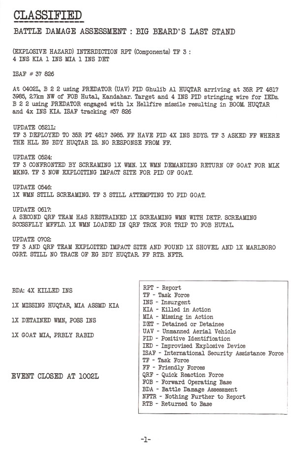
The plot-relevant action report part of the back material
It’s going to seem strange to praise something that’s technically not part of the comic but BULLSEYES are mostly about what those exceptional things some creators do that work remarkably well. Since I don’t see much back material in what’s published these days, it’s refreshing to see some used in a way that actually brings something to the plot. Let me explain
At first glance, this looks like a great replica of a military report, rife with laconic phrasing and rampant abuse of abbreviations.
Speaking of abbreviations, there’s even a glossary in the corner that shows that some genuine research has been done. This wasn’t half-assed!
The report starts off pretty standard, except maybe for that resulting in BOOM bit which we can ascribe to protagonist Captain Stinger’s less-than-serious attitude that was firmly established within the pages of the comic itself. Logically, this personal trait would surely be apparent in the way he writes his reports. And indeed, as we read further and further down, the author starts sneaking in some made-up abbreviations that are better suited for the spoken vernacular rather than military conventions. In fact, the thing completely veers into slapstick comedy afterwards with a series of updates concerning a woman and her goat.
Apart from the obvious comedic value added to the sometimes buddy cop flick allure of the story, this particular piece of back matter serves a higher purpose than fishing for a few finals laughs before the reader closes the book. When we look at it more closely, the after-action report contains some information that actually has a bearing on the plot: what happened to Huqtar’s body? The man was supposedly blown to smithereens in the first few pages, a victim of his own misdeeds and of a well-guided missile. He apparently turns up later in Las Vegas. Is it really him? Was it a hallucination? A clone? Seeing a military document in which is revealed that nobody was ever found deepens plot points already present in the narrative.
Now that prompts a final question for the creators: why was this piece of back matter taken out of the color version I later received as a PDF*?
*Chris sent me a physical copy in black and white but he later sent me a color PDF. Oddly enough, the back matter changes from one edition to the other.
HIT!
The dynamic camera work
One complaint I often see leveled at indie comics is the lack of variety in camera angles. Indeed that’s something to be expected when the creators are beginners lacking the experience required to have developed an elaborate visual vocabulary. It’s far from the case with DRONES #1: the camera is constantly moving around the characters, zooming in and out, even taking the time to focus on inanimate objects, a trick rarely seen used by neophytes who tend to hug their characters all the way.
To illustrate this point, let’s have a look at page 2:
This page shows a wide variety of shots:
- Over-the-shoulder shot, focused on an object
- Ground-level view of another character walking away
- Tight side-shot
- Wide shot framed by silhouettes in foreground
- Long shot inverted from last panel
- Close-up on action in foreground with main characters of the scene walking away in the background
Visual vocabulary is as important for comic creators as word vocabulary is for novel writers. Without it, comic pages appear as flat uninspired series of vignettes. It’s the virtual movement of the comic camera that gives the static images the movement they need to capture the reader’s attention.
It’s a skill that’s as important to develop for the writer as it is for the artist. The latter can accomplish a lot from a written script, but they shouldn’t have to shoulder the entire responsibility of bringing the narrative to life. In a medium such as comics, it’s important to cultivate a sense of visual thinking, even if your job involves nothing more than typing pages of script.
However, variety for the sake of variety isn’t the answer. You must place the camera in a way where it will best serve the story otherwise you risk actually hurting it
MISS
The lack of visual context in certain scenes
Varying your shots is great but you shouldn’t forget the basics either: the main goal of every choice made pertaining to panel content is to make the story clear for the reader. No matter how original or cool-looking something is, if it’s hindering comprehension of the story, it should be replaced by something else, no matter how plain that can be.
The shots used in DRONES #1 aren’t always the best. I’ve found some instances where the choices made proved inadequate for conveying the physical context of a scene. As such, the reader is left scratching his head, focusing on the first hurdle of what is going on , unable to further enjoy the other layers of the narrative like the humor.
Let’s have a second look at page 2 above; the shots are framed so tight that you’d have no idea where the action is taking place if not for the very helpful location caption.
Page 5 shows the same lack of context applied to the introduction of a new character:
In his first panel of him acting in the narrative, the character is speaking off panel. The second panel show him as a small figure framed by the protagonists and then he’s reduced to a truncated silhouette. Characters need to be established the same way as locations. The same reproach could be leveled at the way the main characters were introduced as well: after four pages of voice-overs, all we get are small bust shots for their first real appearance.
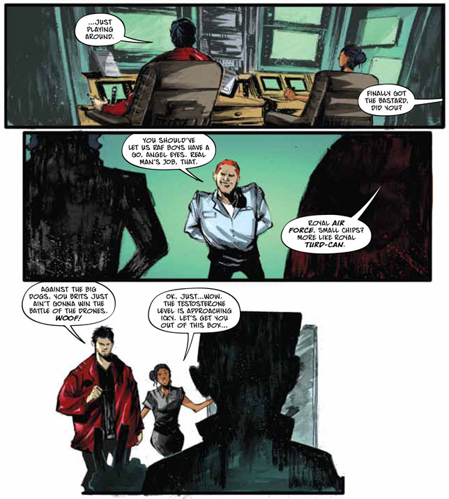
Page 6 shows a similar lack of concern for location:
This is supposed to take place on an Air Force base but since there’s no proper establishing shot, we get no sense of the location whatsoever – no sense of space, distance or even distinguishing features for that matter. This is due to having tightly framed shots bookended by wide shots lacking detailed backgrounds. Mind you, when I first did my analysis, all I had was a black and white hardcopy. Since then, I obtained a color PDF and I have to admit that the coloring somewhat attenuates the problem, but it doesn’t entirely solve it either. Even in color, the backgrounds remain vague color swathes, whereas they were a simple white void before.
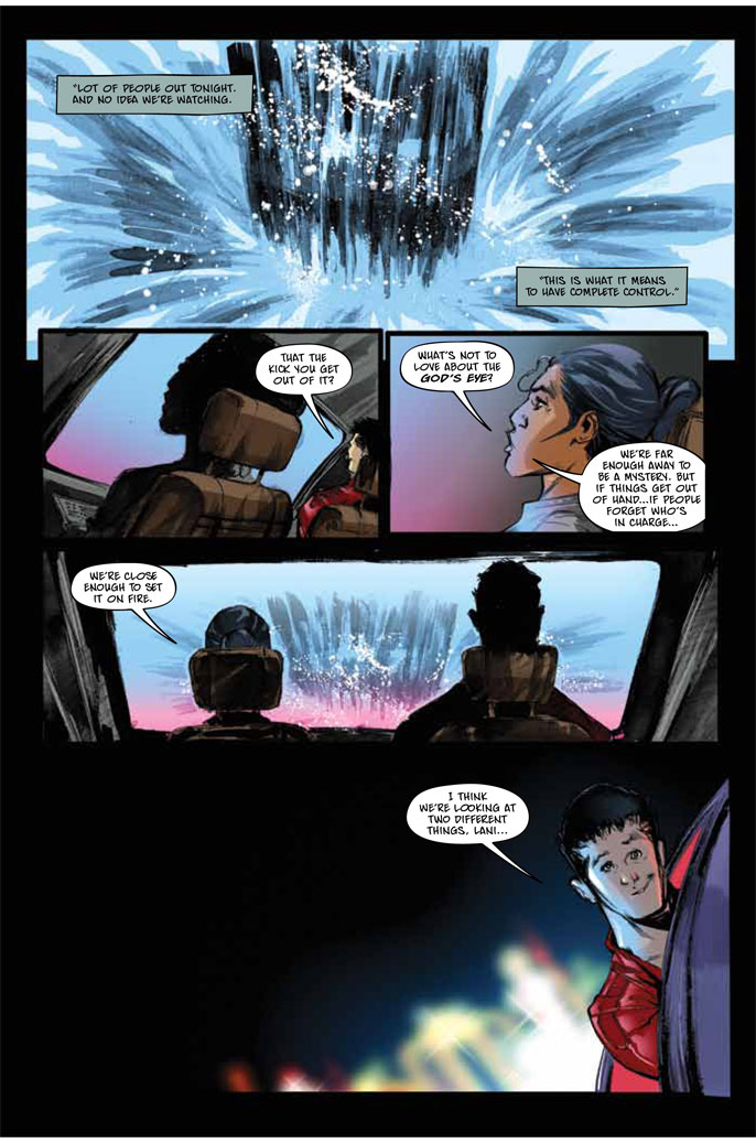
My biggest grip however is reserved for page 12:
That’s the fountain in front if the Bellagio in Las Vegas. At least with the colors, we get a clue. The rest of the page shows the same lack of concern for detail. I was certain they were sitting back in their control room, looking at an explosion on the screen when I first read the comic. It’s only once I looked over to the next page that I understood they were sitting in a car on the Strip, looking at water splashing. I should also mention that the last panel was completely empty save for the character.
Since the location was finally explained on the next page, doesn’t this count as a cliffhanger/reveal combo? Good question. However, I believe for a cliffhanger to work, you need your reader to be able to make something out of the data used to tease him. I’d rather be cleverly fooled into thinking one thing when it’s another rather than not being able to understand what’s basically going on until it gets explained to me in proper terms.
DRONES #1 is a very good comic. Lewis and Oliveira have a great understanding of what makes a comic work and it shows. Now they only need to be careful not to take too many shortcuts with establishing locations and characters. Just by correcting this, DRONES could go from very good to great .
Lesson Learned
There were three valuable lessons to be found in DRONES #1:
1. The story doesn’t have to end with the last panel. Back matter can be used to further develop the plot in new interesting and original ways. Hey, it worked for Brian Wood on THE MASSIVE! Not to mention that if you’re a little too tight on pages, you can always push the nice-to-have there and keep your panel-space for the essential.
2. Expand your visual vocabulary. Nothing kills a comic faster than repeating the same shots over and over. This is not a novel where the readers will endure looking at one cloned paragraph after another. They need some stimulation and the written bits can’t do it alone!
3. Always take the time – and space! – to do proper establishing shot, either of locations or characters. If it’s the first time the reader is confronted to a new place or person, provide him with the basic info needed to properly interpret the scene.
And that’s quite enough for a vacation week. No Honorable or Dishonorable Mentions this week; I probably won’t even be reading this week’s comics as they’re coming out. Heck, I got more than a year’s worth of DAREDEVIL and MORNING GLORIES catching up to do anyway.
In closing, I’d like to thank Chris again for sending me this comic. Even though I roughed him up a bit there in the end, I want to remind him something Leonard Cohen once sang: there’s a crack in everything, that’s how the light gets in. Without mistakes, we’d never have anything to learn about ourselves or our work. In the end, that’s all really counts.
Besides, at the end of the day, once I’ve taken what I can learn from a comic, the question I always ask myself is: did I enjoy this comic? Would I read more of it?
In the case of Lewis and Oliveira’s DRONES, the answer is YES. Keep it up, guys!
Please click here to make comments in the forum!
Related Posts:
Category: Columns, Points Of Impact









Comments (1)
Trackback URL | Comments RSS Feed
Sites That Link to this Post