Points of Impact – Week 22: Some Young Blood for a New Age
Important Disclaimer
When I wrote this article two weeks ago, all hell hadn’t broken loose yet about Rob Liefeld’s troubles with DC. I’m just beginning to take it in today as I see my Tweeter feed turn into something really ugly with some really disgusting declarations going back and forth. I have my opinion on what’s happening right now but fortunately, it doesn’t have any bearing on what I wrote here since this piece is about what was done 20 years ago and what we’ve inheritated from those past deeds. So no, I’m not rewriting anything because of the recent events. What I will ask of my readers however is to keep in mind that this doesn’t constitue in any way me taking a side or another in the current conflicts.
You now know what I think about yesterday. Today will be the subject of another article.
Summer Vacation 2012 Edition – Part 2 of 2
Welcome to the second week of this special Summer Vacation Edition of Points of Impact!
Once again this week, I’m on vacation from both my day job and my columnist duties. As such, I’m treating you to a little something I wrote in advance. This time, I’m making good on a promise I made in the beginning of my tenure as a ComixTribe contributor, that is to devote an entire article to Rob Liefeld’s YOUNGBLOOD #1!
YOUNGBLOOD #1 by Rob Liefeld
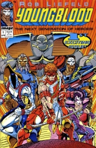 Creator: Rob Liefeld
Plot, pencils and inks: Rob Liefeld
Dialogue: Hank Kanalz
Color design: Brian Murray
Lettering: Hank Kanalz (not credited)
I hear you scoffing already: You’re going to find both a BULLSEYE and a HIT in there? Wouldn’t it be simpler to just not say anything at all?
Dear hypothetical scoffer, don’t forget the core purpose of Points of Impact: it’s not about reviewing a book and saying if it’s good or bad. It’s about looking at a comic and seeing what lessons we can extract from the work done by those who’ve come before us. The BULLSEYE is for when creators do something extraordinary or break new ground in comic making. The HIT is for when a usual trick of the trade is exceptionally well demonstrated. The MISS is for when an error has been committed but it allows us to point out how others can avoid it in their own creations.
This means that if you want to read about how Liefeld can’t draw feet, burdens his character with crooked spines or an overabundance of pouches, or skimps on backgrounds, go get it out of your systems on some other website before reading on. I think there’s been enough of that already plastered all over the Web. For my part, I might not be a fan of how the man draws or writes either – to each his own, I say – but there’s nothing constructive to be learnt from airing that out in 2,000 words.
With that out of the way, let’s have some Points of Impact!
HIT!
The early action scene
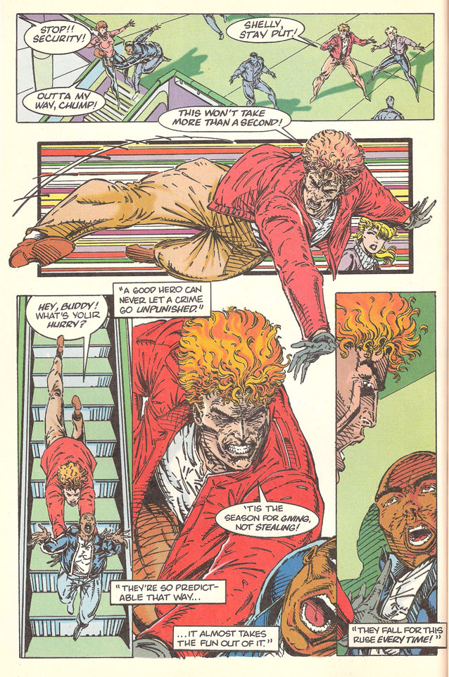
If there’s one thing for which we can’t blame YOUNGBLOOD #1, it’s that it doesn’t waste any time throwing its readers into an action scene. Sure, there’s first page 1 that’s mostly setup: Shaft, the leader of Youngblood is out shopping with his girlfriend in a version of downtown Washington D.C. that’s oddly rife with high-rise buildings. As soon as we turn the page however, the chase is on!
Ignoring the fact that there’s a missed opportunity for a mini-cliffhanger at the bottom of page 1 (with a Stop, thief! balloon coming from an off-panel character), this early action scene accomplishes two things. First, it does a great job of hooking the reading right from the start. Instead of mudding down the narrative with setup information that would be tempting to dump on the reader in the first pages – which would rebuke the reader – Liefeld opts to start with an action sequence that pulls him in.
Second, this scene sets the mood for what the series is about: high-octane action of the type that won’t be too introspective. Hence it sets up a contract with the reader right away: This is what you can expect from YOUNGBLOOD as a series. It’s an upfront declaration of intent, a public directive line that’s enforced for all subsequent issues.
Not only does YOUNGBLOOD #1 start with a bang, but it also doesn’t let up for too long either. Team member introductions are quickly dispensed with – only a few panels for each in densely-packed pages – before we get to another action sequence. (Mind you, I’m not advising rushing through character introductions, just not to let the adrenaline levels drop too low between bursts of action.)
Thus, for what it lacks in substance, YOUNGBLOOD #1 more than makes up in sheer excitement. For a comic produced by a group called Extreme Studio , I’d say that’s a win.
MISS
The confusing placement of speech balloons
Although not credited for it in the inside cover with the rest of the team, Hank Kanalz – who wrote all of the dialogue – was also responsible for the lettering. (History time: he’s also the man who designed the i symbol gracing the cover of every Image title since the beginning of the publisher.) Now that you can be graceful for this historic contribution to the industry’s landscape, keep it in mind as I wag a disapproving finger at his lettering.
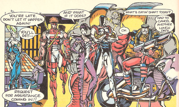
Our first example is the team’s first meeting, as they strangely all face the same direction – and what is Chapel doing on his bike INSIDE?! Ok, sorry about that. Back to the lettering
See the problem? According the way the balloons were placed inside the panel, the previous exchange should be read thus:
SHAFT: You’re late. Don’t let it happen again!
SHAFT: You’ll get–
VOGUE: And what if it does?
BEDROCK: What’s eating Shaft today?
BEDROCK: Oh.
CHAPEL: Had to cancel another lunch date
RANDOM WOMAN: Request for assistance coming in!
First problem: Shaft’s reply to Vogue is read before she has the chance to say anything because his reply appears higher in the priority order created by the placement of the balloons. Same problem with the side conversation between Bedrock and Chapel: the former reacts before hearing the latter’s answer.
And then there’s that troublesome double-dash! It’s at the end of Shaft’s second balloon. It indicates that he’s being interrupted by someone, namely the woman informing him of the request for assistance coming in. Unfortunately, her balloon has been placed so far down the panel that the eye simply doesn’t go there before jumping to the exchange between Bedrock and Chapel. Even worse: compounded with the earlier problem, Shaft sounds like he’s being interrupted by a line he should have been replying to!
However, to be fair, if I had to place the balloons in a way allowing them to be read in the right order, I’d have a hard time finding some space to do it elegantly. Hence, it seems its not as much a problem with the lettering itself as much as it’s one with the art: simply put, Liefeld apaprently didn’t plan his panel composition with the dialogue in mind. The way it reads, I even suspect that the dialogue might have been written after the pages were penciled. If someone is more informed than me on the subject, I’d love for you to sound off in the ComixTribe forums.
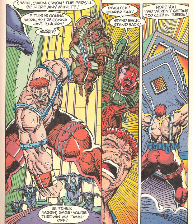
Anyway, we find the same kind of confusion on the facing page:
Once more, it’s a speech balloon placed at the bottom of a panel that gets easily overlooked and thus causes the confusion. Here the situation is made worse because we’re led to read a whole row of panels before realizing that this bottom-dwelling balloon was meant to be read earlier. And that’s without even going into the fact that Strongarm here seem to be talking out of his fist, the same way a lot of these characters have balloon tails constantly pointing at various parts of their anatomy that aren’t mouths.
Bottom line: there’s got to be as much dialogue between the artist and the letterer as there is on he page. That way, both can work out how the speech balloons can be fitted in a way that makes sense for the reader. Once again, collaboration is key to producing a viable comic.
BULLSEYE!
It helped get you where you are today
For once, the BULLSEYE is also going to be the conclusion because I think it’s the most important thing to take away from YOUNGBLOOD #1.
At a time where mainstream market alternatives outside the Big Two were practically inexistent and creator rights weren’t that heavy an argument in discussions against those giants, YOUNGBLOOD #1 was part of a movement of revolt and renewal of which a lot of the creator-owned initiatives of today are tributary. In fact, it was this very book that spearheaded a splinter group’s efforts, being the very first title put forth under the nascent Image Comics banner. It wasn’t the best book that Image could have put forward as its charging brigade – rough art, shaky plot, empty dialogue – but dammit if it wasn’t the first one out the gate, screaming “Look, ma – no permission!”
 Sure, it may have been critically panned and it’s art-first-plot-is-an-afterthought approach to storytelling was certainly not to the liking of a very vocal part of the readership – heck, it’s still reviled in certain circles today – but the fact remains that despite all of its oft-cited flaws, YOUNGBLOOD appears in retrospect as a symbol of what can be accomplished when creators decide they don’t need anyone’s authorization to make comics the way they want.
Hence, it’s not as much a lesson on how to make comics as much as it shows us why we should be making comics.
I keep hearing that 2012 is the Year of the Creator. Well, 1992 surely qualifies as well with the birth of a whole new publisher that still stands today as an undeniable force in the comic market, a force that features the highest concentration of creator-owned talent in comics today. Before SAGA, before FATALE, before THE ACTIVITY, MORNING GLORIES and THE STRANGE TALENT OF LUTHER STRODES, there was PITT, SPAWN, SHADOWHAWK, SAVAGE DRAGON and – first in line – there was YOUNGBLOOD.
So next time you see some Rob Liefeld art and you start snickering about how he can’t draw feet or how spines don’t work that way , remember YOUNGBLOOD #1 and how much you owe your plausible aspiration to be both indie and successful to the trail blazed by the house Rob helped build with this very first brick.
After all, we’re now past the halfway point of the Year of the Creator – what have you done?
For my part, I’ve got some introspection to do…
See you next Saturday!
Many thanks to Ken Tupper for lending me the first three issues of YOUNGBLOOD!
Please click here to make comments in the forum!
Related Posts:
Category: Columns, Points Of Impact

