Points of Impact – Week 25: Overexposed!
1st Disclaimer: Points of Impact contains so many spoilers it can practically replace reading your comics. Know what that means? Read your comics first!
2nd Disclaimer: For the sake of simplicity and since it’s impossible for me to know exactly who did what for the specific elements I usually examine, unless the creators come forward themselves to set me straight, from now on I’ll assume that everything in the comic stems from a joint decision by both the artist and the writer. I figure I’ll get it right most of the time if I give each 50% of the credit. I apologize in advance if I’m off from time to time, but I’d rather give too much credit than not enough where it’s due.
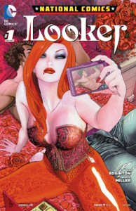
The overuse of exposition in Ian Edginton and Mike S. Miller’s NATIONAL COMICS: LOOKER
 Writer: Ian Edginton
Art: Mike S. Miller
Colors: Rex Lokus and Antonio Fabela
Letters: Carlos M. Mangual
Editors: Ben Abernathy, Alex Antone and Kristy Quinn
I was going to start this week’s column with a cliché: Exposition is a necessary evil.
What made me hit the Delete button is the realization that exposition in itself is not evil. It’s just another moving part in the great machine of fiction. And like any other part, it’s its placement and quantity that determine how detrimental it can be rather than its mere presence alone.
Hence, switching for another cliché image, I’ll liken exposition to salt. Salt is an essential ingredient in many dishes, no matter how much you think it doesn’t need it. I mean, even chocolate chip cookies, brownies and ice cream contain salt! Thus, the best stories contain their part of exposition; the trick is to make sure you don’t spoil it by adding too much!
In order to further explore that idea, we’ll be doing something this week that we haven’t done in quite a while: provide some negative feedback. Apart from a few Dishonorable Mentions, lately I mostly focused on examples you could emulate rather than avoid. However, since we can still learn from a bad example, today we’re going to look at how not to go about doing exposition.
Ian Edginton and Mike S. Miller are the creators behind the newest NATIONAL COMICS one-shot over at DC, a post-Flashpoint revival of the Looker character – although she never actually goes by that name, the title rather referring to the modeling agency she’s heading. Thus, on top of heroes losing the eponymousness of their book titles, LOOKER shares another trait with the previous ETERNITY one-shot: they both faced the challenge of telling an origin story at the same time as presenting an engaging done-in-one plot.
Once more, the main character is presented with a crime to solve: Emily Briggs, former runway model turned vampire turned modeling agency owner must solve the mystery of the disappearance of her latest protégée, all the while tracking down the monstrous guilty party behind a string of murders spanning multiple decades. Of course, having a vampiric protagonist should be good for spicing things up! Right? Right?
The main problem with NATIONAL COMICS: LOOKER isn’t as much that’s it’s using a character trope that was already old-hat in the nineties as much as it’s dreadfully bogged down by an overbearing mass of exposition that constantly gets in the way of the story. In fact, if I were to categorize the ways in which exposition is misused in this comic, they would fall under these three themes: extraneous scenes, intrusive infodumps and explicit character reveals.
Extraneous Scenes
Extraneous scenes occur when whole narrative blocks are entirely devoted to providing backstory that could either be replaced with in-dialogue hints, inferred by the reader based on context or simply unnecessary to the enjoyment or even bare comprehension of the plot.
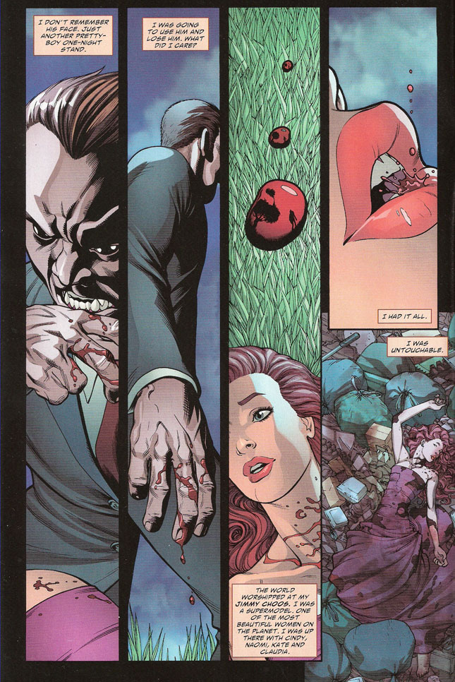
I’ve decided to tackle this pitfall first since it’s actually the very things that greets us when we crack open LOOKER: a three-page retelling of how Emily Briggs became a vampire.
Before I go further and delve into the exposition aspects of this scene, I’d like to get a couple of things out of the way that have nothing to do with this week’s subject but still bugged me when I read the comic. First, the dialogue here is nothing short of pedestrian: it’s exactly what you’d expect to come up with on the first draft, almost as if the place-holder lines had been left in by mistake. Second, logic takes a break even before the story has properly begun. How does getting your own blood back into your mouth after death turn you into a vampire? Also, if the vampire who kills her leaves her on a grassy hillside – we see him walking away in a reflection in a falling drop of blood – how does she end up in a garbage dump? And how can we see the vampire walking away in those falling drops of blood if it’s dripping from his hand! Aargh. Must not break brain just yet. Must finish column.
Anyway, that’s three pages burned for no discernible purpose. Sure, it establishes that Emily is a vampire now, but she already had tons of inner monologue starting on the next page to establish it again.
EMILY: But what’s a girl supposed to do when she no longer shows up on film, or turns to cinders on a swimwear shoot?
This scene adds absolutely nothing to the story that isn’t narrated later on. Now if Emily had shut up about her condition in the following pages, this mini origin story might have served a purpose; right now, it’s just filler.
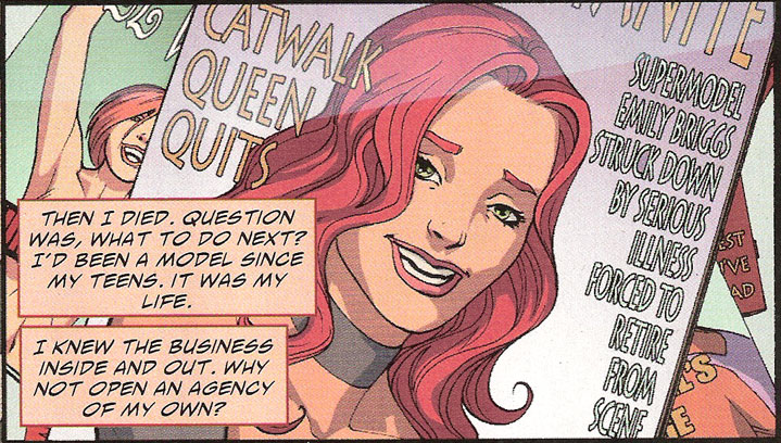
The same goes for the flashback scenes that follow the Discovery of the Mystery. First we get one page of Emily’s human days to establish that she used to be kind of a difficult person. Since this has already been painfully established (more on this later) in the scene that just ended, this flashback proves eminently superfluous. Not only that, but there’s also a panel showing a magazine cover with a comically lengthy line rehashing a plot point that was already explicitly made twice.
Even more unnecessary however are the two following pages, each dedicated to explaining how each of the protagonist’s aides came to be in her employ, the creators seemingly deeming their backstory important enough to be included in the narrative. The fact is that nothing more than the nature of their relationship to Emily is needed to tell the story, and that has already been exposed in a previous scene. These little flashbacks contain absolutely no plot point serving the present narrative, nothing that proves useful to developing and resolving the plot by the end of the book.
Even more egregious – and made worse by immediately following the aforementioned flashbacks – is a scene that takes place in the present for a change, but still introduces a story element that proves completely irrelevant to the plot.
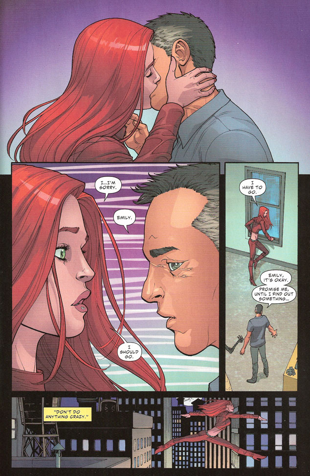
Yes, in the purest tradition of most direct-to-DVD action flicks, Edginton and Miller waste four pages on introducing an unneeded romantic interlude. I was going to say subplot but the use of that word implies relevancy (of which that snippet has none). In appearance, the scene shows Emily doing some legwork, asking her ex-cop friend Paul – and boy is that not hinted at with subtlety –to ask around for clues.
PAUL: I’ve met made men with less ice in their veins than her.
[ ]
PAUL: And it doesn’t take an ex-cop to figure out what this small talk’s leading up to.
And if you didn’t catch the subtext in those lines, there’s also a badge and a picture of the guy in uniform hanging in frames on the wall.
The truth is that by the time the story is over, we never know if Paul did ask around or even if his asking around ever turned up anything. In fact, it’s never even hinted at again. The whole scene – the character even – is dropped from the book until the very end where he’s used to provide a heartwarming closing to the story. I’ll admit there was a nice bit of foreshadowing with the key here so I’ll give them some points for thinking it out.
It’s almost as if Edginton and Miller got allotted too many pages and didn’t know what to do with the extra ones. I count 32 pages of comic, yet there are 10 of those that serve no purpose except to wedge in unnecessary backstory. Fittingly enough, if you take out these pages, you’re left with a regular-length 22-page comic, which lends some suspicious credence to my inflated page-count theory.
Origin stories such as these serve their purpose in two cases: if the whole point of the plot is the origin story, or if the origin story contains some information that will later prove crucial in resolving the plot. Neither of these applies to LOOKER. Sure there’s a throwaway line from the villain about revealing the identity of the vampire that turned Emily, but really, who cares? It’s a one-shot. This isn’t going anywhere else after the reader’s closed the cover.
Emily is a vampire*. Period. Delving deeper into that only further underlines how formulaic her origin story actually is.
What could have been done with the extra ten pages instead? Show us how Emily copes with her condition in the context of her old line of work and lifestyle, and use those elements to foreshadow a plot resolution that goes deeper than getting really angry and punching a guy’s heart out. In other words: bring out what’s special about this character and use it to reinvent an old story.
*When a supermodel becomes a vampire, does she limit her blood intake to no more than three drops per night?
Intrusive Infodumps
Intrusive infodumps occur when plausible and relevant dialogue is interrupted to provide unneeded backstory information. You can usually spot it by looking for unusual breaks in the flow of the lines, or by stripping the dialogue of anything that isn’t necessary to advancing the plot or revealing character.
Yes, it’s our old mantra again: advancing the plot and revealing character. I’m sorry if it’s beginning to grate but it’s easily the best yardstick by which to judge dialogue. It’s perfect for determining which lines truly serve the story and which ones have been inserted for naught, either because the writer mistakenly felt it was important or because he couldn’t bear the thought of murdering such “clever” darlings.
Intrusive infodumps can be hard to detect when they stay discreet, not taking more than a line or two here or there. In that case, they’re pretty easy to excise and their absence leaves no unseemly scar in the dialogue. For example, there are a couple of instances where small slices of backstory make their way through the dialogue – as when Emily is looking at the show – or third-rate characters like Siren get some needless exposition. Cut those out and it’s no loss to the story; it stays perfectly understandable and enjoyable.
However, they can also be a lot more obvious when they’re eating up whole exchanges, scenes even. Then they’re quite harder to cut out since their ablation leaves a conversation-sized hole that has to be filled somewhere with actual action.
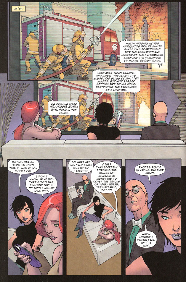
The final pages invite the creation of such a hole. Immediately following her victory over the disgusting villain*, Emily lounges in front of the TV in the company of her two origin-story-worthy acolytes. As they’re watching the news, the announcer relates how the bad guy’s building went up in flames after the kidnapped girl escaped and warned the police. As if it wasn’t bad enough that we didn’t get to see a building catching on fire instead of people sitting on a couch, Edginton and Miller proceed to have Emily state that it was the other characters who torched the building to cover up their employer’s involvement. There’s even dialogue to reassure the reader that some guy spotting the ageless Emily in the opening pages won’t come back to haunt her since they had him sign a confidentiality contract.
In other words, we had a couple of plot holes that were almost going to get a pass – honestly I had completely forgotten by the end about the implications of Emily having been spotted by an old colleague – and instead of just keeping mum about the whole thing, the creators actually draw attention to the plot holes by trying to plug them with giant neon signs saying IT’S OKAY, GUYS, WE GOT THIS.
*I’m digressing again: the reveal of this villain was one of the clumsiest bits of layout I’ve seen in a long time. You have a guy whose face splits open to reveal a nightmarishly raw ruin sporting a telescopic lamprey-mouth and you couldn’t introduce that on the start of an even-numbered page? I turned the page and it was smack there at the bottom of the facing page! I’m going to say this again so the wasted coolness factor sinks in: the guy’s face SPLITS OPEN LIKE A FRIKKIN’ FLOWER OF FLESH AND FEAR. So much for suspense
The trick to dealing properly with intrusive infodumps is to know the difference between passive storytelling and active storytelling. In the former, characters tell the reader and each other about people or events whereas the latter actually shows us the people in action and the events unfolding. As you probably guessed by yourselves, active storytelling should be used over passive storytelling as much as possible as it engages the reader a lot more to see the story take place than to read an account of it.
Hence:
- Don’t tell me you’re using lupus as an excuse; instead use lupus as an excuse to get out of trouble I can see;
- Don’t tell me that the sun burns you; instead get burned by the sun.
- Don’t tell me that hiring a model cost you a fortune; instead sign the contract in front of me.
If the use of italics a bit further up didn’t clue you in, it’s our old pal show, don’t tell at work again. And if you liked the wording of the examples in the above list, you’ll love what Russian dramatist Anton Tchekhov had to say on the subject: Don’t tell me the moon is shining; show me the glint of light on broken glass.
Explicit Character Reveals
Remember when we said that dialogue is supposed to reveal character? That statement should be qualified in fact: dialogue is supposed to reveal character implicitly.
Throughout the course of a story, a protagonist will ideally be changed by the challenges he faces and ultimately overcomes. Indeed, a good complete story not only develops an effective plot, it should also transform the main character, thus showing that his journey is more than just an itinerary through the plot but also a more metaphorical voyage across his inner landscape.
In short: the character starts with a certain pretermined outlook on life, the events of the story challenge that outlook, forcing him to reevaluate how he views the world and, by the end, the character has been changed, ready to face the future with a new and hopefully better-suited attitude. The implicitness comes into play when it comes time to illustrate that process through dialogue.
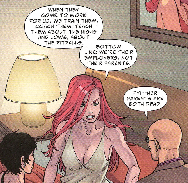
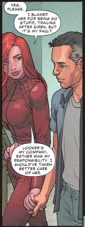
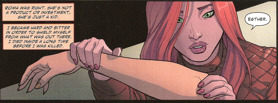
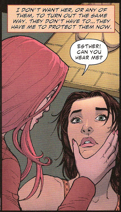
LOOKER takes a rather direct approach to the problem by having Emily flat-out state the tenets of her outlook from time to time, effectively marking with a red flag every stop along the way of her emotional development. In fact, it’s so evident that I can pinpoint every step of the way with specific panels:
Page 12 – Declaration of principle to establish the starting point for character progress:
Page 18 – Declaration of character progress:
Page 23 – Declaration of character progress:
Page 24 – The Turning of the New Leaf (or “I’m a superhero now!”):
Page 32 – The new character status quo is established:
As you can see, it couldn’t be more obvious: Emily’s transformation as a character is plainly documented through declarative statements that leave no doubt as to the progress being made on the scale from egotism to altruism. The seemingly tongue-in-cheek lampshade-hanging in that last panel takes away none of the blunt explicitness of these emotional milestones.
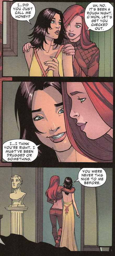
However, to be completely fair, page 30 did show some genuinely good characterization:
Here, Esther’s lines further drive home the change in Emily’s character, not by saying that she’s now a nice person but by rather ascribing the vampire’s new way of relating to her as an effect of the drugs she thinks she’s taken. As plot points go, it’s not much, but at least it’s a step in the right direction to have the effects of a change in characterization be referenced instead of just stating the change out flat.
This brings us to the final leg of this exposé – if you’ll pardon the pun – that is: how should one deal with exposition? How do you season a story with just the right amount of salt and not drown all other flavors in the dialogue?
The answer isn’t simple and it draws more upon the intuitive ability of the creator than any mere technical trick I could share here. The simplest way to boil it down is to make sure nothing is said that isn’t necessary to the present action and for the benefit of the present characters. Thus, any spoken line must contain information that is plausible for the other characters to require knowing. That means that lupus doesn’t have to come up unless Emily has to come up with an excuse for her strange behavior (this is done once in the three times lupus is mentioned in the comic).
However, cutting it so close tends to limit the liberties that can be taken with conventional staples like inner monologues. After all, why should anyone narrate to himself as constantly as most comic book protagonists do? What’s plausible about that?
That’s when you need to rely on the reader’s intelligence to figure things out for themselves. Like I’ve said more than once, readers are a clever lot; they’re educated both in the tropes used to build fictional universes and in the ways of the real world around them. After all, the typical comic reader is at least 25 years old nowadays and has accumulated enough formative years to pick up on hints left throughout a story by a smart creator. You don’t have to spell out everything.
Instead, pepper the dialogue and art with just enough clues to let the reader piece the information together in order to understand the story and enjoy it to its full potential. Thus you don’t need to devote three pages to showing Emily becoming a vampire; all you need is a couple of dropped hints as to her weaknesses. You don’t need Paul to rattle away about his past career as a cop; just the stuff hanging on the wall was enough. And you don’t need to tell us that Emily’s personality is being transformed; seeing her act will clue us in enough about her change of heart.
Small clues, big effects.
Welsh-Canadian author Jo Walton coined a term for this; she calls it incluing. It’s a subtle yet efficient way to dole out exposition that relies more upon your reader’s intelligence than upon your ability to forcefully cram chunks of information down their throats. By distributing the exposition intake through small doses all across the narrative, you make the reader imperceptibly pick up all that he needs to fully comprehend the context of your characters and your world. Then all you’ll have left to do is tell a good story.
Sow those breadcrumbs and the reader will follow you back home.
Throw down mountains and he’ll run the other way.
And so, for their overuse of unwieldy exposition, Ian Edginton and Mike S. Miller get a MISS for NATIONAL COMICS: LOOKER.
Lesson Learned
Exposition is an essential part of storytelling. Without it, the reader lacks the context required to fully appreciate your story. However, you need to take care not to interrupt the flow of your narrative with massive, unwieldy and/or clumsy pieces of information. For example, extraneous scenes that don’t serve the plot, intrusive infodumps that hinder dialogue flow and explicit character reveals that rob the protagonist’s inner journey of all subtlety. Instead, try to spread your exposition across the story as a whole, doling it out in small doses here and there in strategic places where they seem both plausible and necessary. This process is known as incluing. That way, you’ll be able to keep your reader engaged in your story while making sure he misses nothing of the essential details.
And that’s it! The race is on again for next week’s Points of Impact. To be completely honest with you though, it looks like my schedule isn’t getting any lighter so even though I’ll always do my best to do these on times, please don’t be shocked if the release of this column slips from weekly to when time allows .
One thing is certain though: I sure enjoy writing these articles so I’ll keep it up as long as I can!
Please click here to make comments in the forum!
Related Posts:
Category: Columns, Points Of Impact

