Points of Impact – Week 3: The Amazing Rocket-Powered Plot
April 2012 – Week 1
It’s Saturday again so have another Points of Impact, the column in which we don’t tell you what’s good to read as much as what’s good to write!
Once more
- The BULLSEYE! section presents something that really wowed me. That’s usually when a writer does something unique among his peers.
- The HIT! section picks up on a cool trick that gets used pretty often – mostly because it works – but of which I’ve found a prime example.
- The MISS section however isn’t about praising a good shot but – as you guessed it – pointing out where a writer stumbled so you don’t put your feet in the same hole.
And of course my customary warning: this column has a tendency towards being quite spoilerful. You’ve been warned! Go read your comics. Now. Then come back.
BULLSEYE!
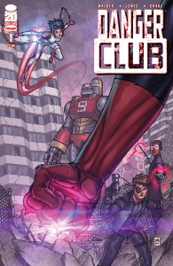
The irresistible pacing in Landry Q. Walker’s DANGER CLUB #1
 Pacing is one of the hardest things to get right when writing a comic. It goes without saying: your process involves taking snippets of scenes and ideas and spreading them across 20 pages or so, hoping it makes sense for the reader. Sometimes you do it right: your transitions are meaningful, the progression is palpable and the impulsion to turn the page is omnipresent. Other times, you don’t do so well: scene transitions are jarring, the story drags across the superfluous bits and rushes through the essential ones, making the whole thing feel completely random.
And other times – magical times! – you hit the ground running for a few steps and just take off.
Landry Q. Walker treated us to one of these magical moments this week with the release of DANGER CLUB #1. What initially looked like a creator-owned take at the Teen Titans turned up to be instead a strange apocalyptic spandex-clad version of Lord of the Flies, one with a cartoonish rocket strapped to the top .
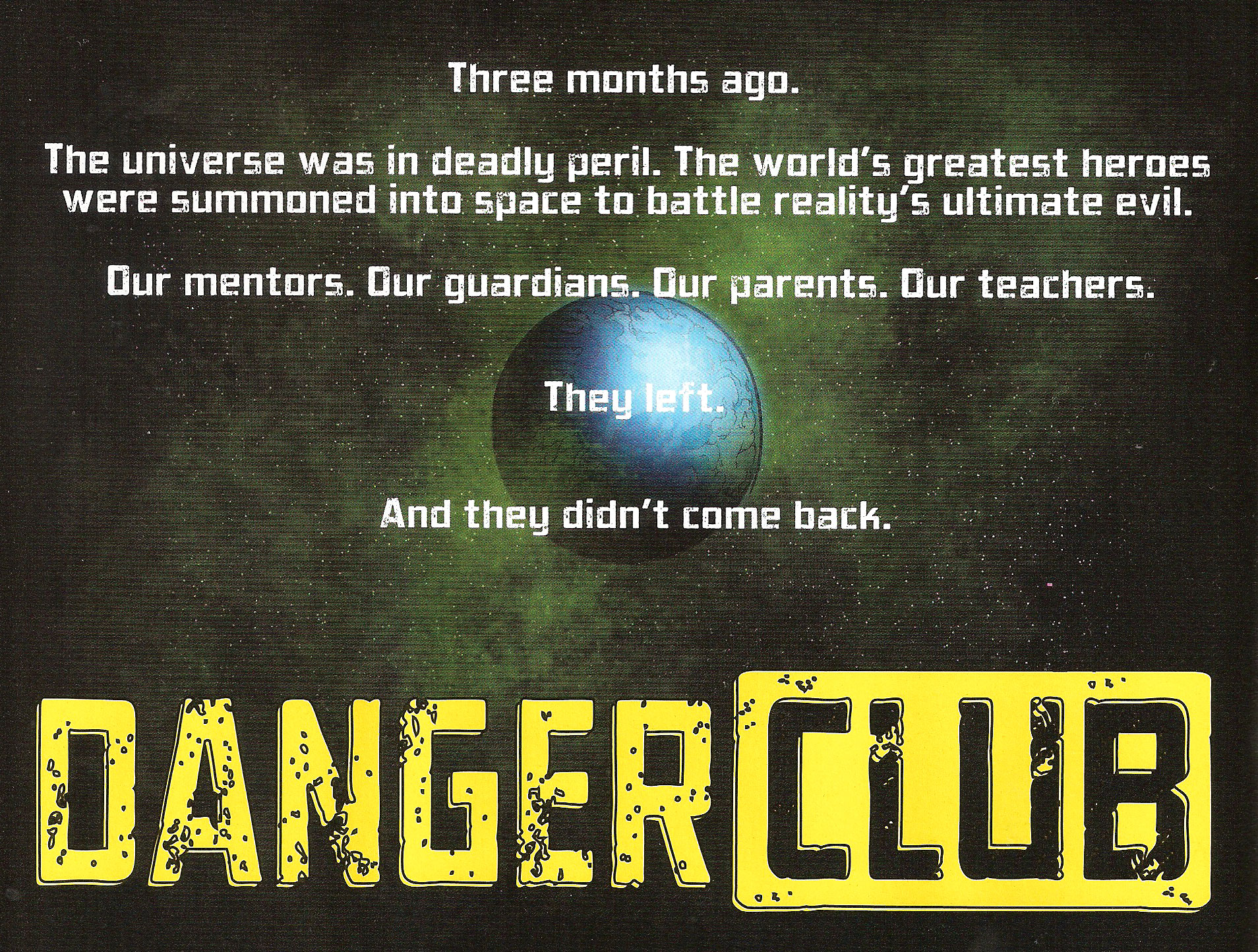
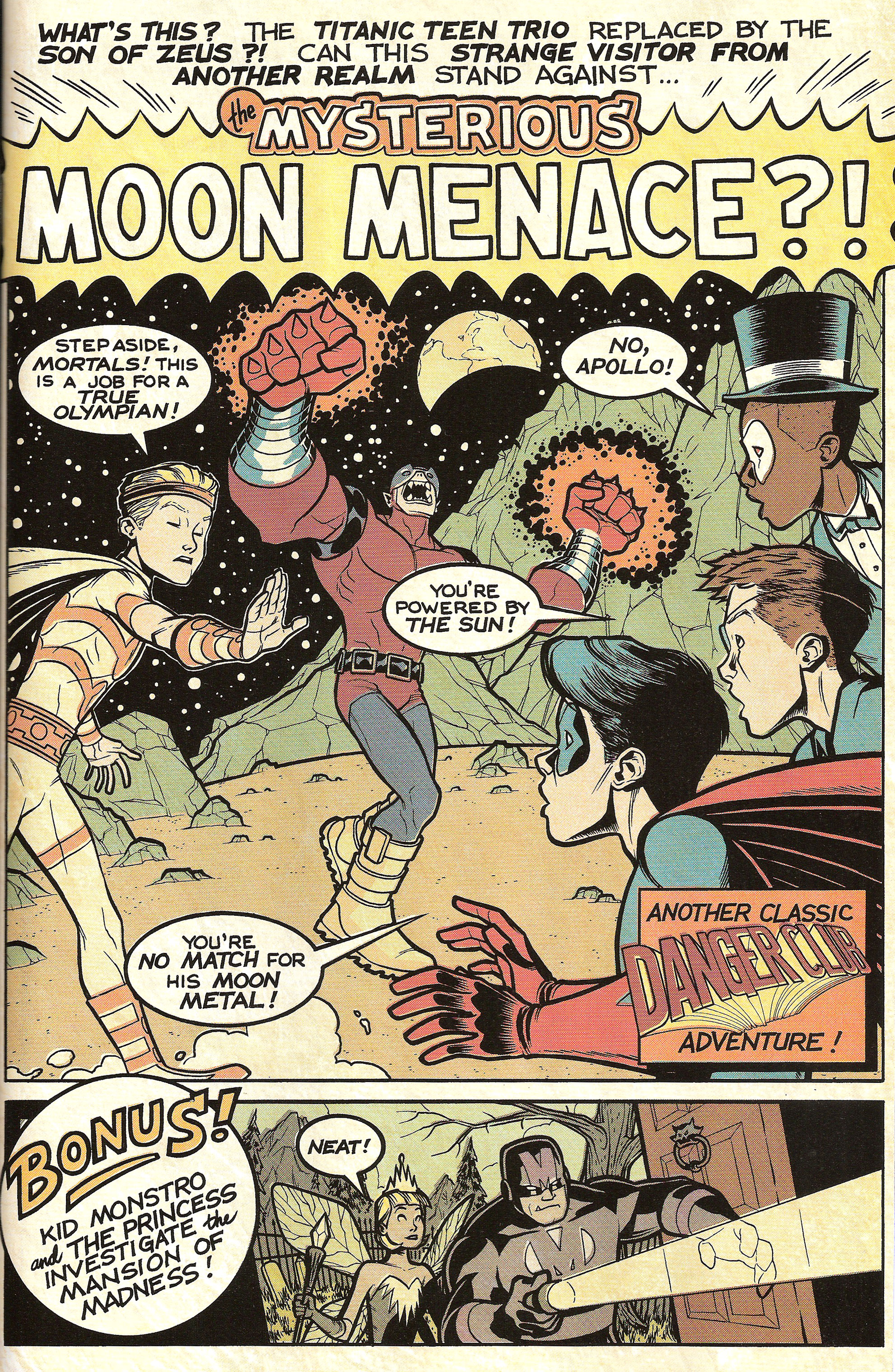
The first issue opens up on a silver-agey showcase page. Well no, to be completely honest, it rather opens up on an introductory blurb on the back of the cover:
I’m not usually a fan of recap pages. I always feel like they’re a form of cheating, as if you had the usher hand you a flyer at the entrance to the movie explaining what you’re about to see is all about. In my opinion, if you need the crutch of an intro text to ease your reader into your comic, then there’s something you’re not doing right in your structure. This time however, it works, and it only works because of what Walker is trying to accomplish with the rest of the issue. You’ll see.
So anyway, back to the retro page. What seems at first like a cutesy way of introducing us to the characters is in fact a fantastic device whose purpose is to get the ball rolling fast. The Titanic Teen Trio (TTT from now on) is introduced as well as the issue’s villain, Apollo. We even get a glimpse of Kid Monstro and the Princess as they investigate the Mansion of Madness! Most importantly, we get a mention of Apollo’s vulnerability to moon metal .
Everything you must know about the characters and the setting is there in these two pages, the blurb and the first page. That means that the rest of the issue – 23 pages in this case – is almost all plot development. You can’t really ever do away completely with exposition, especially in a first issue. No matter how much it chafes to slow down your pacing with back story info, it’s a sadly necessary evil in a medium relying so much on conciseness. However, every opportunity to pare it down should be welcomed. In the case of DANGER CLUB #1, thanks to the use of these two pages, exposition has been reduced to a minimum. Think about it: when all your setup’s done on page 1, what need do you have for exposition?
This leaves Walker free to gun the engine and drag us screaming gleefully up the ramp:
- Pages 2-5 show us the TTT walking to the stadium. A small amount of exposition is still being doled about, albeit you don’t really feel it since it’s being so well integrated into the conversation. If you had real trouble sleeping the night before and was afraid to doze off, Walker keeps you interested with a nice bright conflagration at the bottom of page 5.
- Pages 6-7 bring us to the moon where something is found by a girl piloting a giant robot. This information is relayed back to our earthbound heroes with the promise of joining them soon. Giant mecha on its way? Lets turn that page!
- Pages 8-11 give us the classic villain piece: the megalomaniac speech. Kid Vigilante’s interruption compels us to turn to
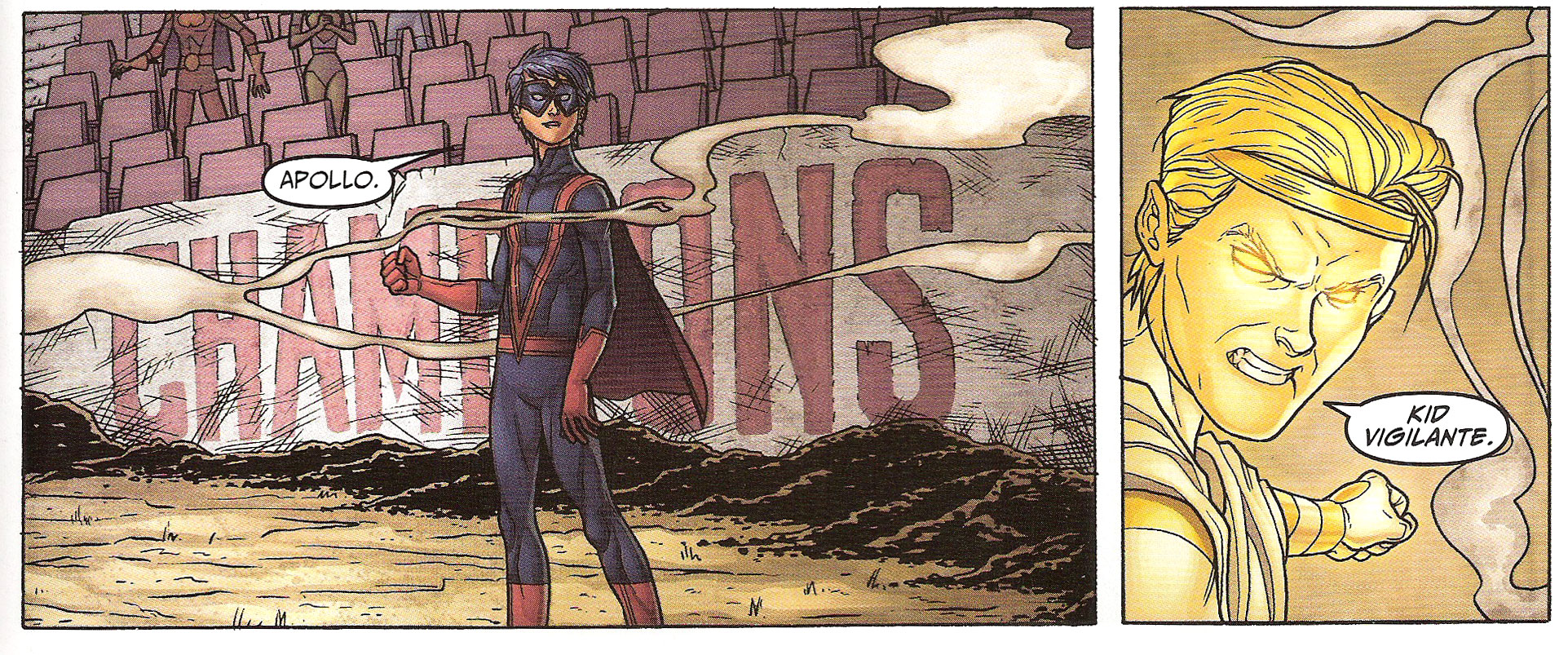
- Pages 12-15. This is it: the big fight opposing Apollo and Kid Vigilante, alternating with glimpses of Fearless and the Magician battling the rest of the New Olympians. The page-turner here is KV’s enigmatic announcement of round two .
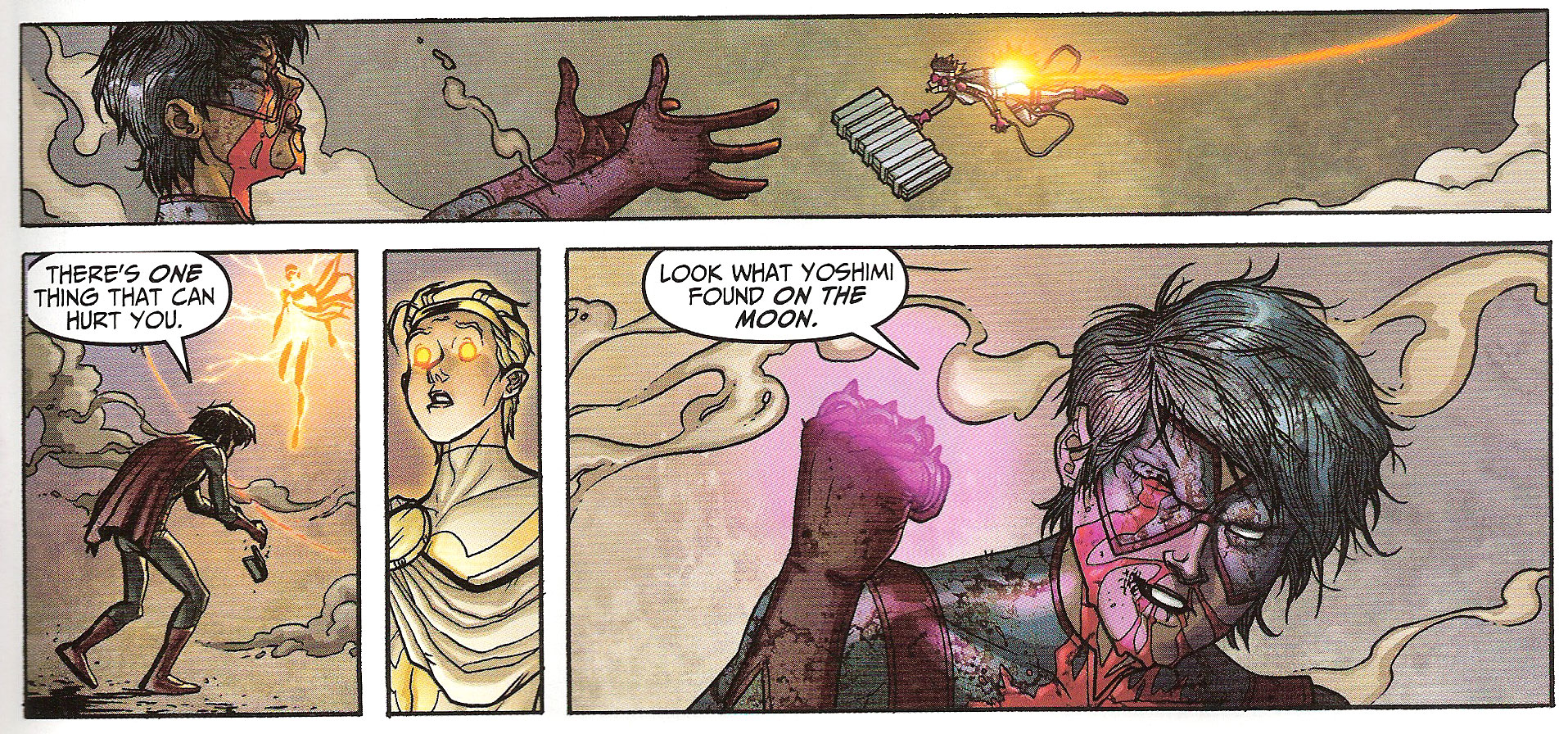
- Pages 16-17: Yoshimi, the girl with the robot, joins the fight and hands Kid Vigilante what she found on the moon: the moon metal knuckles! Let’s turn that page already!
- Pages 18-20: Oh that beatdown looks painful. But you can’t help but enjoy it since the villain had it coming with all of his gloating in the previous pages.
- Pages 21-23 sees Kid Vigilante serving his ultimatum to the crowd of unemployed sidekicks: start acting like heroes or else. With sixty seconds before the stadium is hit by an orbiting laser, everyone runs for their lives – everyone that is except Apollo who gets to experience firsthand the announced
- BOOM on page 24.
Notice how, except for the moon sequence, the whole comic is just one long scene going through the different phases. Notice how there’s always something that makes you turn the page to see the next sequence. Notice how the stakes always get higher with each passing sequence. Even when it seems over and you think the only thing left to do is to wrap up the story, there’s still a literal bang to finish it off.
Where other comics are content to be roller-coasters, climbing hills of tension and barreling down the steep slopes of action, this one only goes straight up.
Yeah, but tension goes down once the fight is over. It slows down at that point! Really? If pacing was only about action, a lot of comics could be accused of having terrible pacing. For example, Fábio Moon’s DAYTRIPPER has practically no action scene to speak of but I dare you to tell me you can read it without turning the pages faster and faster as you approach the end. You see, pacing isn’t as much about the action being depicted but the eagerness with which your reader is going to turn the pages. Hence, pacing is more about the reader’s reaction to the book’s plot than the speed of the plot itself.
And in that sense, DANGER CLUB #1 is a rocket taking off.
POP QUIZ! I told you I would do it and I’m doing it! I’m calling names! Liam Hayes! Can you give me an example of another comic with almost zero action scenes but with excellent pacing?
Lesson Learned
You can’t get rid of exposition but you should do all you can to make it as unobtrusive as possible, either by presenting it at the beginning of your story or be integrating it seamlessly into the dialogue. In any case, never forget that pacing is about maintaining your reader’s interest high and to keep him turning pages – the faster, the better! For that purpose, hook him at the bottom of every even-numbered page with a promise of something rewarding: a cliffhanger, the promise of a spectacular fight, a game-changing revelation and so on. And if you can manage to make each of these hooks more compelling than the previous one, you’ll achieve the rocket takeoff effect!
HIT!
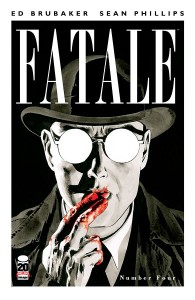
The density of Ed Brubaker’s FATALE #4
 Let’s face it: reading comics is a costly hobby. With three to four bucks a pop, reading a comic should provide you with an experience that seems sufficient enough to warrant its cost. You want a reasonable amount of pages, a high panel count per page, dialogue a-plenty, multiple scenes, a consistent world, engaging characters and an engrossing plot. We all know the infuriating feeling of coming home after our Wednesday shopping and realizing we paid full-price for a small collection of silent vignettes.
At the same time however, as writers, we’re often told to go easy on the wordage. After all, words take up space on the page. The more words you put in, the less space there’s left for the art. In the same logic, the more panels you ask for, the less room the artist has in each of them to depict the story.
Remember all those times you came across advice for panel count per page? For my part, I’ve read five or six as a guideline plenty of times. Not only have I seen this rule stated, I’ve also seen it in action in most of the comics I read. With the rise of the cinematic style , that number often gets reduced to three or four, taking the form of page-wide vignettes stacked on top of each other.
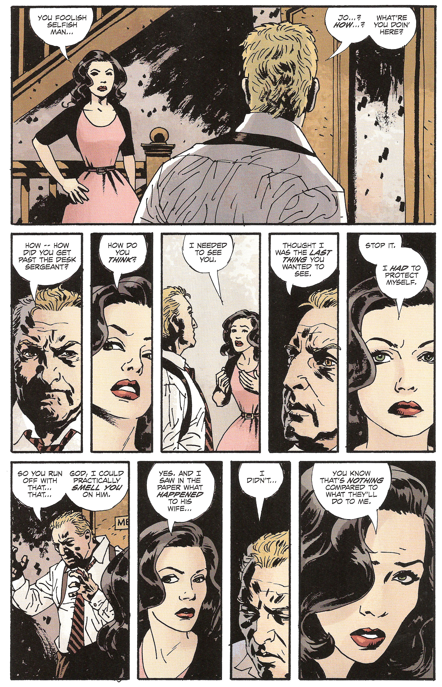
It’s a constant balancing act between giving the reader what he wants and giving the artist what he needs, but it doesn’t have to be an either/or proposition. You can both give a reader his money’s worth and still let your artist have some fun as Ed Brubaker demonstrates in this month’s issue of FATALE. For example, feast your eyes upon this mighty 10-panel beast:
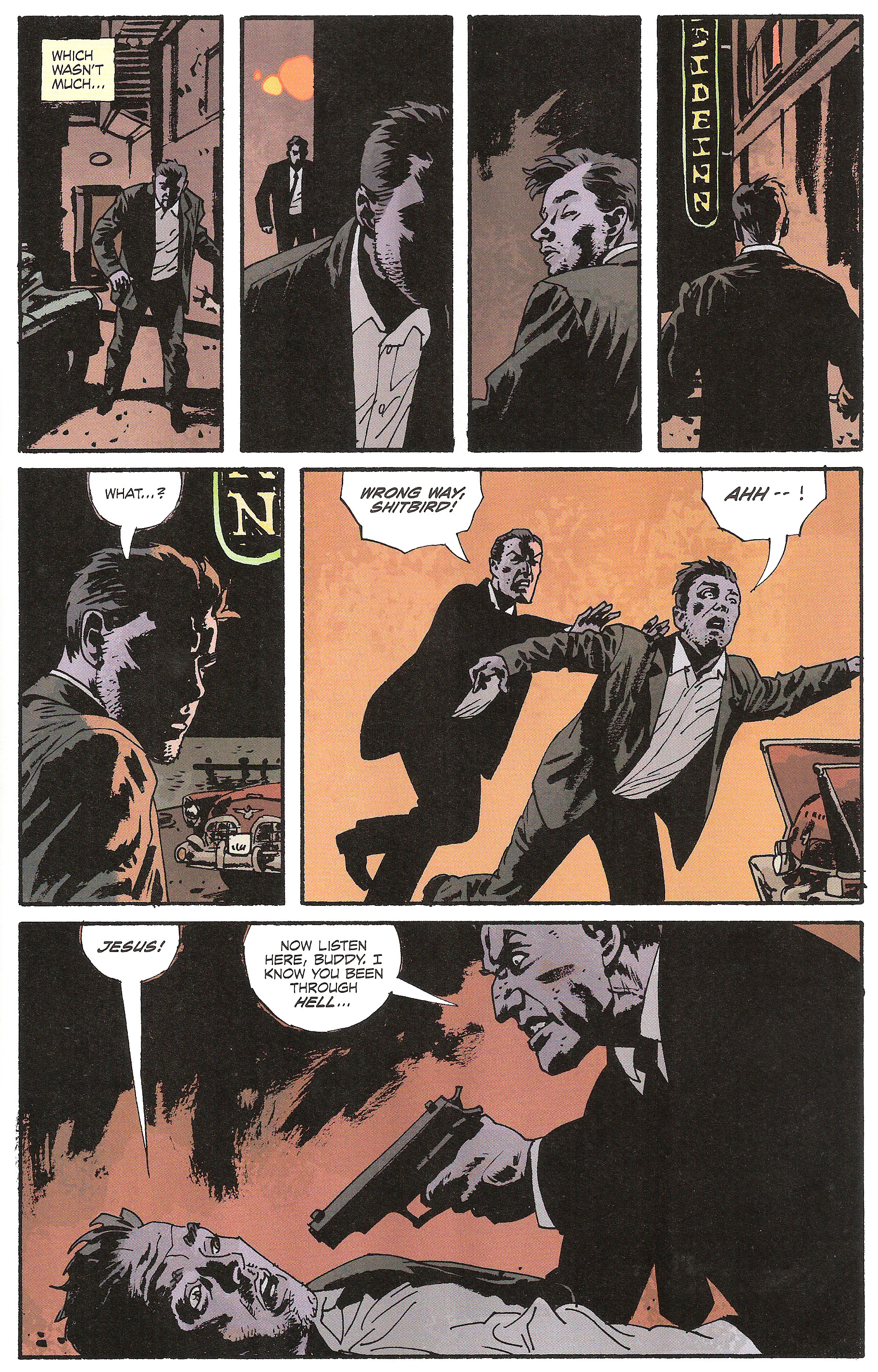
It’s getting pretty tight in that second tier but they somehow make it through. Of course, this scene consists of a conversation between Josephine and Walter, nothing too action-oriented. Most of the time, all the artist has to show is a talking head and not necessarily any background. He still gets to stretch his artistic muscles however as the scene is quite tense emotion-wise. And what about when action is actually involved? That will clock at seven panels for Brubaker:
How does this work? First of all, notice how even though Brubaker is using a lot of panels, he’s still bringing something new every time. There’s no repetition or extraneous details for the sake of padding. Just look at that last page for example:
- Panel 1: A shot of Hank stumbling drunk in the street to establish he’s left the bar alone.
- Panel 2: A shot over his shoulder showing the cop following him.
- Panel 3: A shot of Hank checking over his shoulder. This makes it plausible for Hank to be surprised later on: he doesn’t know he’s being followed.
- Panel 4: A shot of Hank arriving at the hotel where Josephine is staying, establishing the new location for this scene.
- Panel 5: A reaction shot of a surprised Hank.
- Panel 6: A shot of the cop running in and pushing Hank from behind.
- Panel 7: A shot of the cop pointing his gun at Hank and threatening him.
Everything here is essential to making the scene clear to the reader. You can’t take out anything without creating gaps in border time nor can you add anything else without padding the scene. Thus, you won’t be able to pull off that 7-panel-per-page average until you’re able to produce the correct amount of worthwhile content in your scripts.
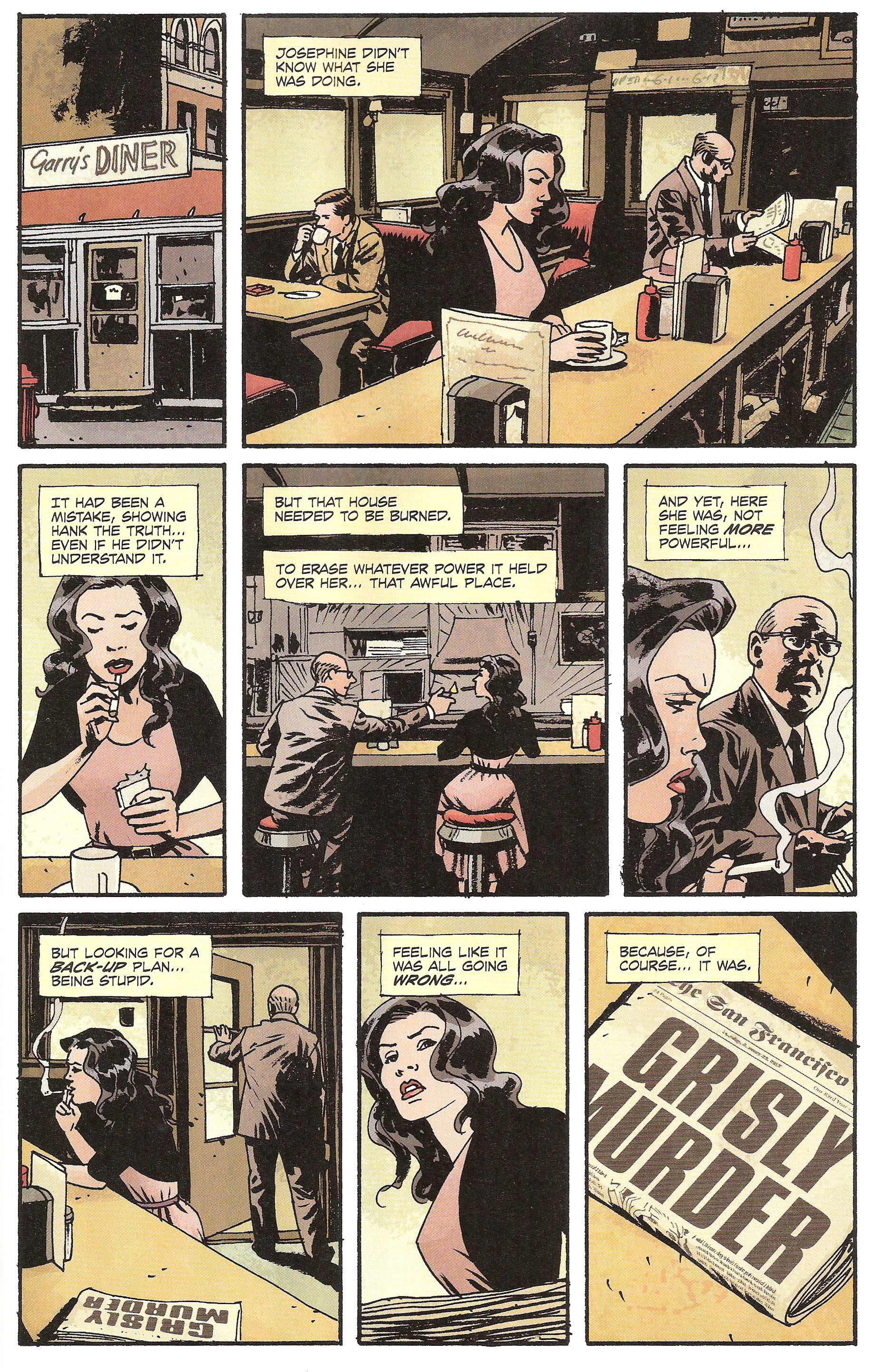
You will also need to vary your camera shots. Nothing gets stale faster than comic pages with the same shots repeated over and over and it’s even worse when you up the panel count because you end up multiplying this effect. (Wally Wood’s 22 Panels, anyone?) As an example, take a look at this page:
- Panel 1: Establishing shot from outside the diner
- Panel 2: Wide shot of Jo and the other customer reading a paper, seated at the counter as seen from behind the counter
- Panel 3: Medium shot of Jo from the front
- Panel 4: Wide shot of Jo and the other customer seated at the counter, this time from the back, as he’s lighting her cigarette
- Panel 5: Tight side shot of Jo with the customer in the background
- Panel 6: Wide shot of Jo sitting at the counter with the paper near her while the other customer steps out – this is an inverted shot from panel 2
- Panel 7: Worm’s eye view of Jo with the paper in the foreground
- Panel 8: Close-up of the paper with the headline visible
There are no repeated shots here despite the page containing a whopping eight panels. Every shot is unique. That’s the way you can engage your reader with a scene as mundane as a woman sitting in a diner and not doing much else.
It’s also why it’s so important as a writer to learn to think visually. A problem that crops up often on Steven Forbes’ Proving Grounds is writers who think like storytellers instead of comic crafters. They write a script as if they were directly telling the reader a story instead of giving the artist the instructions he needs to tell the reader that story himself. The same way novel writers read novels to expand their word vocabulary, comic writers should read comics to expand their visual vocabulary. Go carefully through your weekly pull. Borrow your friends’ comics. Read trades at the library. Plunge deep into the quarter bin at your LCS and don’t come back for air until your eyes water from all the foil covers.
Just don’t download illegally, okay?
POP QUIZ! Justin! Are you still with us? Can you have a look at the page above, the one where Hank is being followed and then jumped by the cop, and give me alternate shots for each of these panels?
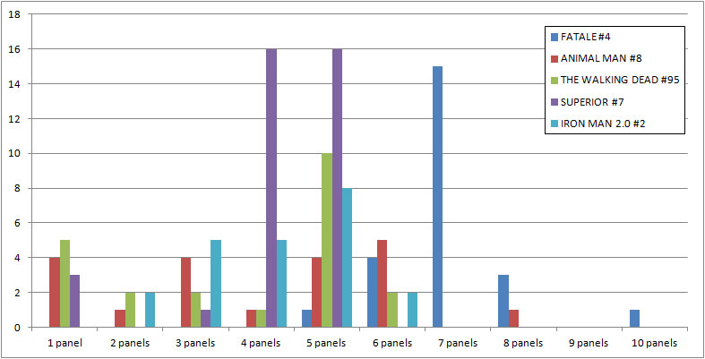
Just before we get to the Lesson Learned, here’s an interesting intellectual exercise: I’ve tallied some statistics on the number of pages by panel count for several comics, comparing FATALE #4 to:
- A comic from the same week – Jeff Lemire’s ANIMAL MAN #8
- A comic from last week – Robert Kirkman’s THE WALKING DEAD #95
- A comic from last month – Mark Millar’s SUPERIOR #7
- A comic from last year – Nick Spencer’s IRON MAN 2.0 #2
As you can see, FATALE peaks higher down the panel count scale with most of its pages counting 7 panels. ANIMAL MAN is pretty much equally distributed along the axis while THE WALKING DEAD and SUPERIOR stick around 5 panels (with an equally impressive amount of 4 panels for the latter). IRON MAN 2.0 hovers around 5 panels per page as well with a noticeable amount of 3 and 4-panel pages. I’d love to stick to this subject as the data here is quite pregnant with ideas, but I know you’re all eager for more Points of Impact instead!
Lesson Learned
There’s no hard rule about panel count. All the rules you’ve heard about the subject are nothing more than generic guidelines. However, if you want to up your panel count, you’ll need to do two things. First, you need to have content enough to fill those panels. These aren’t necessarily speech balloons or captions; they can also be silent establishing shots, character reaction shots or close-ups of objects. As long as it’s not padding! Second, you’ll need to vary the shots you use to keep the viewpoints fresh in these densely packed pages.
MISS
The inefficient dialogue in Scott Snyder’s SWAMP THING #8
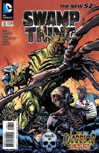 This week’s MISS was a real heartbreaker for me since I’m a big fan of Scott Snyder. In fact, Mr. Snyder has been awarded the HIT! in the first two Points of Impact columns I did here and has also gotten several mentions back when I was only doing this on my blog. But in any event where anything is graded, someone has to take the low position and Scott Snyder assumes it this week with his dialogue in SWAMP THING #8.
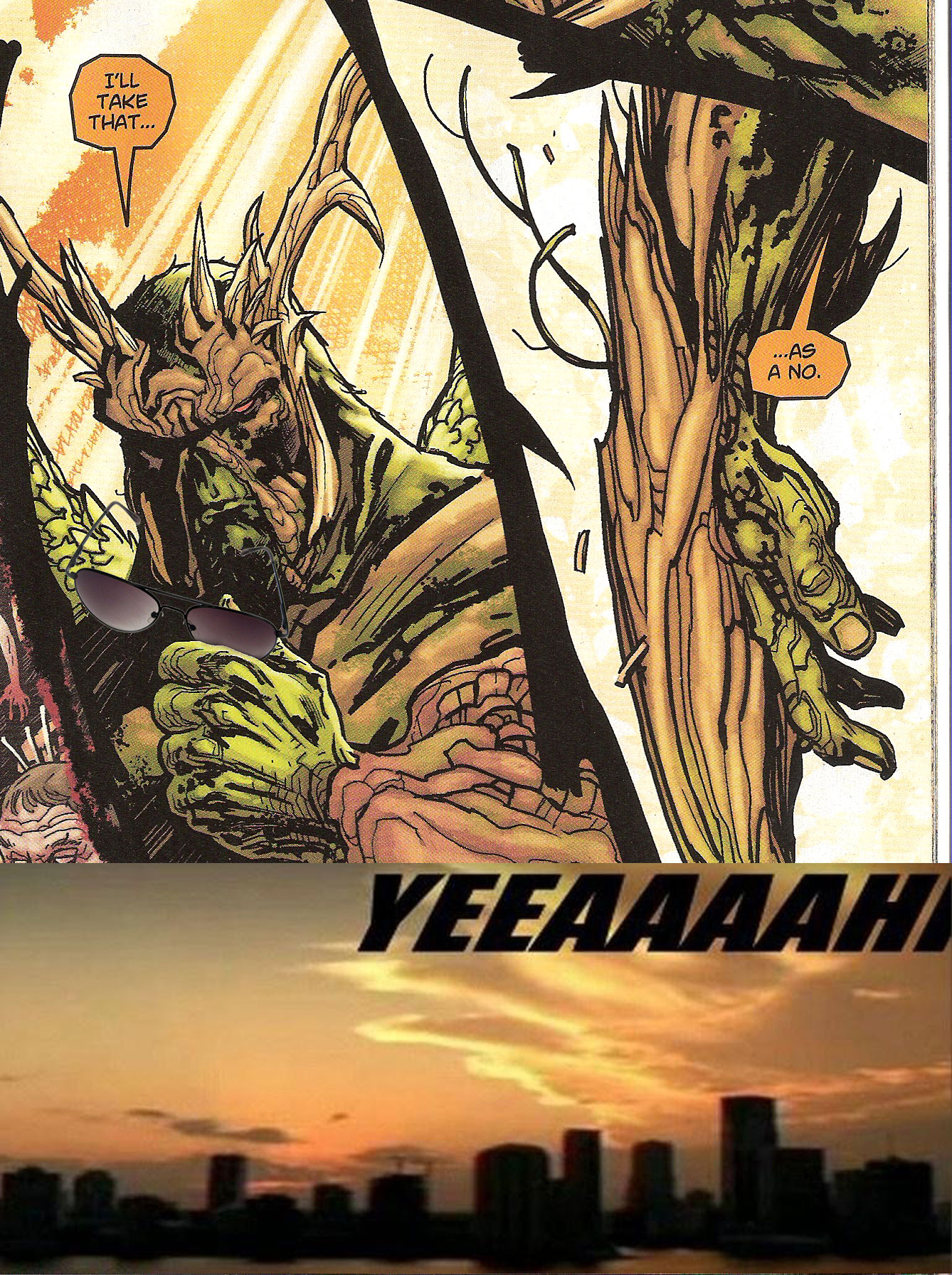
In an uncharacteristically un-Snyder way, we find dialog boxes upon dialog boxes crowding up otherwise silent vistas. Basically, this is Sethe talking to himself (his subjects are nothing more than an extension of his own conscience). After that, it’s Swamp Thing’s turn to talk to himself.
Once they’re both done with their monologues, we get spoken dialogue. Apart from the first couple of pages, most dialogue lines in this issue are Sethe and Swamp Thing going back and forth about how each of them is going to win the fight.
What this dialogue fails to accomplish is strong characterization. What little it reveals about the speaking character has to fall under the caveat of the unreliable narrator as it’s never contrasted to what anyone else has to say – well anyone not in direct opposition. That means we get a more flowery version of No, you!
Compare this with this month’s issue of ANIMAL MAN in which Buddy has arguments with both his wife and mother-in-law. Even Socks the cat gets his word in! Sure, Buddy gets some me-time in the form of inner monologue captions near the end of the book, but by then it’s possible to confront these lines with those spoken by other characters, thus creating a richer meaning through contrast. When Buddy Baker starts talking and acting like a superhero, the meaning of his behavior is enriched by the exchanges he had earlier with a very distraught Ellen. In comparison, as Alec Holland gets all tough when facing Sethe’s hordes, we can only take his word for it because there’s nothing else to provide it with any depth.
Finally, I have to admit that this was a very fast read. There were a lot of silent panels in this issue which comes as no surprise since it was basically just a setup to and a fight. Of course, Yanick Paquette’s work on these scenes is quite commendable. I only wish there would have been more words to accompany his gorgeous art.
Mind you, the first few pages were typical solid Snyder with the use of multi-layered narration that won him the HIT two weeks ago so all is not lost: the writer we all know and love is still in there!
POP QUIZ! Anyone who has read the comic can answer this one: tell me about the use of multi-layered narration in this issue of SWAMP THING. We’ll see who retained their lessons from two weeks ago!
Lesson Learned
Strong characterization can be achieved by setting up meaningful dialogue between characters. It’s by bumping their personality against another character’s personality that you can better define your protagonists and antagonists. If you just have them narrating to themselves or engaging in petty repartee with their nemesis, you’ll create no feedback for their traits and the readers will just have to assume – for example – that a character is noble because you just told them he is.
Honorable Mentions
- There’s a magnificent fight scene in Jeff Lemire’s ANIMAL MAN #8 that completely silent and yet even more emotionally charged than the one closing the book.
- Steven Niles makes great use of ironic echo in his dialogue of CRIMINAL MACABRE: DIE, DIE, MY DARLING. 10 points to Dark Horse!
Dishonorable Mention
- Bill Willingham’s plot for FAIREST #2 committed the capital sin of not accomplishing anything this month. And that’s bad.
That’s all for now. Check us out again next week; we should be here! In the meantime, keep reading, keep writing and never trust a man in a bark beard.
* * *
 Yannick Morin is a comic writer, editor and vivisector hailing from the frozen reaches of Quebec City. You’ve just caught him with all of his endeavors being drawn by artists right now. You will however soon see his work in IC Geek Publishing’s JOURNEYMEN: A MASTER WORK anthology (spring 2012) as well as in ComixTribe’s OXYMORON anthology (fall 2012). Of course he also has a few other projects on the side but it’s all very hush-hush at this point as you can imagine.
Apart from complaining about running out of time for writing, Yannick also acts as ComixTribe’s Digital Comics Manager, making sure the electronic shelves are well stocked with the Tribe’s offerings.
For more of what spills out of his brain, have a look at his blog Decrypting the Scripting. You can also feed his ravenous ego by following him on Facebook and Twitter.
Related Posts:
Category: Columns, Points Of Impact











“. In any case, never forget that pacing is about maintaining your reader’s interest high and to keep him turning pages – the faster, the better! ”
Danger Club 1 strikes me as being a high octane action story in the vein of Warren Ellis’s The Authority.
I find the notion that you can extrapolate universal pacing rules from it to be a real stretch.
Heck from what I recall Lord of the Flies doesn’t have kids decapitating each other by page 10, it builds to the action.
Just for the sake of argument, couldn’t even a “high octane action story” also follow rules? Excitement doesn’t exclude formalism after all.
Anyway, I think I should clarify something: I don’t claim any of the “Lessons Learned” to be universal rules. Rather, the purpose of Points of Impact is to look at things that work in the comics you read and to try and extract the *method* that could let another writer achieve similar – if not identical – results. It’s about looking at your weekly comics haul from the practical viewpoint of a comic crafter in order to pick up tips and tricks, not to infer any theoretical “rules”.
Can you tell I hate that word? 😉
As for Lord of the Flies, it’s been 20 years since I’ve read it so the only thing I retained from it is the premise, not its pacing structure. That’s why I was referring to the former rather than the latter in my text.
Thanks for taking the time to leave a comment, Scott! I appreciate it. You’ve given me a great opportunity to clear some things up. I hope you come back in the next weeks to find other things of interest to you in this column!
Some of the later Walking Dead issues have great pacing. Nary a zombie in sight, yet the pages flow wonderfully.
At the moment I’m reading ‘Jimmy Corrigan, the Smartest Kid on Earth’, and it’s devoid of action. Sometimes pages can elapse without dialogue, yet the story is so immersive that you can’t help but dive deeper.
Cheers
Liam
Indeed, Robert Kirkman’s THE WALKING DEAD presents some spectacular issues where the “action” is nothing but psychological, yet the pacing is – as you’ve pointed out – top-notch. Nice find, Liam!
I haven’t read ‘Jimmy Corrigan, the Smartest Kid on Earth’. I’ll have to track it down! Thanks!
“Just for the sake of argument, couldn’t even a high octane action story also follow rules? Excitement doesn’t exclude formalism after all.”
Some rules, sure. Pacing rules? I’d argue it’s paced completely different than Runaways #1, for example. You could write an essay comparing and contrasting the two.
And maybe I will! 🙂
But seriously, I agree that – thankfully! – not all comics follow the same “rules”, pacing-wise or other. It all depends on what the creator aims to accomplish with his story. And we’re back to what the purpose of Points of Impact is: looking at how one writer did one cool thing and how you could reproduce that cool thing yourself.
Last week, DANGER CLUB #1 had pacing that worked exceptionally well in my opinion and I explained why. Next week, who knows? I might praise another comic for its pacing, even though it tackles that issue in a completely different way. None of them are right or wrong; they might both work according to their respective premise. One thing is sure: you won’t read me say that one contradicts the “rules” established by another.
Talking about panel count. I was reading Essential Spider-man volume 4, and I was surprised by how many three panel pages there were, with more dialogue balloons then you’d find on three PAGES of most modern marvel comics.
Right after reading your comment, Conner, I went to my LCS and had a look at some Essential Spider-Man volumes and you’re right on one point: the bubble count is through the roof in these old comics. This is due in part to some old habits of the time that had the writer put in as much info as he could in the dialogue *in case* the art wasn’t clear enough for the reader. Drawing techniques, tools and printing technology have since evolved enough that this “safeguard” has been dropped.
However, I’ve found the pages still surprisingly dense with a majority of 5 and 6-panel pages. Of course, that doesn’t mean the panels you’ve cited as examples don’t stand out! I’ve seen a couple of occurences where Spidey almost recites War & Peace in its entirety in the space on a single kick to Doc Ock’s face!