Points of Impact – Week 5: Setting ‘Em up, Knocking ‘Em Down
April 2012 – Week 3
You came back! Here it is then: another edition of Points of Impact, the only place where writers can get good press for bad writing!
As always
- The BULLSEYE! section presents something that really wowed me. That’s usually when a writer does something unique among his peers.
- The HIT! section picks up on a cool trick that gets used pretty often – mostly because it works – but of which I’ve found a prime example.
- The MISS section however isn’t about praising a good shot but – as you guessed it – pointing out where a writer stumbled so you don’t put your feet in the same hole.
You know I say this every time but it bears repeating: this column is absolutely spoilergetic! Read it before your comics and weep, or read it after you comics and smile. Your move!
BULLSEYE!
The setup of expectations in Terry Moore’s RACHEL RISING #7
 Expectations. We all have them when reading and the writer – and often the genre itself – relies upon them. Without expectations, you couldn’t get a laugh from a joke, you couldn’t present an engrossing investigation in a whodunnit and you couldn’t generate any tension in a ghost story. The setting up and the dashing of expectations is thus an essential storytelling device in comedy, mystery and horror, all three genres that are mostly built upon the setting up and the unexpected dashing of expectations.
It comes as no surprise that Terry Moore’s RACHEL RISING, a comic that takes after each of these three genres, would at some point use this device to impress a noticeable effect upon its readers.
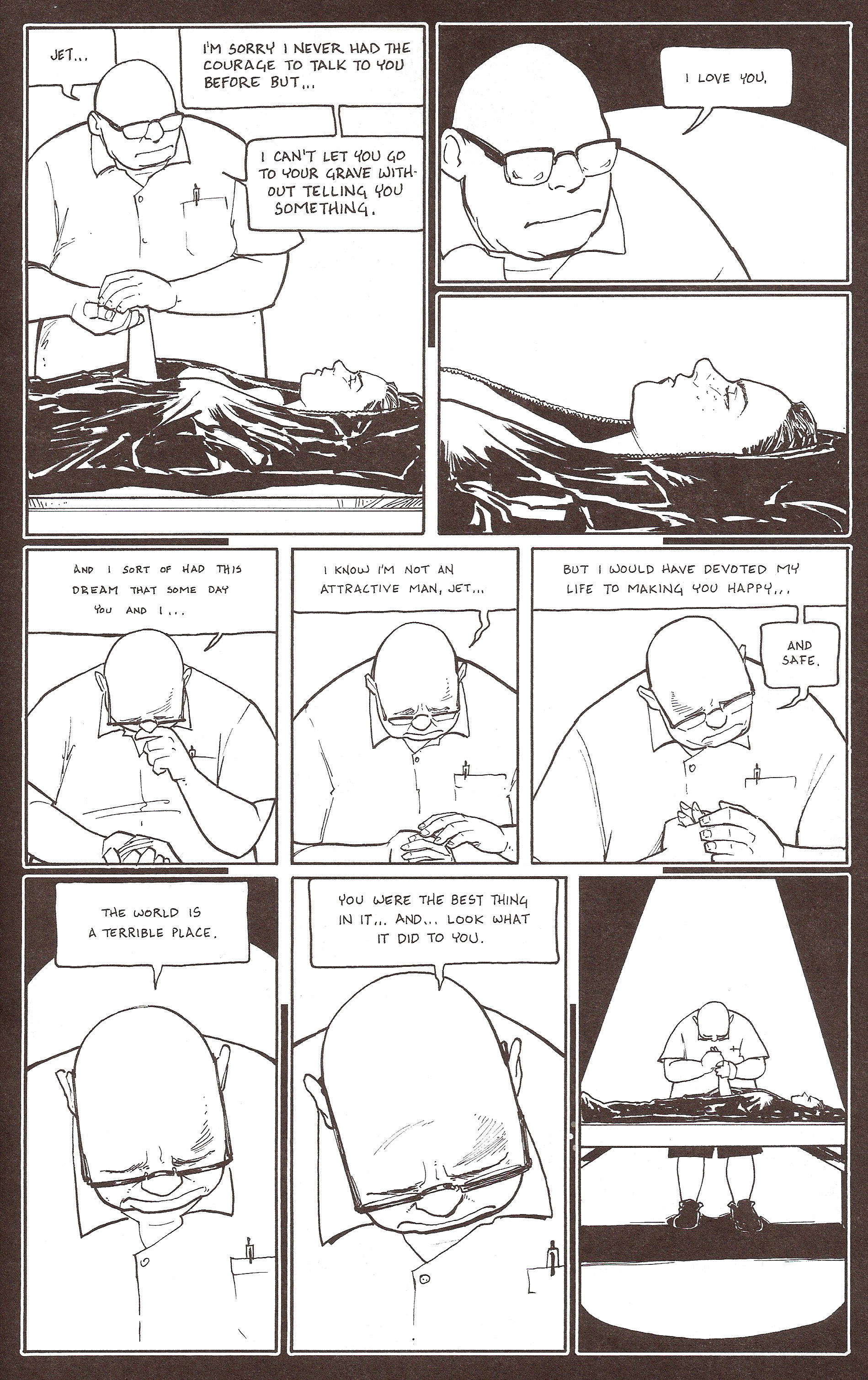
Our example scene literally “opens” with Earl, a mortician, zipping open the body bag containing the body of Jet, Rachel’s best friend who died at the end of the previous issue. As he hovers over her still and naked form, the large bespectacled man comments upon her devastated beauty, result of the brutal car accident in which she was involved. And he stands there, looking at her, his emotionless – eyeless even – face staring down at her body. At this point, Earl is an unreadable blank slate upon which the reader can impress his expectations.
And these expectations take a turn for the ugly when he leaves her side to lock the door.
We’ve all heard stories. We all know of these occurrences – fictive or real – where things have been done to young girls’ bodies behind closed doors once death had robbed them of any way to defend their dignity. Just to be sure our mind veers into that particular gutter, Moore has already presented us with a sexually abusive figure in the previous issue. We know that the writer is ready to take us into very dark and dirty places. He already fooled us once by showing us a prospective adoptive father who turned out to be a sexual predator. Earl’s appearance here – however neutral it might be – is fertile ground for growing our own ideas of his character at this point.
That’s when Moore decides to add some rough texture to the canvas, by showing him undertaking actions that do nothing but confirm our expectations.
He’s now alone, behind a locked door. He’s turned off the webcam on the nearby laptop. No witnesses, no recording. The fat ugly man can now do whatever he wants with the body of this beautiful young girl, a girl who wouldn’t have given him a second glance – and if so probably in disgust – while she was alive. Except now she can’t defend herself anymore. She’s all his now and there’s nothing she or anybody else can do about it.
He approaches the body – his face always so disturbingly expressionless – and he takes her hand.
And then…
This was without a doubt one of the most heartfelt things I’ve ever read in a comic.
He wasn’t staring disturbingly, he was gazing adoringly. He wasn’t hiding behind lcoked doors, he was bashful about his feelings. He wasn’t lusting for her body, he was mourning the love they never shared. Every negative, sexual and perverted intention we impressed upon Earl was the fruit of the expectations that Terry Moore carefully cultured up to this point, expectations we projected upon what appears – in hindsight – as nothing but a neutral white screen.
In order to achieve this however, Moore had to set up three essential elements for this device to work:
- Previous occurrences – The appearance of the abusive foster father in the last issue established that sexual predation and deviancy were part of this comic’s world. It’s a subject that can be broached. It’s the same logic that makes us expect people to have superpowers in the Marvel Universe. Of course, Moore is also helped by other occurrences from other works of fiction as well as in real life. However, setting up a prior event in this world is more efficient than just relying on the reader’s other readings or knowledge of real world events.
- Ambiguous circumstances – Earl is a large ugly man. He locks himself in with the naked body of a young woman. He makes sure not to be disturbed or recorded. These are all circumstances that invite suspicion and are ripe to be interpreted in the same vein as the previous occurrences mentioned above.
- A virgin canvas – Notice how we never see Earl’s eyes or how his mouth never betrays any emotion up to the moment he’s declaring his love for Jet. Earl is a blank slate, ready to accept any trait we’ll be led to apply to him. Sure, Moore could have given him shifty eyes and drawn him always licking his lips as his hands hover over the girl’s body. But this would have undermined the whole device since our expectations wouldn’t have been our own. Instead they would have been dictated by an actual demonstration of reprehensible behavior. Hence, our reaction upon that last page would have been confusion and irritation at the obvious discrepancy between appearance and substance. What the scene rather achieves is that we find ourselves genuinely and pleasantly surprised by the power of our own imagination.
And soliciting the reader’s imagination is always one of the best ways to engage him emotionally.
Lesson Learned
Creating expectations and then contradicting them is a common technique used by fiction writers. However, you must be careful not to spoil your surprise too soon or offer a contradiction so jarring it just doesn’t make sense. In order to get the best result, try to introduce these three elements: previous occurrences to make the expected development plausible, ambiguous circumstances to lead your reader astray and a virgin canvas on which his expectations can be projected without any detail to prevent them from sticking.
HIT!
The super-scene in Scott Snyder’s BATMAN #8
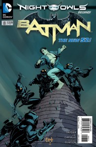 ERRATUM: Richard Douek wrote me to point out that I miscredited this entry. Indeed, this scene is part of the backup story which has been co-written by Scott Snyder and James Tynion IV. Big thanks to Rich for pointed out my error and my apologies to Mr. Tynion for leaving him out of the spotlight!
Here’s the problem: you need to show scenes in roughly 40 different locations all occurring at once. This is a major plot point, one on which will hinge an entire event implying almost a dozen titles, so you can’t gloss over it by having it happen behind the scenes.
Oh and you’ve got no more than a couple pages of a backup story to do it.
This is the challenge that Scott Snyder took up in BATMAN #8, kicking off the long-awaited Night of the Owls. The Talons’ attack upon the various public figures of Gotham City is the starting point of the event. It’s also the justification for implicating all of Gotham’s resident heroes and thus bringing their title under a common banner. Let’s have a look at how he does it
(Please forgive me for the scan quality as I have a very small scanner and this is a very big spread.)
Notice how many locations we visit throughout that spread. I count six (including one we’ve seen just before the page-turn). Showing what goes on at every one of these locations – not to mention the rest of the implied locations on the Owls’ hit list – would easily take up the whole comic. However, just showing what goes on at the few sampled locations would still take up a sizable chunk of the page count. What to do, what to do?
The answer is staggering. Not that’s it’s shocking. I mean that Snyder staggers the different part of the narrative, switching from one location to another, but always moving forward in time. When he’s done showing us what happens in one place, the next place we visit shows us something that happens after that previous scene. All of these little vignettes aren’t simultaneous, they’re consecutive.
To further solidify the link between these scenes, Snyder also takes care of threading a common dialogue through it all. Even though we understand that the spoken lines don’t belong all to the same assassin but are in fact said by each of them in their respective location, it still lends a sort of homogeneity to the scene, providing the cement required to make all these bricks form a coherent whole. The close-up on a menacing Talon brings this sequence to a close by concentrating the common elements of each scene into one final panel.
What elements did Scott Snyder use to achieve this effect? Let’s see:
- Multiple locations – According to the story, he had the choice between 40 locations as this was the number of targets on the Talons’ hit list. We could also theorize that it would be possible to pull this off with fewer locations – two or three, for example – and switching back and forth between them.
- Continuous forward movement in time – Everything occurs on the same timeline. Nothing happens simultaneously. When we leave one scene for another, time has elapsed while the former was going on.
- A common thread – In this case, there were two elements filling this role: the presence of the faceless and easily interchangeable Talons, and the continuous dialogue.
By combining these three factors, Snyder is able to obtain a staggering effect, rapidly switching from one scene to another with minimal need for transitional devices, and – most importantly – combining a multitude of separate scenes into one coherent super-scene.
Lesson Learned
Switching rapidly from one scene/location to another can often cause confusion for the reader when you don’t have the panel count to do proper transitions and establish your shots. A way to solve this problem is to combine all of your mini-scenes into one super-scene . The main trick for this to work is to have continual forward movement in time – each scene occurs after the previous one – and a common thread to fuse the entire composite structure into a cohesive whole.
MISS
Robert Kirkman tells instead of showing in THE WALKING DEAD #96
 O how the mighty have missed. This week’s third entry proves how easy it is to slip from a BULLSEYE to a MISS in the space of a couple of weeks. Last week, it was Scott snyder’s turn to feel the sting, this week it’s Robert Kirman’s.
Show, don’t tell is an oft-cited maxim that doesn’t apply only to comics. Novels, movies, TV series – sooner or later, someone’s going to get hit with the showy stick since it’s so very easy to fall into that trap. After all, why go through all the trouble to set up scenes where the characters’ words and actions become concrete testimony of their motivations when they can just come out and say it.
And boy does Kirkman say it this time.
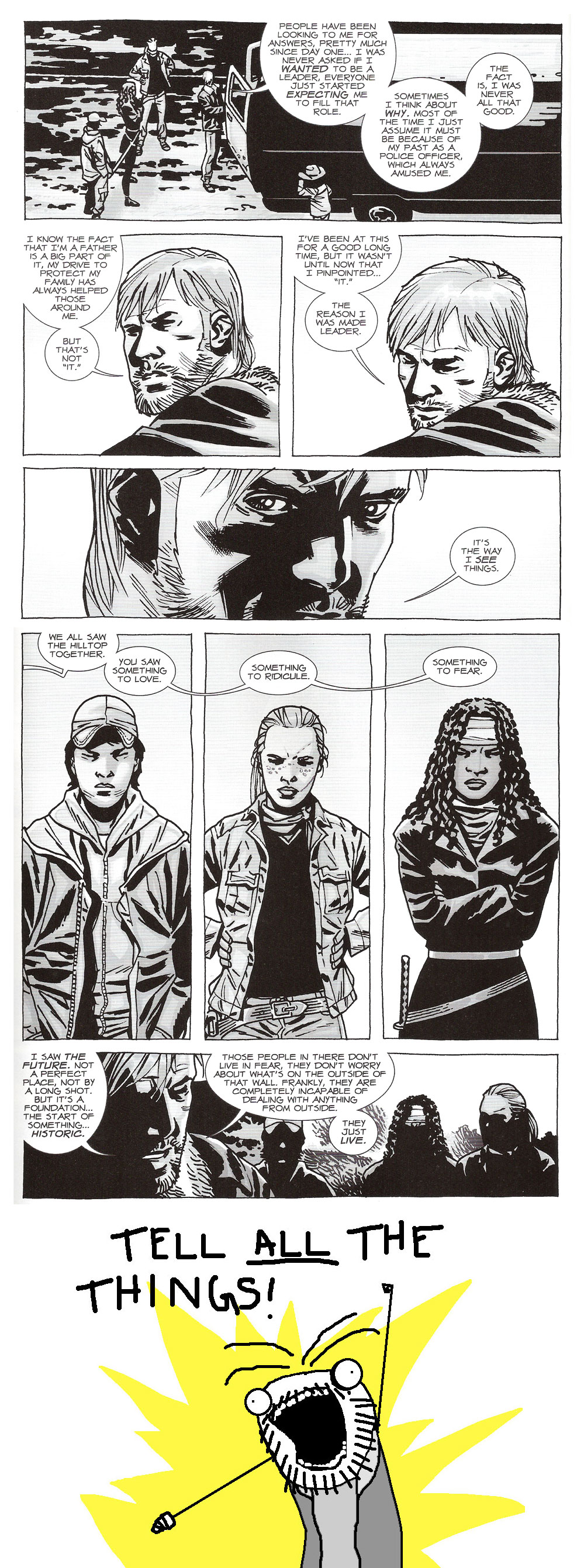
Towards the end of the comic, Rick gets chewed up by both Michonne and Andrea for proposing their help to the Hilltop , the other community they discovered through the course of the A Larger World story arc. Of course, Rick needs to sell his point that coming to the Hilltop’s help is not only beneficial to them but is actually the key to obtaining what they’ve always wanted since the series started: a way to live life as they knew it before the Walking Dead.
Well, that’s what I took away from it after wading through a few pages of late exposition.
You see, instead of just getting his point across with sensible arguments and actually – I don’t know – discussing the situation with his fellow survivors, Rick launches into a seven-pages long speech about his own character, that of his friends as well as his motivations for entering the next story arc. Mind you, no one ever tries to get a word in throughout all this; they just stand there listening to him.
And if this wasn’t enough to give you the first tiny bit of suspicion that all this talk is filler, you’re treated to two whole splash spreads showing Rick talking and a final splash page of a close-up of Rick’s face. I need to say this again because you need to appreciate its significance: the final page is a close-up of Rick’s face. And not for him to deliver a clever revelation. Not for a gripping cliffhanger. Here’s the text:
RICK: THIS CHANGES EVERYTHING. CAN’T YOU SEE THAT?
RICK: WE CAN FINALLY STOP SURVIVING
RICK: AND START LIVING.
Wasn’t that the whole point of all of the 95 previous issues? Settling down to live and then moving on again when zombies/bandits/sadistic political figures showed up to screw things up? What’s so different this time?
In any case, I assure you, Mr. Kirkman, sales of THE WALKING DEAD trades are high enough to ensure most of your readers have a good grasp of your characters. There was no need for this handy guide you’ve just provided us. Just keep on upping the stakes and we’ll keep on reading.
But please show us the stakes.
Lesson Learned
Showing character motivations and intentions is a lot harder than just having them come out and tell the reader about it. You need to set up dialogue and situations to present the inner mechanics of a character in a concrete way and trust your reader to pick up on the manner your creation reacts. That way, you get a kick out of overcoming that challenge and showing off some clever writing, and the reader has the satisfaction of meeting you halfway into the story – which feels a lot more engaging to him. Of course, sometimes you can’t help but just tell, but if you do, try not to stretch it out for a third of your comic, okay?
Honorable Mentions
- Scott Snyder almost had a hit for his fake establishing shot of Gotham City in the opening of BATMAN #8 but the super-scene won out instead.
- Kyle Higgins did a nice bit of caption bait and switch in NIGHTWING #8 when his monologue boxes turned out to be emanating from a narrator in the present rather than in the flashback as the opening seemed to indicate.
- I owe Angelo Tirotto an apology for underestimating NO PLACE LIKE HOME. Issue 3 finally made it clear to me that this is in fact a great slasher story and not a badly-structured supernaturally-tinged murder mystery, as I was led to believe by some media outlets. This misleading info sadly tinted my view of his comic and explains why I had so much trouble reconciling what I read with its supposed genre. On a more personal note, I might add that this title has earned a definite place in my pull list.
- Greg Rucka used some astute dual-purposed captions in THE PUNISHER #10.
- The main character of Peter Hogan’s RESIDENT ALIEN #0 had some running commentary captions that fitted in a perfectly organic way with the rest of the dialogue.
Dishonorable Mentions
- Jay Faerber’s plot for NEAR DEATH #7 called for a character to decide if he wanted to change his life for the better. Unfortunately, this central plot point happened off panel.
- That looong central scene in Garth Ennis’ THE SHADOW #1 was a tiresome unending slab of exposition. Did I mention it was long too?
Well that’s enough for this week. Join me next week when I’ll probably talk about – oh, I don’t know comics?
* * *
 Yannick Morin is a comic writer, editor and vivisector hailing from the frozen reaches of Quebec City. You’ve just caught him with all of his endeavors being drawn by artists right now. You will however soon see his work in IC Geek Publishing’s JOURNEYMEN: A MASTER WORK anthology (spring 2012) as well as in ComixTribe’s OXYMORON anthology (fall 2012). Of course he also has a few other projects on the side but it’s all very hush-hush at this point as you can imagine.
Apart from complaining about running out of time for writing, Yannick also acts as ComixTribe’s Digital Comics Manager, making sure the electronic shelves are well stocked with the Tribe’s offerings.
For more of what spills out of his brain, have a look at his blog Decrypting the Scripting. You can also feed his ravenous ego by following him on Facebook and Twitter.
Related Posts:
Category: Columns, Points Of Impact










This is a great column, Yannick. If I had one complaint, it would be that the honorable/dishonorable mentions should be thoroughly analyzed to the same extent as the bullseye/hit/miss sections. Yes, that’s right, make the column longer! 😉
I always suspected you wanted my death, Don, but now I have proof. In the case of my untimely demise while writing this column, my attorneys will receive a copy of this comment! 😉
It’s good to hear you like the column! Thanks!
Oh and just for the record, I actually force myself to write less in order to still have time to write other things. Otherwise, I don’t know how I’d manage to write any comics too!
Hey Yannick!
The Lessons Learned recaps are proving to be invaluable. It definitely comes across in your writing that you’re having a blast teaching others while learning at the same time.
Loving this column!
Thank you so much, Wes!
I think one of the greatest joys of learning new things is to share them with others. That is, after all, the very mission statement of ComixTribe: “Creators helping creators make better comics.” I was fortunate enough to stumble here a little more than a year ago and I’ve never left since. Now I get to give back some of what I’ve learned. I’m very grateful for this opportunity.
Thanks for chiming in and being – in that way – part of the Tribe! 🙂