Points of Impact – Week 7: Borrowing Some Eyes
May 2012 – Week 1
Welcome back to Points of Impact, where we read comics so you can write comics! And happy Free Comic Book Day! Don’t forget to visit your local comic retailer to see what goodies he has to offer on this fine and special day!
Anyway, you know the drill:
- The BULLSEYE! section presents something that really wowed me. That’s usually when a writer does something unique among his peers.
- The HIT! section picks up on a cool trick that gets used pretty often – mostly because it works – but of which I’ve found a prime example.
- The MISS section however isn’t about praising a good shot but – as you guessed it – pointing out where a writer stumbled so you don’t put your feet in the same hole.
Also, for the love of all the Kirby dots out there in deep space, go read your comics before reading this column! It’s extremely spoilermatic!
NEW! Following the suggestion of a reader, I’m now going to list the whole creative team for all three main books. Editors, I’m sorry to drag you into this if one of your books ended up a MISS!
BULLSEYE!
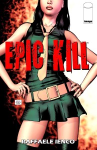
The alternate subjective viewpoint in Raffaele Ienco’s EPIC KILL #1 of 5
Script: Raffaele Ienco
Art: Raffaele Ienco
Inks: Raffaele Ienco
Colors: Raffaele Ienco
Letters: Raffaele Ienco (I suppose…)
Cover: Raffaele “Raff” Ienco (I can see his name right next to her hip.)
Editor: No one credited. Raffaele Ienco again? Maybe? I dunno…
Comics are mostly a third-person affair. Sure, we get to follow the main character around and often enough, we get to read his or her thoughts in all of those pretty floating boxes, but we essentially continue to see the world through the objective eyes of the writer. Apart from very notable exceptions (Mark Waid’s present run on DAREDEVIL comes to mind), what we see is the cold hard reality of what is there and nothing more.
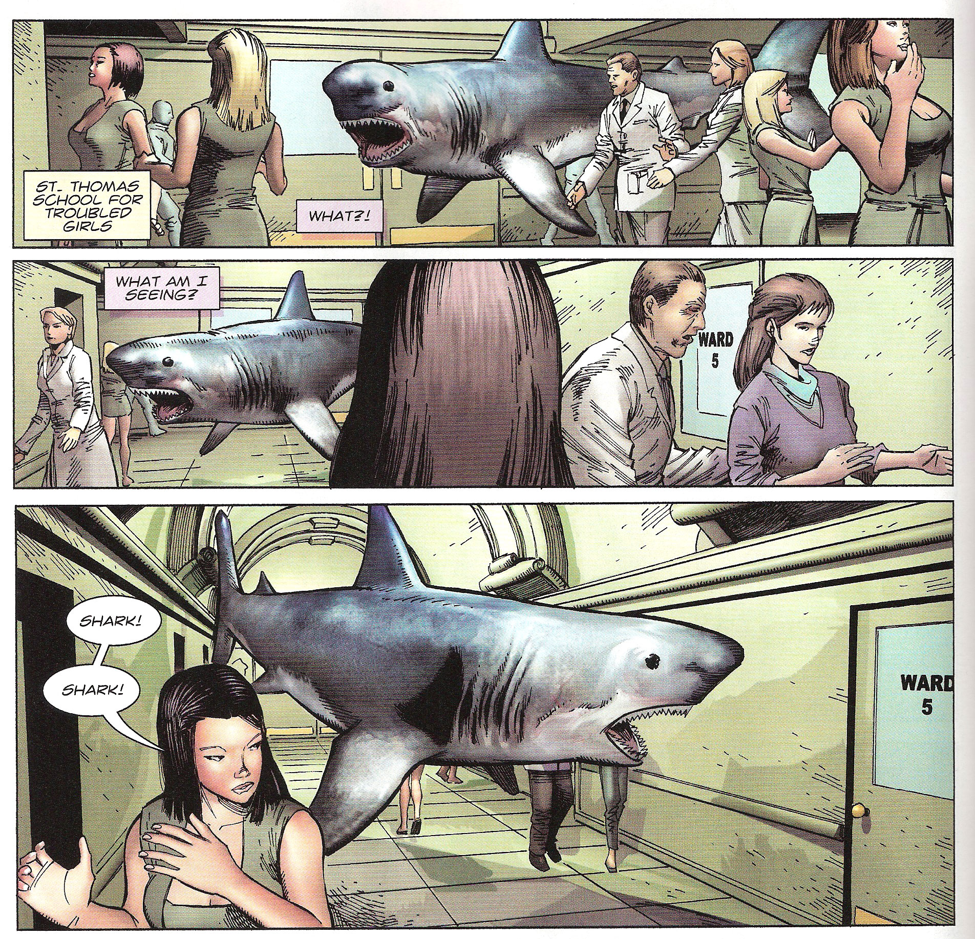
In his first issue of EPIC KILL, Raffaele Ienco takes us through the looking glass, into the world as his heroine, Song, sees it. Straight on page 2, we’re hit with a bizarre vision: a shark floating down a corridor.
Since we’re in a comic – a medium where the wildest premises are often accepted from the get-go – and that we’re just on the second page of a first issue – we don’t know if flying predatory fish are possible in this setting – we’re led to accept that this occurrence is par for the course in EPIC KILL. After all, we don’t see anyone else panicking about the man-eater, don’t we?
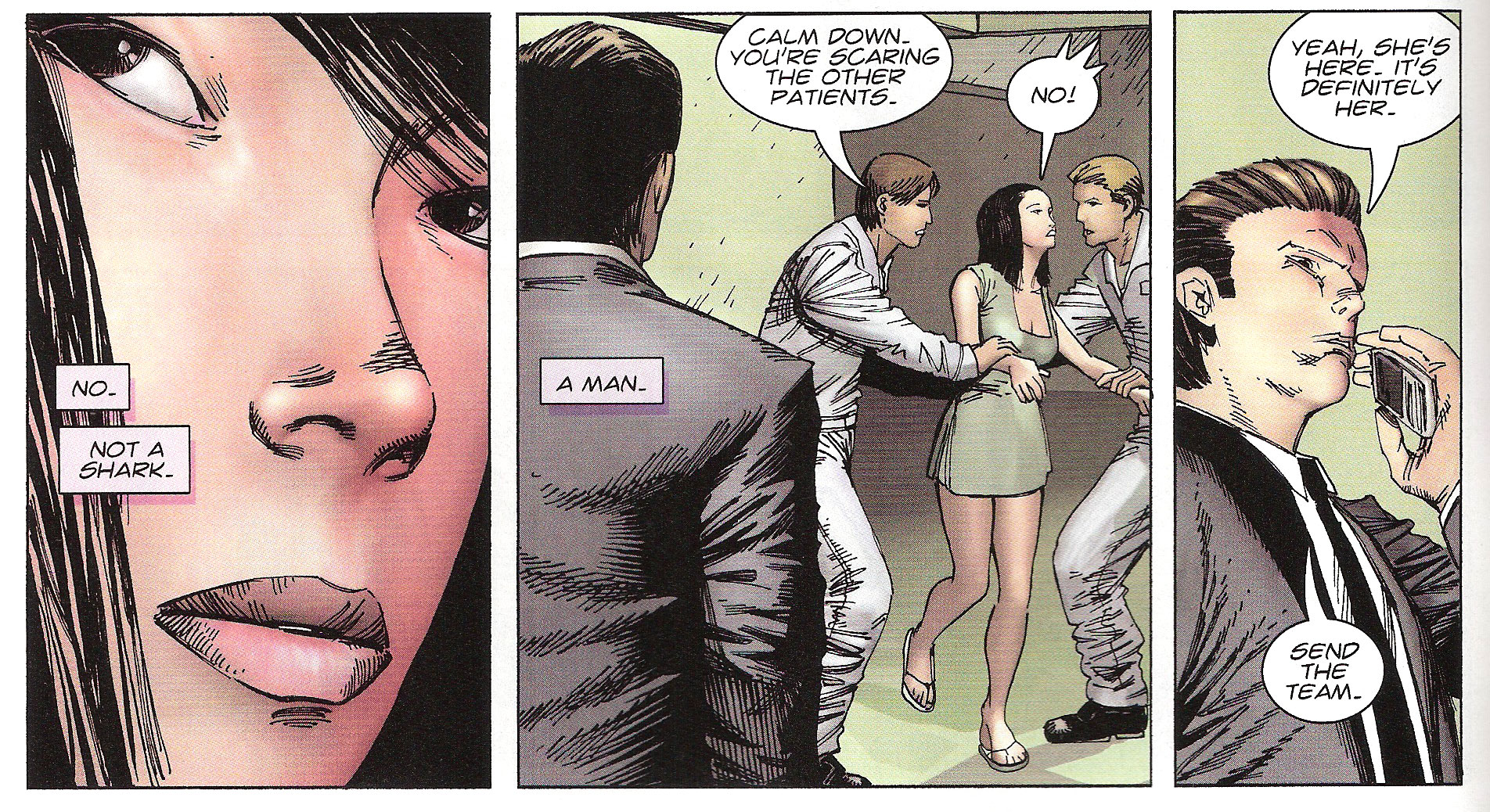
It soon becomes clear however that the shark was nowhere to be seen but in Song’s mind when she corrects herself.
A man who means Song some harm apparently. A man who was silently stalking her, stealthily slipping into her familiar world. Much like a shark in fact. It’s important to note that Song’s vision reveals the menace for what it essentially is, giving it a visual interpretation that fits with the nature of the threat. This further drives the point home that this way of seeing things is intrinsically personal to the character. What we see is the way Song perceives the man, not how he appears to the rest of the cast.
More importantly, notice that Song’s vision is shared with the reader. Her interpretation isn’t conveyed by the mean of words ( That man is a shark to me ), but by way of images: we see the shark ourselves even though it’s objectively not there for the rest of the characters present in that scene. It should be noted however that the use of this device is further justified by the fact that Song is apparently fooled herself at first by these visions. She doesn’t see the shark and immediately translate it as a man meaning her harm. Instead she first sees a shark – as do we – and then she understands the meaning of the vision. It’s only then that she sees the man as the others see him, thus letting us switch back to normal view .
Nor-mal view. Nor-mal view! NOR-MAL VIEW! (Sorry, MST3K flashback!)
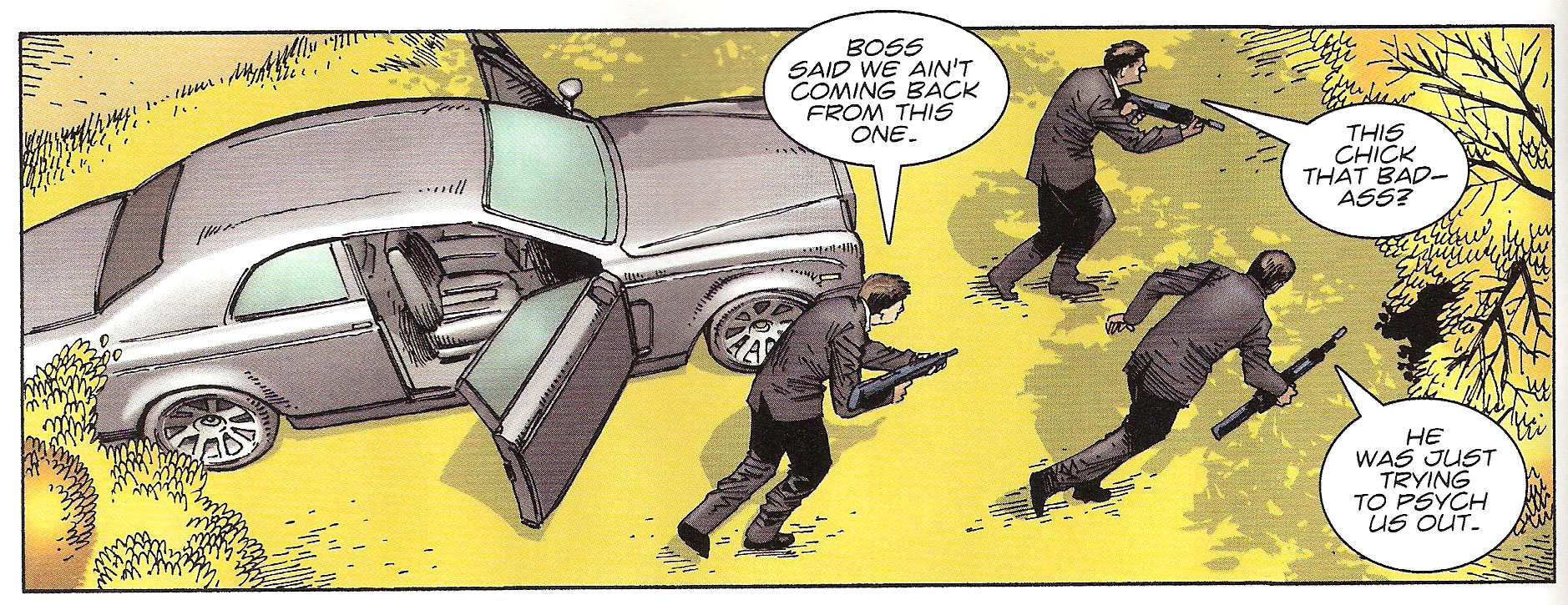
The same device is put to use later in the comic when armed men are sent after her. Even though we’re first aware of their very mundane nature
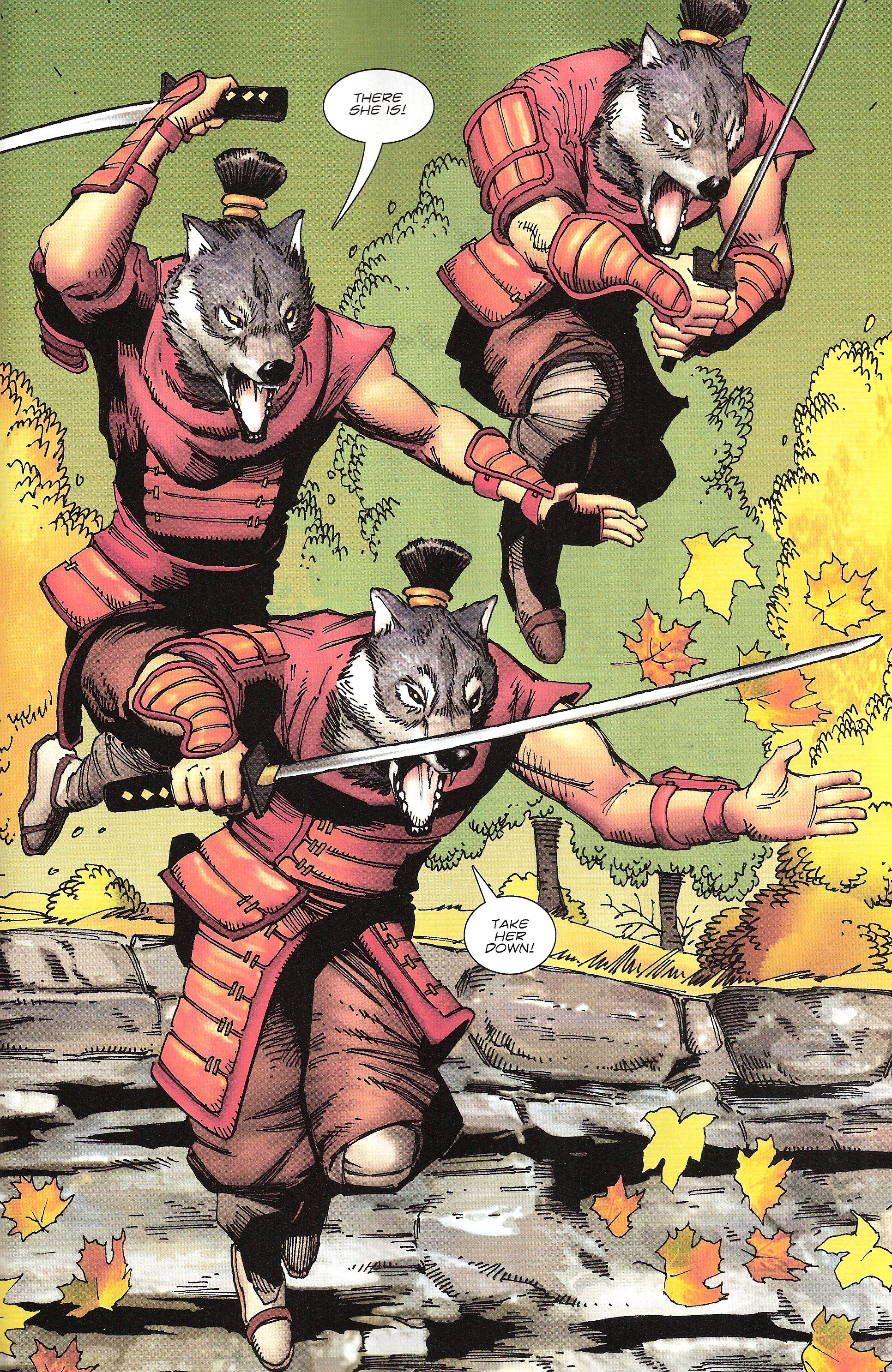
they reveal themselves as quite an unusual sight for Song when she first sees them:
Like in the case of the shark before, predators take the place of dangerous men: men intent on killing her become wolves in samurai getups – essentially a pack of heavily-armed hunters. The vision is also dispelled in the same manner: once Song has assessed the threat in a way that reveals its inner essence, she can see the men for what they appear instead of what they are, and then share that viewpoint with us.
What do you need to pull this off? Find what the object of the vision represents for your viewing character. Translate that into an image that is easily interpretable by your reader. For example, predatory animals like sharks and wolves carry clear enough connotations to be instantly taken as shorthand for concepts like danger , menace or hunter . Finally, don’t forget to revert to the standard objective viewpoint! Failure to do so might result in your reader taking your vision for the absolute truth, thus thinking that your world is actually populated by flying sharks and cosplaying wolves! How would he then tell the difference between visions and reality ?
Ultimately, this device has the effect of thrusting us right into the mind of a character by replacing the usual objective viewpoint by the character’s alternate viewpoint. This provides us with additional information about the character, information that could have otherwise been given through dialogue or thought captions. As such, it essentially replaces text.
In that sense, it’s one of the best and most original ways of showing instead of telling.
Lesson Learned
Thought captions are a great way to get into a character’s head but try and shake things up! A good way to do this is to switch from the usual objective viewpoint to an alternate subjective viewpoint. To do this, instead of showing things as they would normally appear, show them as what they represent for the character, using easily recognizable images to convey the concepts. Don’t forget to switch back though or your reader will think you’re setting your story in a fantasy world!
HIT!
The text-only first page in Nate Cosby and Ben McCool’s PIGS #7
Script: Nate Cosby and Ben McCool
Art: Breno Tamura and Will Sliney
Inks: Breno Tamura and Will Sliney
Colors: Chris Sotomayor
Letters: Rus Wooton
Cover: Humberto Ramos and Edgar Delgado
Editor: No one credited again. (Is there a detail I’m missing about a specific policy Image has related to editing?)
I like pretty pictures.
I think we all do otherwise we wouldn’t be reading comics! In fact, comics are such an intrinsically visual medium that it often gets a bad reputation as children literature or easy reading for the feeble-minded. Indeed, I’m sure most of us have been chided at some point in our childhood for reading comics instead of real books . How little did these people know that images are as much a part of language as writing! After all, aren’t letters nothing more than pictograms – images carrying a meaning – that being the very definition of a comic panel?
After having girded our loins time and again in the defense of images as literature, it’s strange to come across a comic like Nate Cosby and Ben McCool’s PIGS #7 that actually forgoes the use of them – at least for one page only! But can we fault something that works? Let’s have a look, shall we?
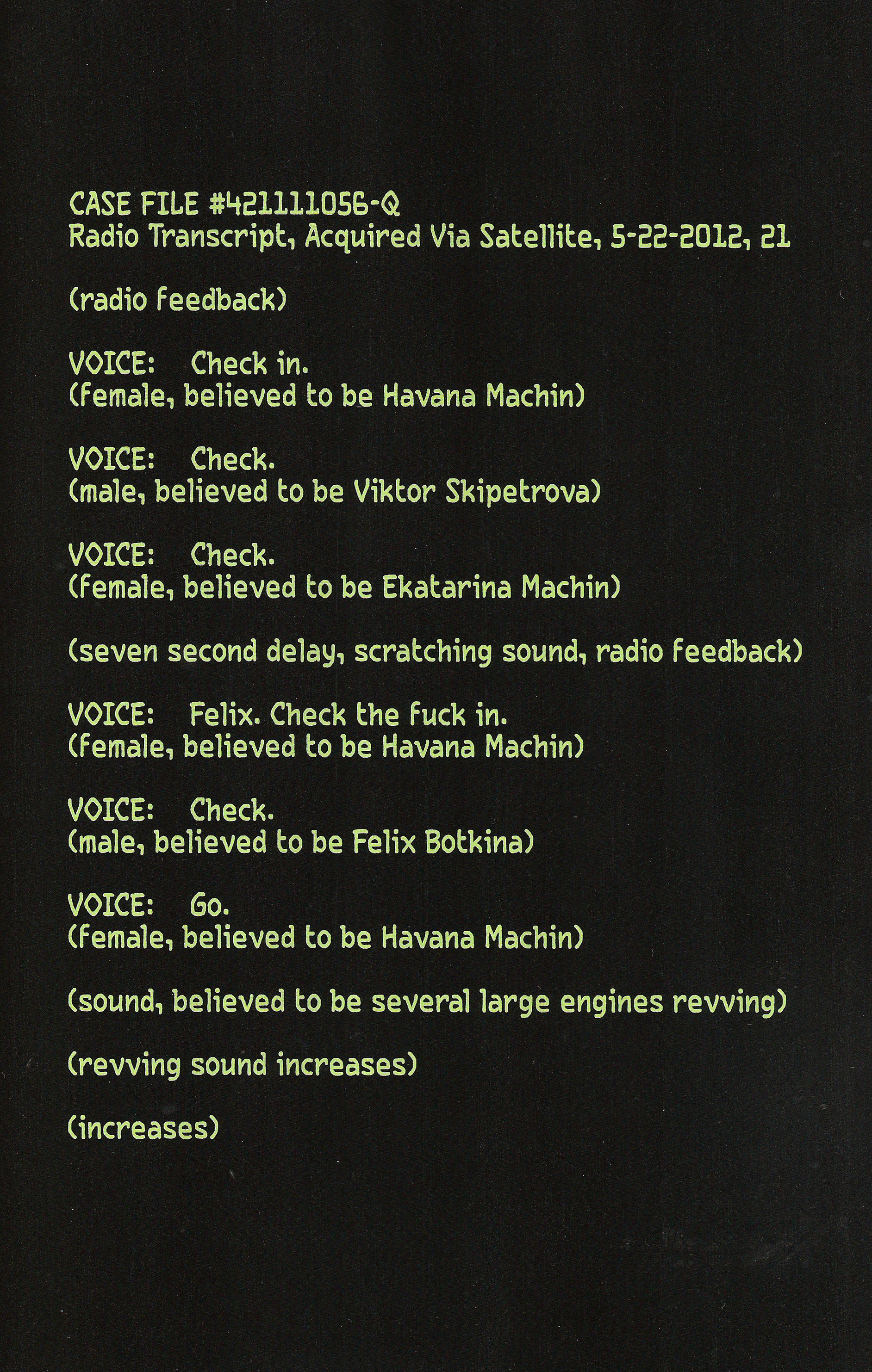
Right after the behind-the-cover recap page, we’re greeted by a black featureless void save for some green lines of text (in a font that looks suspiciously like a distant cousin of Comic Sans):
As you can see, all we have are dialogue lines associated with character names and sound effects. No art, no panels, no captions. It is literally a transcript (like it says on the tin) of the scene. Every visual cue has been stripped away and we’re forced to rely on elements that would – in the real world – only be heard.
Of course, since this is only text, we can’t actually hear antyhing. That’s why we’re given interpretations of the voices and sounds, as if provided by a dutifully precise government surveillance operator. This is what replaces the characters in the panels. We don’t get any sounds effects either; these are replaced by descriptions of what the sound is believed to be. Finally, since we don’t have any panels, the flow of the text itself is what measures time, with one pause duly noted in length to signify a silent panel. In fact, the only thing that doesn’t have a textual equivalent is any sort of inner monologue or caption. To be honest, these weren’t really prevalent in the series to start with.
So, if EPIC KILL #1 replaced text with images, PIGS #7 does the opposite: it replaces images with text.
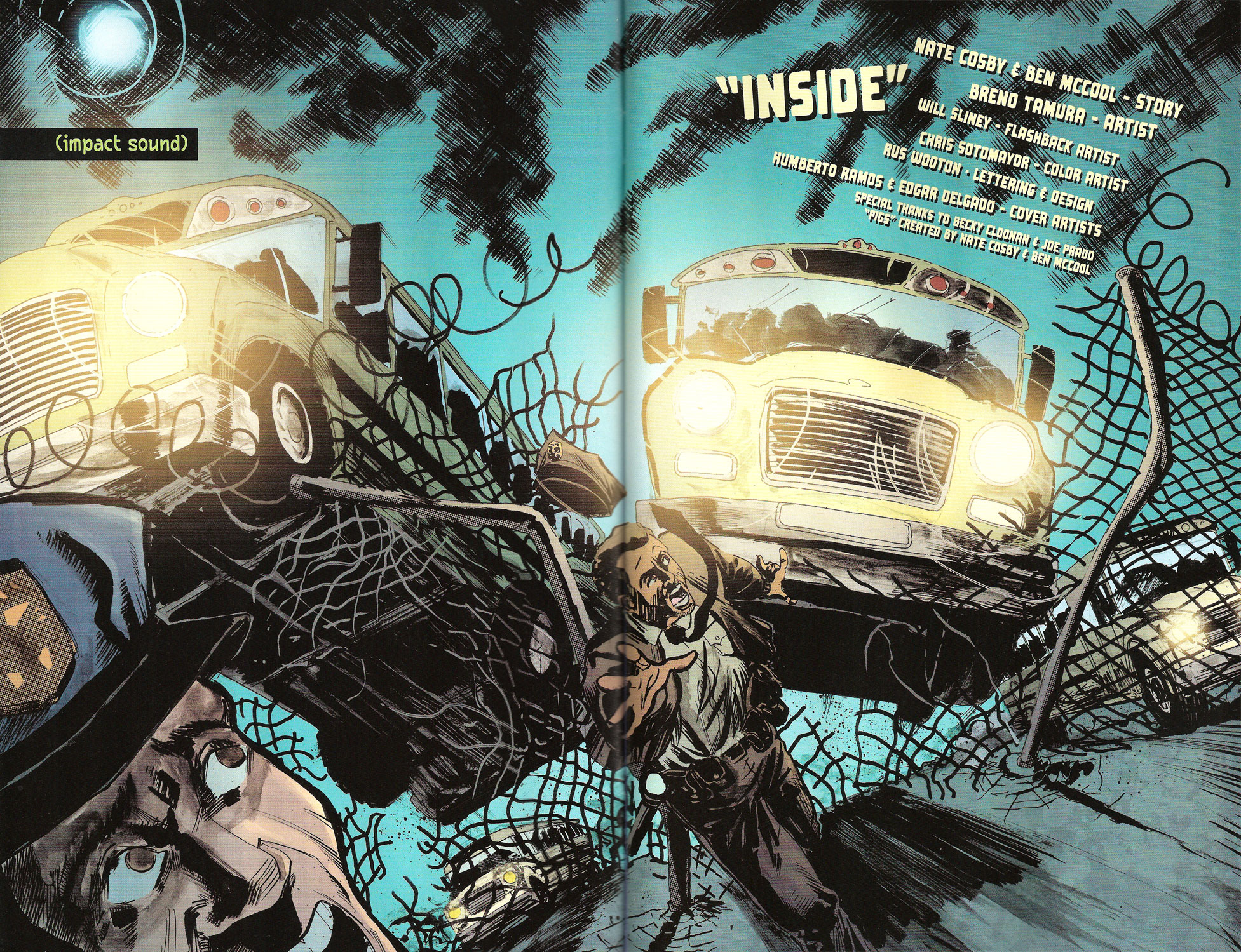
What does this achieve? Essentially, it postpones the revelation of what the team’s plan is, namely: crashing through the wall of the prison with school buses.
It would have been very difficult to set up the same revelation by showing the characters in their respective buses. Indeed, the whole shock and awe of the following spread relies upon the reader having no idea how the characters are supposed to break into the prison. Heck, that was the whole point of the cliffhanger at the end of issue 6, a suspense that was cruelly extended by a delay of the release date.
In order to make it work for yourself, you need to isolate the audible aspect of a scene, mostly spoken dialogue and sound effects. It’s then a simple matter of representing these elements in a way coherent with the framing device you’ve chosen. Here, Cosby and McCool used a satellite-intercepted radio transcription. Other possibilities you can explore include a court transcript, a 911 call recording or simply plunging your scene in the dark.
It should also be noted that this should preferably be used just before a page-turn since its purpose is to make sure you get the biggest bang for your buck with your big reveal. Using this on an even-numbered page (on the left side of the spread) defeats that purpose. I would also strongly advise moderation: too many text-only pages used for trivial reasons will not only cheapen the effect but you’ll also cheat your readers out of some awesome art.
You did get an awesome artist, didn’t you?
Lesson Learned
Can’t set up a big reveal without spoiling the surprise on the previous page? Then forgo the use of images! Just be sure that the audio half of the scene is still properly conveyed so that your story doesn’t suffer. A word of caution: don’t overdo this: people buy comics for the art too! Keep this trick in reserve for when you really don’t have a choice in hiding the visual part of the setup and only if the following revelation has enough punch and shock to be worth the frustration of essentially blinding your reader.
MISS
The exposition-heavy dialogue in Tony Daniel’s DETECTIVE COMICS #9
Script: Tony Daniel
Art: Tony Daniel (Backup story: Szymon Kudranski)
Inks: Sandu Florea (Backup story: Szymon Kudranski)
Colors: Tomeu Morey (Backup story: John Kalisz)
Letters: Jared K. Fletcher (Backup story: Dezi Sienty)
Cover: Tony Daniel
Editor: Mike Marts
What’s the purpose of dialogue in comics? Any writer worth his salt will tell you dialogue is used to reveal character – by letting the personalities shine through interactions or particular inflections – and to move the plot forward – by providing information about important plot points.
And apparently if you’re Tony Daniel, it’s also for dumping tons of exposition into your story.
DETECTIVE COMICS #9, a comic I only picked up because of the Night of the Owls tie-in, is a frustrating exercise in separating the real dialogue from what the writer wasn’t able to convey properly through the rest of the plot. I kept getting thrown out of the story as I stumbled upon blocks of exposition, sticking out of the dialogue like rocks in a tapioca pudding.
I’ll gloss over Dr. Arkham’s musings upon a couple of his inmates because it feels more like extraneous filling rather than info-dumping. The difference is you can cut out filling and it doesn’t change the story whereas info-dumping is just badly introduced exposition.
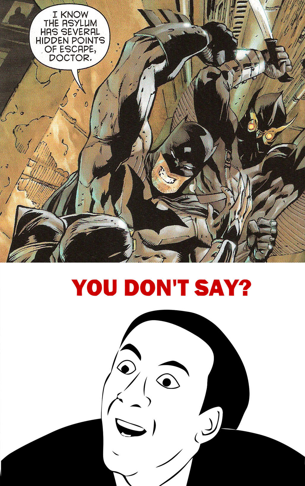
Instead, I’ll jump straight to Batman’s appearance. As he crashes in, he blurts out four speech balloons. Since it’s not clearly shown that Batman used freeze grenades, Daniel has to say it in the dialogue. And since it’s never been properly established that Arkham Asylum is filled with secret passageways which the doctor knows about, Batman has then to actually remind him – something the character already patently knows!
Not only do these make no sense in the plausible context of the panel, but they also make the already wordy dialogue seem even more bloated. And honestly, can someone really say all of this in the space of one jump kick?
This is but one example that I wanted to show in detail but there are others such as Two-Face droning on about his relationship with a secondary character followed by a completely unrelated narrative during the chase scene at the end of the back-up story.
My impression is that for the plot to work – no scratch that – for the plot to be basely understandable, the reader must be provided with some background information, information which Daniel is apparently unable to provide organically throughout the story. That’s why we get thrown these thick slabs of exposition at regular intervals. The choice was either to have a nonsensical plot or clumsy dialogue. The latter was seemingly the lesser of the two evils.
In another telling contrast with this week’s BULLSEYE, this is a comic that shows you what happens when you don’t show enough: you tell, you tell, you tell and you tell
Lesson Learned
Dialogue should be used to either reveal character or forward the plot, not to wedge in exposition that you couldn’t fit elsewhere in the story. Even though exposition is a necessary evil for any work of fiction, in such a space-constrained medium as comics, it becomes even more important to make sure your exposition is an organic part of your narrative, so that’s it’s as unobtrusive as possible. It should be lightly sprinkled upon your story, not slathered on top or wedged into every crack.
Honorable Mentions
- Jeff Lemire made a nice reference to the Grant Morrison era in ANIMAL MAN #9.
- In BLUE ESTATE #11, Viktor Kalvachev makes a seemingly innocuous detail from several issues ago an important plot point – those dang termites!
- China Miéville crafts some eerily stream-of-consciousness-like thought captions in DIAL H #1.
- The Skeleton Key one-shot by Andi Watson presented an anything goes premise a la Doctor Who, opening up almost infinite possibilities for future plots.
- David Liss’ THE SPIDER #1 not only had solid pacing that made the non-costumed parts as interesting if not more than the costumed parts, but it also had the best line of the week: Can I get some take-out?
- Once again, I get the impression that Scott Snyder has read the previous week’s BULLSEYE and applied it this week. In SWAMP THING #9, he uses an apparently insignificant detail from a few issues ago to resolve a sticky situation.
- Robert Venditti’s X-O MANOWAR #1 started with an illustrated fact sheet a la NIGHTLY NEWS that helped us better understand the historical context of the comic’s setting.
Dishonorable Mentions
- Judd Winnick forgets a character’s name and changes it halfway through BATWING #9.
- Another bad note for Tony Daniel’s DETECTIVE COMICS #9: Dr. Arkham visits Black Mask who is tied down in his cell, Talons arrive, Batman joins them, Arkham leaves the cell while Batman continues to fight the Talons and then we see Arkham talking in secret to Black Mask – while Batman is apparently still in the same cell fighting Talons. This whole sequence makes no sense since we can barely make heads or tails of where the action takes place.
- G.I. COMBAT was a letdown. J. T. Krul manages to be all setup and no plot in a story that involves the army fighting dinosaurs. In their half of the comics, Justin Gray and Jimmy Palmiotti use a first person narrator that is never introduced in the plot and is dropped halfway through.
- Paul Levitz’s WORLD’S FINEST #1 had so much witty back-and-forth banter between the main characters that he almost forgot to introduce a plot until the end.
- Oh and my LCS isn’t getting MIND THE GAP #1 until next week. What gives?!
That wasn’t so bad, was it? Come back next week and we’ll have some more!
* * *
 Yannick Morin is a comic writer, editor and vivisector hailing from the frozen reaches of Quebec City. You’ve just caught him with all of his endeavors being drawn by artists right now. You will however soon see his work in IC Geek Publishing’s JOURNEYMEN: A MASTER WORK anthology (spring 2012) as well as in ComixTribe’s OXYMORON anthology (fall 2012). Of course he also has a few other projects on the side but it’s all very hush-hush at this point as you can imagine.
Apart from complaining about running out of time for writing, Yannick also acts as ComixTribe’s Digital Comics Manager, making sure the electronic shelves are well stocked with the Tribe’s offerings.
For more of what spills out of his brain, have a look at his blog Decrypting the Scripting. You can also feed his ravenous ego by following him on Facebook and Twitter.
Related Posts:
Category: Columns, Points Of Impact







The shark sequence was clever. I didn’t find the foxes anywhere near as engaging. Unfortunately, I saw Epic Kill as a colossal waste of time.
I do like the way you break these ideas down and I look forward to reading more of your thoughts.
It was a very interesting approach to literally showing a character’s inner dialogue, that’s for sure. As for the rest of the comic, I didn’t find it so bad myself, but I wouldn’t put it in my personal top of the week.
It’s circumstances like these that really drive home how Points of Impact isn’t a reviews column – taking the whole comic into account – but rather a craft reference tool for certain techniques and devices. And these can be found in any comic, even the ones we don’t enjoy as much.
Thanks for reading, Zach! I hope to keep on being interesting to you and that you find other things to pique your interest on ComixTribe.com!
That is an excellent teaching point. Creativity takes many shapes and forms and not everyone is going to synch up. I applaud the effort, much like you do.
We diverge on the execution but it’s encouraging that opportunities are being given to new voices. Even with continuing changes in retail, there are still some exciting choices available.