Points of Impact – Week 8: How to Get Framed
May 2012 – Week 2
It’s another Saturday so here we go with some more Points of Impact! Why only read when you could also write?
As always:
- The BULLSEYE! section presents something that really wowed me. That’s usually when a writer does something unique among his peers.
- The HIT! section picks up on a cool trick that gets used pretty often – mostly because it works – but of which I’ve found a prime example.
- The MISS section however isn’t about praising a good shot but – as you guessed it – pointing out where a writer stumbled so you don’t put your feet in the same hole.
Now you know what I’m going to say: go read your comics first! Don’t you know how spoilixic this column is?
BULLSEYE!
The consistent framing device in Greg Rucka’s THE PUNISHER #11
 Script: Greg Rucka
Art: Mirko Colak
Inks: Mirko Colak
Colors: Dan Brown (the Da Vinci Code guy?) and Jim Charalampidis
Letters: Joe Caramagna
Editor: Stephen Wacker
As comic readers – and writers – we’re all familiar with the concept of the framing device: a literary mechanism by which the main narrative is presented inside another narrative. Some current examples in comics would be the interview in Kurtis J. Wiebe’s PETER PANZERFAUST and the interrogation room sequences in Nate Cosby and Ben McCool’s PIGS.
Framing devices however are rarely more than bookend-like extrusions, propping up the main narrative on both ends and never popping up in the middle except for the rare caption or a couple of panels. In these instances, one could go as far as wondering if the framing device was even necessary. What good is it if can be completely excised from the story and you’re still left with a strong free-standing narrative?
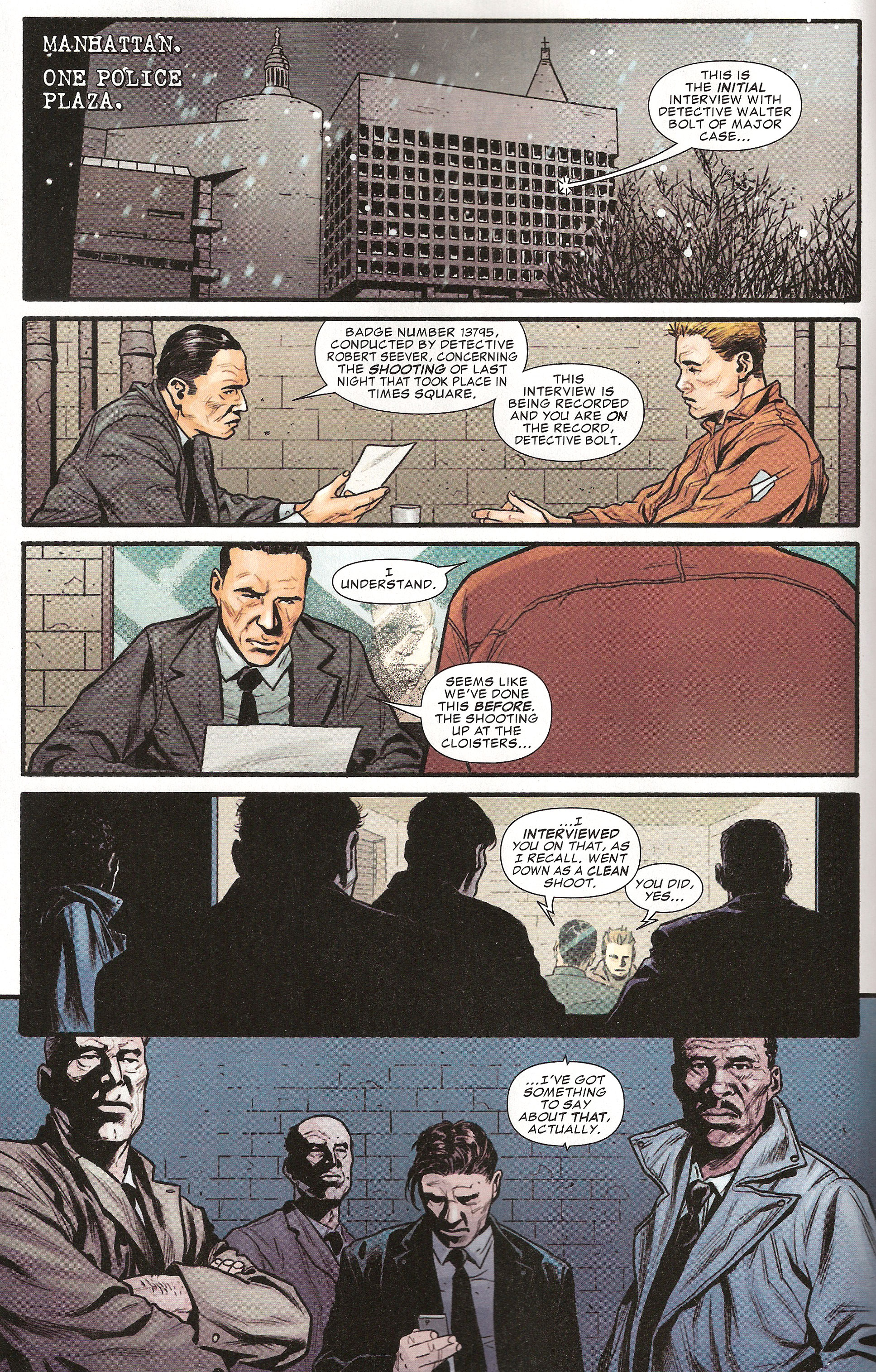
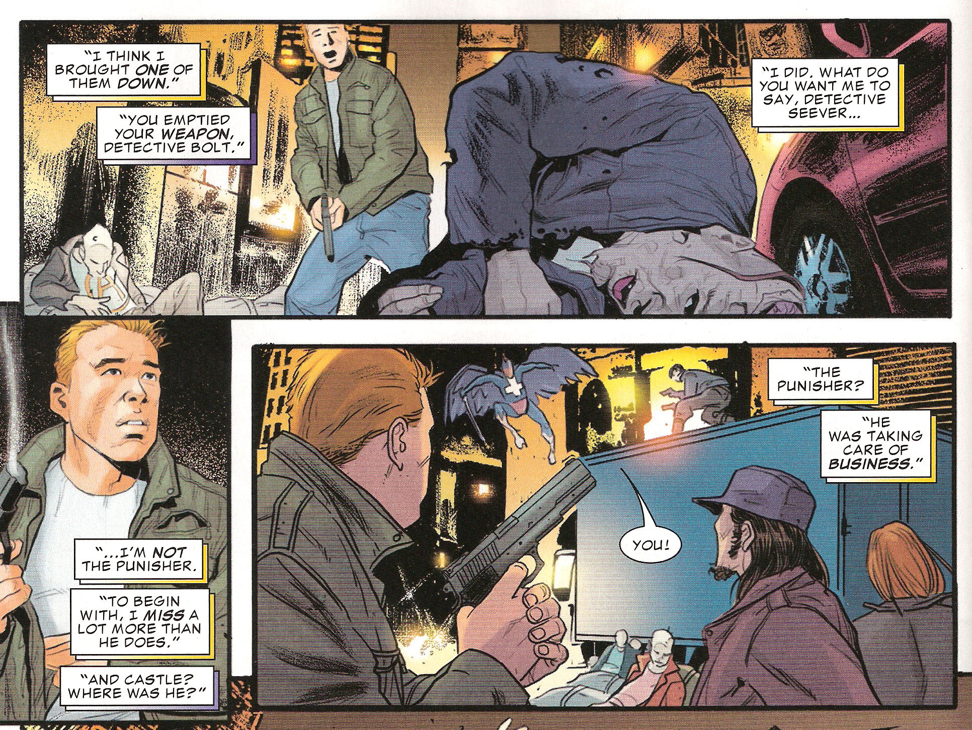
Such is certainly not the case with Greg Rucka’s THE PUNISHER #11. The framing device in this story consists of Detective Skeever interrogating Detective Bolt about the incident that makes up the main narrative: a zombie outbreak in Times Square! The comic starts with Rucka setting up the framing device with the customary establishing shot and quick character introductions.
Once the framing device has been properly introduced, Rucka takes us into the main narrative, a charming story of a boy and a girl on a date and how the Punisher likes to drop by at the worst possible times.
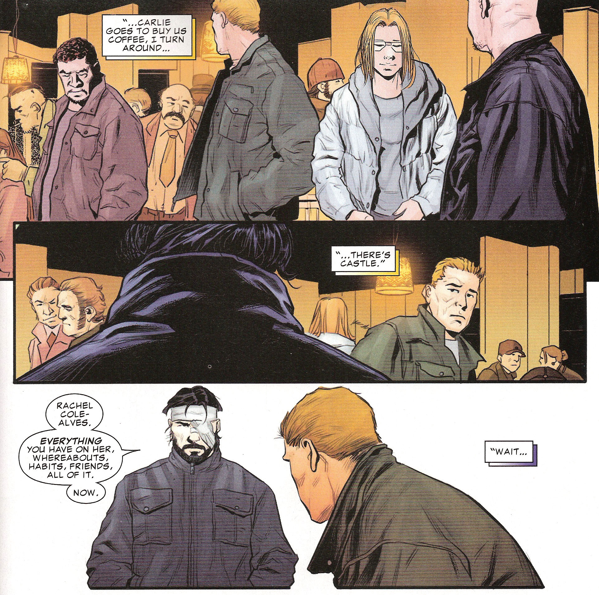
As the story unfolds, we keep going back and forth between the zombie-infested Times Square and the interrogation room at One Police Plaza. These switches are very frequent, the number of panels devoted to the framing device almost equal to the number of panels for the main narrative. We can also notice that even when we’re in the latter, the framing device is never far as Skeever and Bolt continue talking in color-coded voice-over captions.
What we have here is what I’d call a consistent framing device. In my opinion, there are three characteristics hinting at a consistent framing device that set it apart from its regular counterpart:
Sustained presence throughout the main narrative
The narrative constituting the framing device makes more than a token appearance in the comic. In this case, I define a token appearance as a quick introduction of the device in the beginning, a return to it in closing and a few panels here and there throughout.
Like I’ve said earlier, we’re constantly being pulled back to the interrogation room and even when we can’t see it, it lingers through the use of voice-over captions. The presence of the framing device is so pervasive in fact that the main narrative could be mistaken for a simple flashback if it weren’t for the fact that the series’ main character is in it and his adventure is actually what the comic is about.
Presence of a free-standing plot in the framing device
The framing device’s doesn’t have for sole purpose the presenting of the main narrative. In other words: it’s not just people telling us a story. The story they’re telling, the way they are telling it, their reasons for doing so and the consequences cascading thereof constitute a fully-developed second narrative by itself. You could take out the main narrative and still be left with a worthwhile complete plot.
Sooner or later, Bolt was going to have to answer for his actions regarding the Punisher and Rucka has chosen to deal with this issue in his framing device. There is a definite story here with a beginning, a middle and an end. There are high-level stakes (will Bolt keep his job or will he go to prison?) and a surprising twist to the story (he keeps his job because the police can’t afford to tarnish his image). All in all, if you replaced all the main narrative panels where he and Skeever talk in voice-over with more scenes of them in the interrogation room, it would be possible to piece together a viable story with all the required moving parts.
Significance in the overall run
The plot proper to the framing device has lasting effects upon the overarching story arc. Either the status quo is changed or a character has been changed by the depicted events. Careful not to confuse effects originating from the main narrative with effects originating from the framing device. If you want to make sure the framing device is in cause, make complete abstraction of the main narrative. If the effect still stands, it’s related to the framing device.
Bolt’s involvement with the Punisher has always been one of the main plot points of the series since its debut. Issue #9 even pulled the rug out from under the detective by revealing that his partner was aware of his playing for both the law and the vigilante’s teams. At the end of this issue, the matter has been further complicated: even though Bolt wanted to come clean – even at the cost of losing his hero status, his job and his freedom – he’s nonetheless forced to continue living a lie for the police’s PR needs. The way he deals with this new burden – he’s not only concealing the truth for himself now but also for the City – and how it affects him in the long run is certain to have long-reaching effects in future story arcs, especially when it comes to where he’ll place his loyalties when the need arises for him to finally pick a side.
In any case, one thing is sure: the framing device in THE PUNISHER #11 does more than bookend the story; it is a story in and of itself.
Lesson Learned
Sure, you can use a framing device if you want to present your story in a cool way. But why stop at that when you could have a consistent framing device instead and tell two stories (and be the envy of all the other comic writers)? All you need to do is make sure your framing narrative has more than a token presence throughout the comic, that it can stand on its own as an independant story and that its plot leads to long-lasting effect on the regular cast of the comic.
HIT!
The page-turn transitions in Robert Kirkman and Nick Spencer’s THIEF OF THIEVES #4
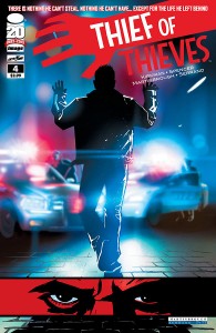 Script: Robert Kirkman (credited for Story ) and Nick Spencer
Art: Shawn Martinbrough
Inks: Shawn Martinbrough
Colors: Felix Serrano
Letters: Rus Wooton
Editor: Sina Grace
Even though digital is slowly taking its hold of comics, in the meantime writers have to contend with the physical limitations that come with writing for comics. Taking the ads and backup material out of the equation, we’re talking about twenty-something pages, stapled together. Apart from the first and last page, all of the even-numbered pages are facing the odd-numbered ones. This particular configuration has us working with the following constraints:
- Readers perceive the comic as a series of two-page spreads first, and as singles pages second.
- The reader’s eyes will invariably glide over to the right-side page, even though he’s just starting to read the left-side one.
- The reader will have a new spread to take in only once the right-side page has been read.
With that in mind, how does a writer work around these particularities to tell a legible story, but also how can he exploit them to create interesting effects?
Robert Kirkman and Nick Spencer’s THIEF OF THIEVES #4 constitutes an interesting showcase of ways of playing with page-turns and we’re going to have a look at a few of them.
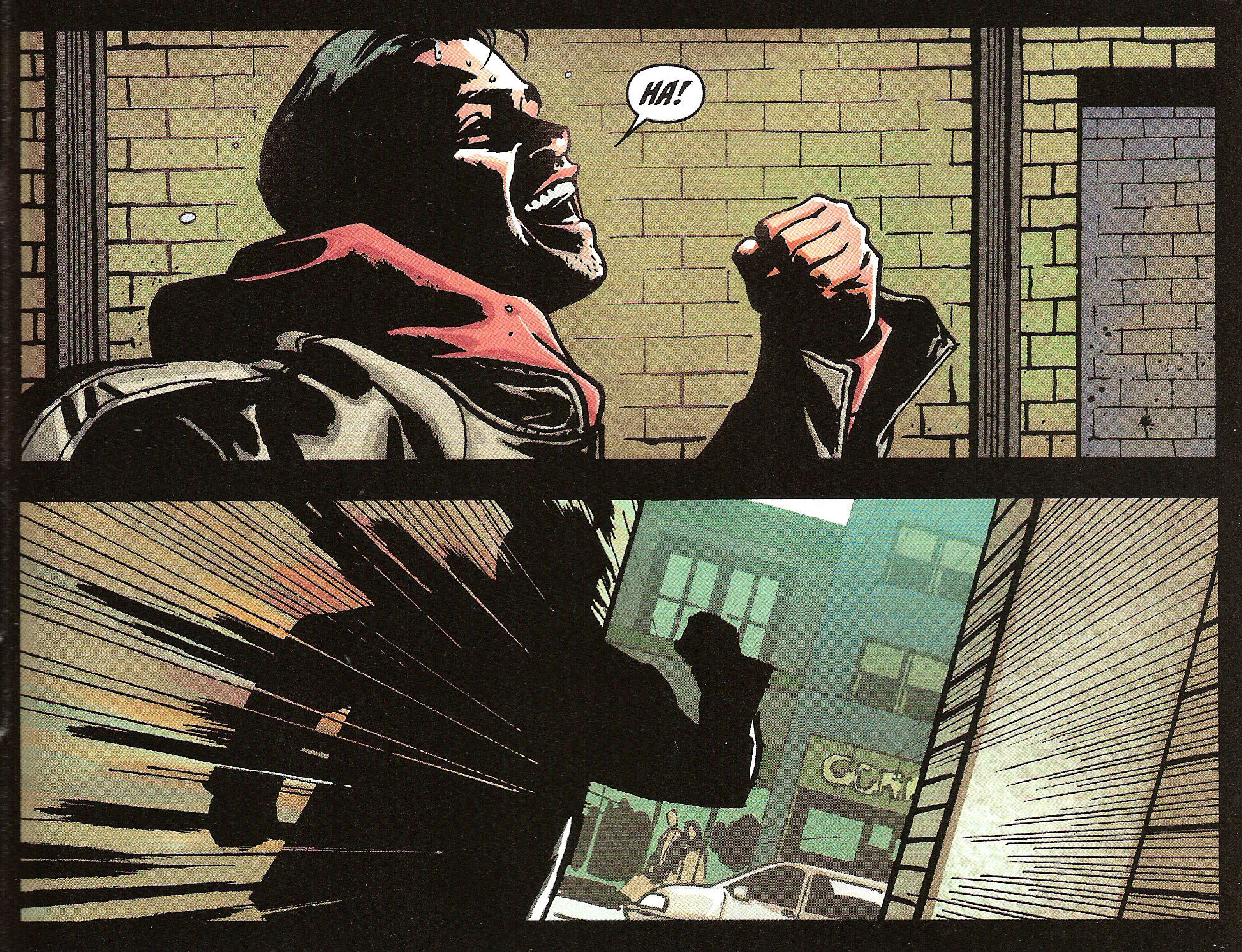
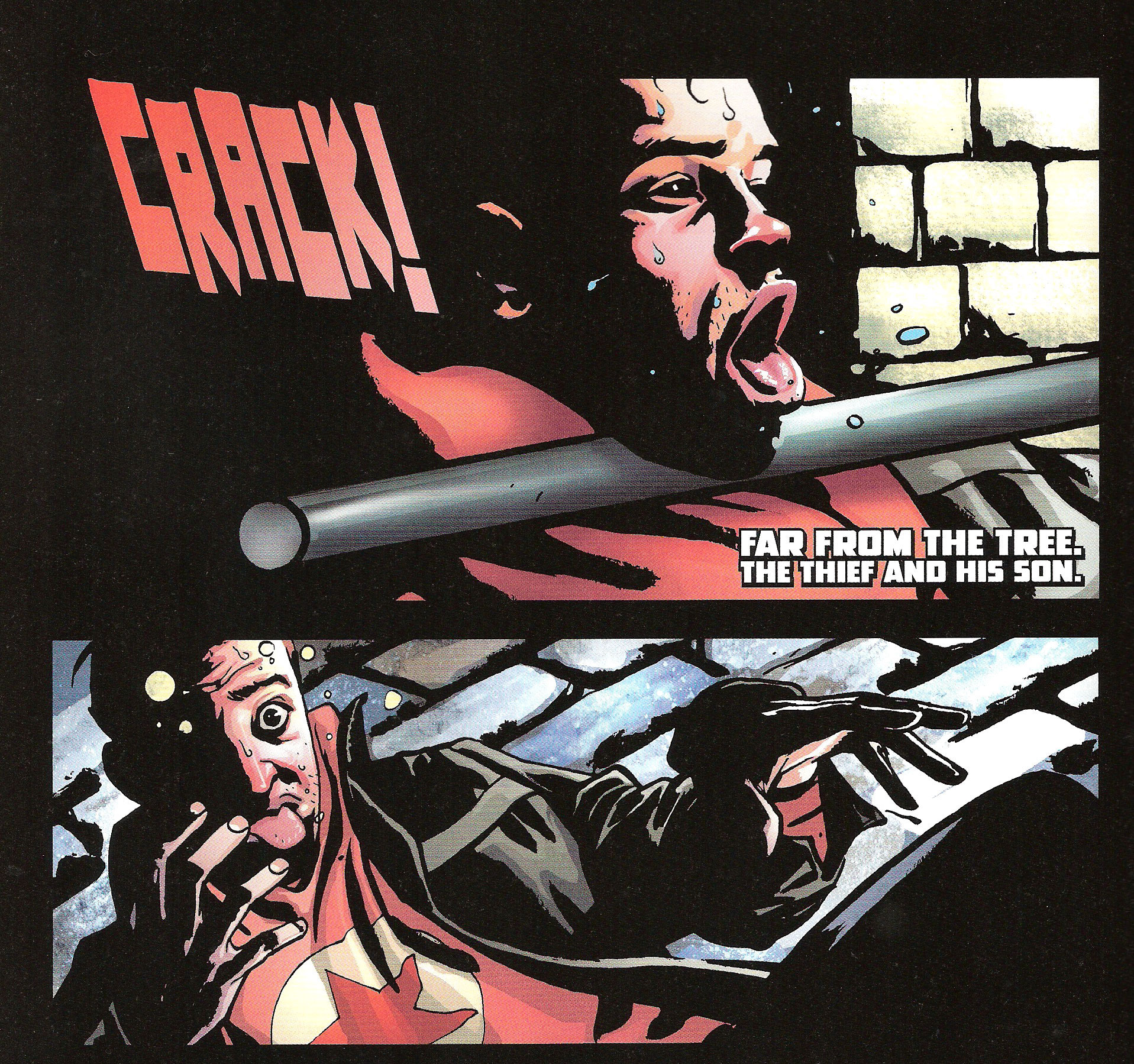
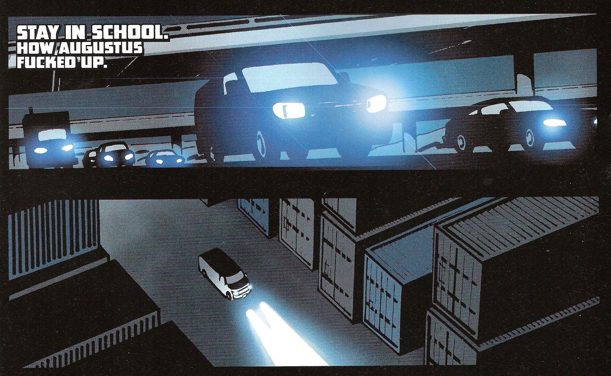
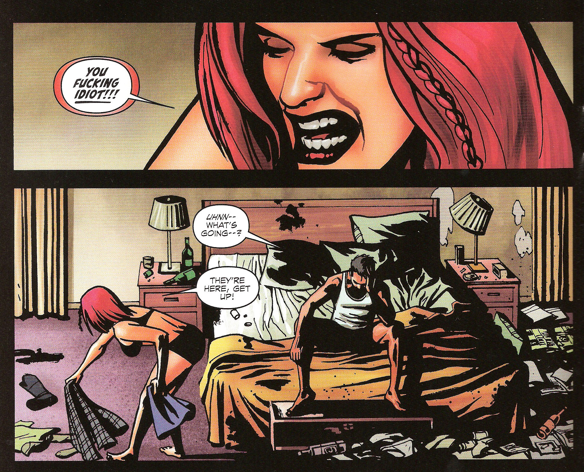
First of all is the surprise reveal of which we have a prime example at the start of the comic. The first three pages shows us Augustus, Redmond’s son, fleeing on foot from police officers. Page 3 – a right-side page – has him eluding their capture by climbing over a wall and heading for the safety of the open streets.
Once the reader turns the page however, he finds out that Augustus’ hopes of escape are comically short-lived.
The surprise effect can be achieved only because of the page-turn. If that last panel had been at the end of the same page, the reader would have seen it as soon as the previous page-turn. Same thing if the page transition had occurred from a left-side to a right-side page. Of course, the more medium-savvy readers know how to recognize a setup and are familiar with how events can take another turn – ha! – at the bottom of a page. Still, it’s not because the reader might expect a surprise – if you’ll allow the oxymoron – that we should necessarily spoil it for him.
Another use of the page-turn transition is for underlining a change in setting, either a switch in location or a move in time – either backward or forward. In this case, we have Agent Cohen interrogating Augustus and talking about the failed heist that got him arrested in the first place.
As we turn the page, we’re taken out of the interrogation room, back in time, to the location of the heist in question.
As we can see, the page-turn creates a clear cut between scenes, further driving in the change in location/time. In fact, this simple device is so effective that you could entirely take out the caption in that last panel and the reader would still understand that we’re now in flashback mode. On the contrary, panels all on the same page and – barring the use of explicit captions – on the same spread are more often than not perceived as being part of the same scene. In that regard, try to finish your scenes, if not just before a page-turn, at least at the end of a page. Scene transitions in the middle of a page feel off to a reader and give the impression that your plotting is haphazard, with panels randomly lined up one after another as long as there’s still space on the page.
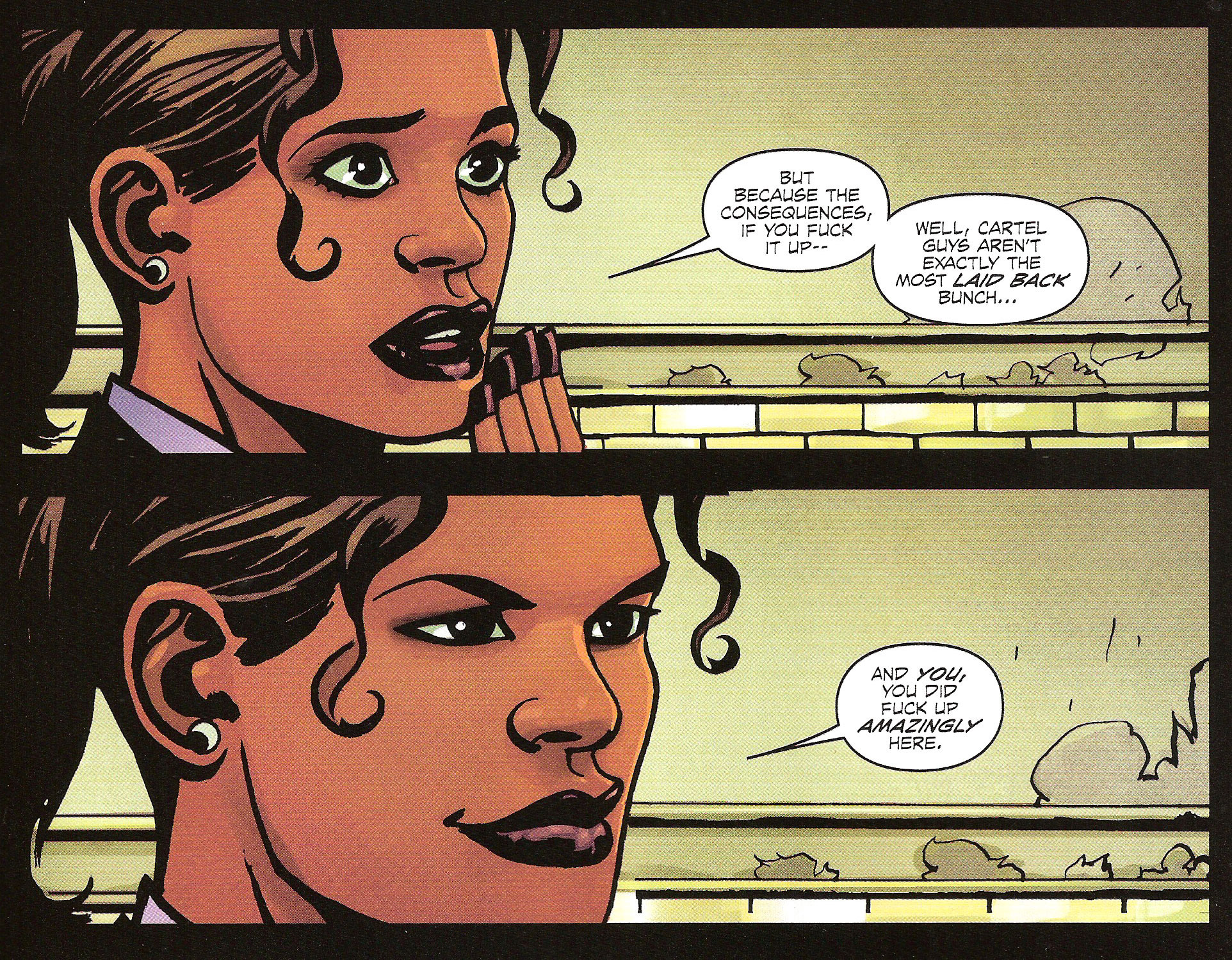
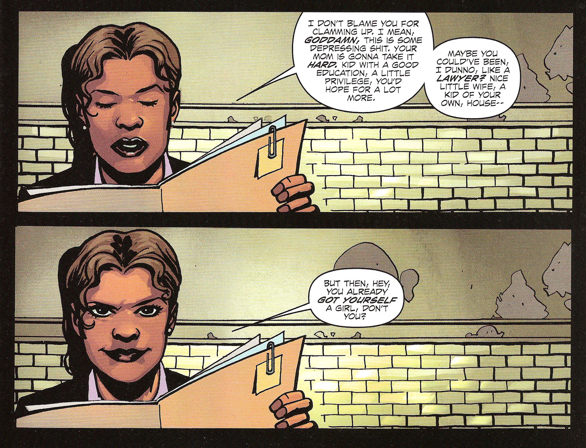
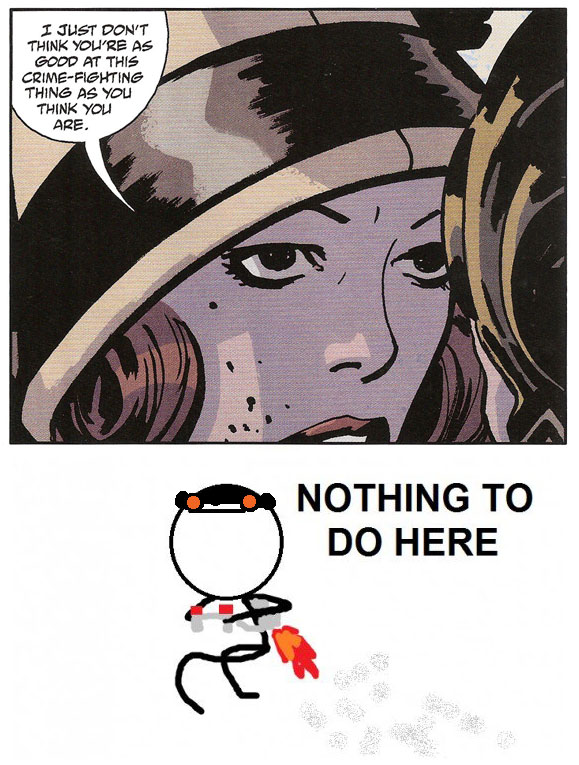
For the final example, I’d like to show you how the two types of use we’ve just discussed can be combined. In the same interrogation scene – another framing device! – Agent Cohen laments Augustus’ lot in life and how he could have had a normal life.
Of course, the page-turn revels that the expected sweet girl in question is anything but.
Not only do we have a change in time and location, but we also get the surprise of finding out the character being discussed is nothing like we were led to believe.
In closing, the heart of the matter is that page-turns act not only as visual barriers but also as psychological milestones – not unlike paragraph jumps in novels or commercial breaks on television. Even if you don’t set up any surprises or begin a new scene, there’s something in the reader’s mind that tells him that an invisible line has been crossed. Does it mean you should always have something special set up for every page turn? No, but remain aware at all time of this demarcation and be assured that it will work its magic when you do call upon it.
Lesson Learned
The printed form of comics requires the writer to work around certain constraints, one of them being the regular and obligatory page-turns. Instead of a hindrance, use these as an additional device in your arsenal of devices. Indeed, page turns can be used either for setting up surprise reveals – as long as you make sure the surprise is just beyond the page-turn – or to establish clear cuts between scenes for switching location/time.
MISS
The unnecessity of Mike Mignola and John Arcudi’s LOBSTER JOHNSON: THE BURNING HAND #5 of 5
 Script: Mike Mignola and John Arcudi
Art: Tonci Zonjic
Inks: Tonci Zonjic
Colors: Dave Stewart
Letters: Clem Robins
Editor: Scott Allie
Really now? What the Hellboy, guys? This is the third time Mike Mignola gets a MISS. This is getting embarrassing. I’m proud to say that Mike Mignola is one of my top favorites comic creators, but even a die-hard fan like me starts feeling awkward with so many dubious nominations.
Three times! That’s almost half of the Points of Impact on the ComixTribe website! I’ll never get a job at Dark Horse now!
*sigh* Let’s get this over with then, shall we?
Honestly, if it weren’t for the little helpful of 5 in the cover’s indicia, I never would have doubted that LOBSTER JOHNSON: The BURNING HAND #4 wasn’t the last one in the miniseries. When that comic ends, the main threat has been neutralized, the villain has been routed, the girl is safe and the sniveling little guy is at their mercy. What else was left to do?
Well apparently Mike and John got told they had to tidy up the place and turn off the lights on their way out because they went to extraordinary lengths to tie up – excuse-me, to tie dozens of extra knots into already tied ends.
To illustrate my point, let’s run down the plot:
Scene 1 – The police are at LJ’s hideout, examining the scene. They also got Not Ghost Rider in custody. Why was it necessary to show us this? I’m pretty sure no one was wondering what the police would do since they were barely involved in the plot anyway.
Scene 2 – Our heroes are driving to the location the little white-clad twerp pointed out as the crime boss’ house. Along the way, the reporter tells them how she managed to get back to them at the end of LJ: TBH #4. You know, the explanation we already knew, having seen it all last issue.
Scene 3 – The crime boss gets treated for his bullet wound by a surly doctor (who proves the most developed and interesting character in the whole series – and that’s his only appearance). This scene exists for you poor folks who were worried he might just not make it – all three of you.
Scene 4 – LJ and his Merry Seafood Buddies attack the house where the crime boss supposedly is. Surprise! It’s full of cannibals. I’m not making this up. Yes, completely out of left field, zombie-like hobos assault them and they fight their way out. This is the creamy center, the top attraction of the comic – hell, it’s even what they show on the cover. It’s like they had this scene written for another comic that they couldn’t do – I suspect Eric Powell’s THE GOON – but they didn’t want to waste the idea so they built a completely bogus fifth issue just so they have their little cannibal holocaust.
Scene 5 – LJ and the reporter part ways since he’s apparently not competent enough to protect her. The comic actually says that, not me.
Scene 6 – The Pale Snotling visits the crime boos and – using one of the reporter’s tricks – relates everything we just saw. Just in case we fell asleep and missed that part.
Scene 7 – The reporter goes bragging to the police that she got a sweet exclusive interview with LL Cool Johnson. And that’s practically the only thing the hero accomplished competently in all of the five comics: he gave an interview.
There’s nothing in this rundown that justifies a fifth entry in the LJ: TBH mini. Nothing. In fact, most of the comic is a random fight and two retellings of events we’ve already seen firsthand. In fact, with a little tightening up, this mini could maybe have been done in three issues instead of five. One thing is sure however, just by cutting out this last one, you wouldn’t feel the difference at all in the overall narrative.
I’m going to go ahead and say it: this was a filler issue.
Anyway, August solicits just came out for Dark Horse today and there’s a Lobster Johnson one-shot slated for release by the same writers. I’m going to buy it of course because I have everlasting faith in the power of comic creators to rise from mistakes and always get better. It’s what we all wish we’d get the day we turn out something less than good. Still
Fool me once, shame on you. Fool me twice, shame on me.
Fool me five times in a row, shame on the editor.
Lesson Learned
When you plan out a miniseries, plan it tight. Make sure every scene that makes up the story is absolutely necessary to furthering and finally completing the plot. Readers will forgive you for packing a few issues with 10-panel grids but they’ll eat you alive if you make them waste their hard-earned cash on a full issue of fluff. If you gotta err, err on the tight side.
Honorable Mentions
- In BATGIRL #9, Gail Simone managed to pull off having her main character conversing with her own thought captions.
- Scott Snyder once again shows his storytelling chops by intertwining a tale of bat infestation with current events, both narratives feeding the other with added meaning.
- Peter Tomasi showed that he did his research with amazingly accurate references to military tactics and strategy in BATMAN AND ROBIN #9.
- In FATALE #5, Ed brubaker achieves the perfect mix of genres, allying the grime of noir and the shudder of Lovecraft.
- Adam Glass once again wrote some genuinely witty dialogue in SUICIDE SQUAD #9.
- Brian Michael Bendis shows us that recaps don’t have to be a dry paragraph at the start of the book in TAKIO #1.
- There was a great page-long moment-to-moment transition in Robert Kirkman’s THE WALKING DEAD #97.
Dishonorable Mentions
- Unfortunately, there was a very clumsy transition in Scott Snyder’s Batman #9 when it’s implied that the events of a whole other comic take place in the space of a gutter between two panels. It feels as though Tony Daniel’s DETECTIVE COMICS #9 was added to the Night of the Owls event at the last minute and that’s the only place they could plug that comic’s story without Greg Capullo having to redo the art for the final pages of BATMAN.
- A friend of mine lent me GRIFTER #9 by Rob Liefeld on story and Frank Tieri on dialogue, and both of these men have their failings to answer for. The comic is a classic example of a plot that bends backwards against logic to conform to an edicted storyline while the dialogue is so full of forced “wit” that it goes full circle way past wittiness and back into puerile obnoxiousness. In other words: I’ve never seen two men do so bad at half a job. Oh and you’re no longer my friend, Ken!
And that’s it! I hope you learned something this week. If you didn’t, I’m sure you will next week! See you in seven!
Related Posts:
Category: Columns, Points Of Impact












I’m sorry I messed up your Thursday night read!!!! To make amends, I’ll let you read a fantastic find I made in the 25 ¢ bin at my Montreal comic book treasure trove, 1,000,000 Comics. I managed to scoop up Rob Liefeld’s 1st issue (1st printing) of Youngblood…. The actual genesis of Image Comics!!!! I hope it makes up for Grifter #9…… ;o)
Actually you know what? I’d be very interested in reading that, if only for its historical value.
For example, I despise a lot of things in early 20th century art, but I do appreciate what these experiments signify in terms of stepping stones towards modern aesthetic values. Maybe that early Image stuff can be viewed with the same academically inclined viewpoint and I’d leverage that cultural dissonance with some well-earned perspective on the comic medium.
Or I’ll come into the office the following morning and take out your eyes so we’re *both* blind from now on.
Ready to take that chance? 😉
My pleasure! I’ll even refer you to the MajorSpoilers retro review of the issue. It is amusingly scalding yet conveys the importance of the creation if Image Comics in light of the publisher/writer relationship of the time.
http://majorspoilers.com/2011/03/06/retro-review-youngblood-1-april-1992/
…but leave me my eyes. The fried brain cells I can live without!
UPDATE: Ken has brought me YOUNGBLOOD #1 this morning and it feels like I just got handled a pair of Nazi cufflinks.
It’s like a rare piece of history no one should be proud of owning.
I’m going to read it tonight. If there’s no Points of Impact next Saturday, you’ll know why…
It’s easy to criticize, sure…
But imagine you’re 13 years old, hunting it down a few months after it first came out, and being completely thrilled to be in on the ground floor of a brand new comics universe started by some of the freshest voices in comics.
I’m proud of owning all of that early Image stuff.
Wouldn’t be reading comics today were it not for Youngblood and the rest, and I certainly wouldn’t be making them.
And that’s why I say they have a HISTORICAL value. There’s no denying the influence early Image stuff had on young creators of the time as well as on the medium itself, but let’s not kid ourselves: it doesn’t hold up to many of the great books written today (or written at the same time, for that matter).
A historical viewpoint is necessary to appreciate a work’s effects on its comtemporaries and the other works that followed. It helps up understand how the medium was shaped by the various forces – human, technical, aesthetic – of that era. It tells us where we come from so we can better understand where we stand today. It’s also great to just reminisce about our enjoyment and sense of wonder as we discovered these works with fresh eyes in their original context.
However, we can’t go back to that time and see these comics as we saw them then. We can only read them today with the sensibilities we’ve developed since those halcyon days.
I own SPAWN from the first issue right up to #50 in one of my longboxes. Teenaged me loved those comics. Adult me however would have to search pretty deep to find anything worthwhile between those pages. That’s because Adult me is looking for something else in comics now.
I’d never throw my SPAWN run away, but I’d never look through it for guidelines on how to write comics either.
Oh, I’d argue there’s plenty to be gleaned from both Youngblood and Spawn.
You don’t sell a million copies and not have any redeeming characteristics.
And I wouldn’t argue with you either because I’m sure it must have SOME redeeming qualities in there somewhere. The publishers at that time surely had a reason for offering it to the (unsuspecting) public.
Tell you what: let’s make this official. I need to produce at least a couple of fill-in articles in case I ever get sick or take a vacation. I’ll do a whole Points of Impact ENTIRELY on YOUNGBLOOD #1: Bullseye, Hit and Miss.
How’s that sound to you?
I hope you get sick soon, Yannick.
Gee… uh, thanks, Don!
I guess…
Yannick, thanks for this piece on framing devices in literature. You’ve educated me as I’ve always associated the term with art. I was aware of the devices in writing, but wasn’t aware of the descriptive term. Being an editor and instructor, this makes my job a bit easier.
Nothing makes me happier than to know someone has learned something reading Points of Impact. Thank you, Steve!
I’m a firm believer myself that a certain amount of theoretical knowledge is necessary in any craft, be it medicine, automobile mechanics, ceramics or comic script writing. Sure, you can get by with an instinctual feel for it, but in my opinion it doesn’t compare with knowing the name of all the bits and pieces as well as how they work with one another.
But hey, it won’t replace raw talent and sheer doggedness either, but it’s still a good start – and a good start is what we’re aiming for here at ComixTribe! As we like to repeat a lot these days: “Start here.”
Now stay tuned for The Proving Grounds tomorrow morning. I have it on good authority that it should be quite the learning experience!
I take the exact same type of approach in my instruction. My motto is “meat instead of milk”. There are so many reference books out there that give the milk, rehashing the same basic (or even below basic) information. Those who are serious about working in this industry need a bit of technically “raw steak” in their diets in order to truly advance in their craft.
One artist I recently spoke to told me he was entirely instinctual in his work. I’m sorry, but everyone has both in their systems. A draftsperson may be technical, but needs to have a creative bone in his body in order to perform his job effectively, creating previously unimagined shapes and forms for his clientele. The same applies to artists and other creative individuals. I may be able to write a story, but I need to know things like three act structure, character development, “framing devices”, etc. I give it roughly a 75% to 25% ratio. But I understand your approach completely, Yannick.
The way I see it, one of the best ways to get some “meat” is by apprenticeship. That’s kind of what Points of Impact is: it’s apprenticeship by proxy.
In the old days, artists such as painters and sculptors learned their craft by watching the old masters work and by studying their past production. There’s no reason we can’t do the same with comics. As comic creators, most of us are already comic readers as well. It’d be a shame to not consider our weekly haul as another source of reference material.
I personally wouldn’t use the term “by proxy” because we are, in actuality, the direct link to knowledge, not the middle man relaying it. You’re good at what you do and I wouldn’t want someone else to steal that from you or lesson your personal or professional impact on the industry with the use of that word. You’re the teacher, the visionary, the man behind the thoughts and actions, the master of what you instruct. You may get reference from another source, but you aren’t a high school teacher relaying the information of (enter writer here) to maintain a curriculum. YOU ARE THE ONE whose mind creates the eloquent flow of verbiage that expresses and explains a new way in which to view the world of our art form.
In other words, give yourself the credit, man!