BTP: Sedat Oezgen’s Punisher Max #6 Sequential Pages
In this introductory piece to the column, I’d like to establish how I’ll be presenting my commentaries on the sequential art which will be displayed. Every page has something to like about it and I will say so, but then I will be breaking down everything I see that just doesn’t work. In the end, I will summarize my assessments to give not only the artist, but you, the readers, some food for thought in things to consider when reading your favorite comics or drawing your own.
Let it be known that every artist has their own take on how a page is drawn, so even though they are working from a script, creative license will sometimes result in a stronger final product. Let’s see how often that will be the case.
For this inaugural piece, I have commented on pages drawn by talented artist Sedat Oezgen, who has chosen to redraw in his own style and understanding pages from PUNISHER MAX #6, written by Garth Ennis, with original illustrations by Lewis Larosa.
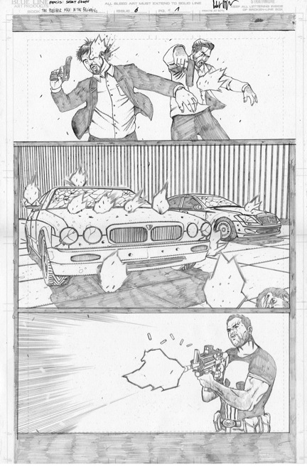
PAGE ONE:
What I like? Your composition of the page is pretty strong. I like the bleed you’ve used for the first panel. To me, it shows they aren’t protected in any way by walls, borders, or boundaries, and the gunfire is hitting them from nowhere and throwing them back into nowhere. Open is great. The next panel has the cars being shot up surrounded by blackness (I like the idea of repeating the quantity of two “victims” in this panel, even without the man’s head in the bottom right corner). In the final panel on this page, you have Frank on the far right shooting towards the left, preventing anything from moving past him into the next page. I love it.
What I don’t like? Panel 1 has a few components with the bodies that don’t work.
1) The bearded man is shot through the eye and the bullet exits through the back of his skull from an angle that doesn’t correspond with Frank’s location. The fact that his angle is wrong is only one issue, the other being the kind of pinpoint accuracy needed and its possibility with a light machine gun. Improbable and beyond suspension of disbelief, needing some basis in reality.
2) Both men could be: A– back a touch more to the left to balance out the fact Frank is in the last third of the panel he’s in, so they should be in the first- and second-thirds of their panel to balance everything out compositionally (instead of being centered); B– loosening their holds on the pistols, seeing as how the entire body goes limp when shot; and C– have their upper bodies thrown backwards more, the bearded man’s head breaking his neck from the whiplash and the other being thrown off of his feet. Role play the actions or view them with someone else doing them.
Panel 2 has a nice clean pattern of four shots hitting the car’s hood equidistantly (the same space apart), and yet the rest are all over the place. Why? Frank has gone from being a sure shot to just gunning rampantly in the matter of a single panel image. Doesn’t make sense.
Panel 3 is a major issue with regards to how the first panel of the next page completely changes everything. Right now, it looks as if he is firing from the same height, ground level, as his victims, but we discover that is definitely not the case. So in other words, your 18 degree angle (I checked it out myself) and the following page’s 35 degree angle are completely different, making this desperately unacceptable. His gun needs to be aimed down more, his head needs to be looking down more, and man, there need to be more than five bullet casings flying through the air as thirteen shots have been fired, including the one that just left the barrel.
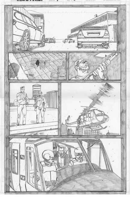
PAGE TWO:
What I like? Your illustration abilities are fantastic, especially the helicopter blades. You also have a nice page design.
What I don’t like? What’s in them. I got lost with the number of people on this page and their relationship to one another in this scene. I assume that the man in the warehouse is Frank’s wingman, and that the two men on the roof are somehow talking with the guy in the helicopter, but is that actually what’s happening??
But let’s start with Panel 1. As mentioned before, you have a 35 degree angle happening here from Frank to the car he’s shooting at, which doesn’t correspond with the previous page’s last image.
Panel 2 shows Frank’s shadow on the edge of the skylight with a man in silhouette hidden behind some crates. Move to panel 3 and you have the man looking up towards Frank’s silhouette. All well and good, but look at sizing: The two head shots are the same size, and yet Frank is at least twice the distance away from the man from the second to third frames! Why?? Another point with regards to Panel 2 rests in the inking stage, where the silhouette is going to get completely lost among the inks of the surrounding crates.
Panel 4 creates a jump in setting as the men on the roof are now looking at the scene from a distance. Their introduction could have been created using a further distance between the second and third tier gutter space to show a jump where Frank is no longer in the immediate vicinity. The image itself is fine.
Panel 5 and 6 introduce the man in the helicopter, but who is he? Is he the boss of the two men on the roof? If so, are they communicating? Is there no relationship between them at all? This is what Scott McCloud would call a non-sequitur transition because they may or may not relate to the same scene. Confusing. One way to do this would be to have the four tiers have individual character interactions, the top establishing the general scene, the second introducing the man in the warehouse, the third of the two men on the roof, and the fourth of the man in the helicopter. That way all are distinguishable in their own rights. Where right now you have good balance between the top and bottom tiers, the new pattern of 1-2-1-2 frames per tier would also work.
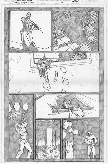
PAGE THREE:
What I like? Your facial expressions on the two men.
What I don’t like? First off, binoculars don’t have that visual design when you look through them. If you don’t have binoculars, see if you can find some, maybe at your local department or sporting goods store, and ask if you can try them out. You can’t see that wide an amount of detail. Problem. It needs to look like the universal representation of what you’d expect to see. Not this. The second part of the top panel issue is the fact you can’t really make out any aspect of Frank besides a small gunfire with a black dot for a figure. He’s almost completely cut off by the circular shape. It doesn’t encourage the attention being on him, especially with the amount of details around him. Finally, the car on the far right is dark in the first panel and light in the fourth and fifth. We can’t distinguish their similarity very easily, only due to its placement near the wall.
Panel 2 has one major issue, and that’s the fact that Frank is facing in the same direction as his real self in the binocular lenses instead of being reversed. He’s also too far away to be giving this type of reflection. Get rid of it as it serves no purpose in the story. At all.
I really like the image of panel 3, but it’s placement backs against two images that are completely unrelated. Also, there is no transition at all to lead to panels 4 and 5.
Panel 4 gets me frustrated because the action of the man climbing out has no lead in. Where did this come from?? I have no idea what is going on or who this guy is. I don’t know how he applies to the scene. If he was supposed to be hidden, your man could be seen easily through the back window. Again, have the last two panels side by side on the bottom tier so they have a relation to themselves and not to the preceding panel. Generally speaking, this is a frustrating page to read.
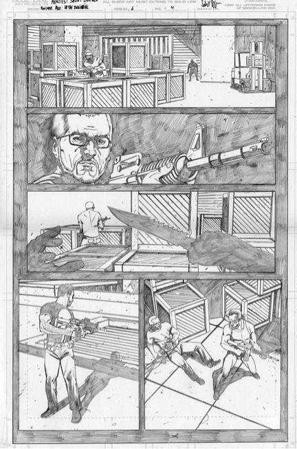
PAGE FOUR:
What I like? Composition and eye flow are good.
What I don’t like? A couple of issues.
Panel 1 has the man in silhouette looking like a human gorilla in the background. Staging is nice, but effect isn’t nearly powerful enough. Instead of standing there, have the man in shadows moving in. Even if he had just entered the room, he’d still have either movement or a more powerful pose.
Panel 2 seems completely unnecessary as it creates a wall separating two pacing components that should directly follow one another. Jump from 1 to 3 and you’re golden. Let me explain why using a visual example and something I learned from Greg Capullo. Greg did a series of articles in the initial stages of WIZARD MAGAZINE entitled “CRASH COURSE!” In one particular issue, he was talking about viewpoint and mentioned what he called P.O.V. (but what film calls reverse angles), where the camera will basically shoot one action and then shoot its polar opposite.
The first has the character look at the situation, then the situation in turn looks at the character. Your current addition of the second panel, even if it did exist in the original, doesn’t work here, so get rid of it.
Panel 3 is good, but could be more effective with a “PSYCHO” Norman Bates way of holding the blade so as to stab in a downward thrust, not lunge in a forward motion. What you have here is a defensive way of holding the knife instead of an offensive, or attacking, hold. He’s sneaking up quite effectively, so would probably be able to go all the way without being noticed.
Panel 4. Well, I have a serious question to ask: Where did the grating come from??? It was absent in the previous and future shots, showing there was no grill covering the skylight/vent. Take that out.
Panel 5 is good and strong except for two components: The blood effect, which should be pooling, not running like a symbiote along the ground, and the stabbed man should be down for the count to strengthen the effect of the major wound, which would be closer to the top portion of his upper torso. Right now he looks injured, not dying, which takes away a lot of power from the image. Have the guy’s head off-panel for better effect.
PAGE FIVE:
My understanding is this from looking at Larosa’s original: Frank looks down to see a pool of blood and his friend missing; he fires down the hole; the antagonist fires back up; the bullets rip through the surface Frank’s standing on and causes him to fall backwards in through the hole; he lands hard; he looks ahead of himself but doesn’t notice the figure with his friend’s gun in his hands coming up from behind. Five tiers.
What I like? Your page layout and design. Four tiers.
What I don’t like? Your use of distances, as the first, third, and fourth panels all have the same camera distance from the subjects, whether Punisher or villain. You basically had the same distances in the last two panels of the previous page. Change it up a bit.
Panel 1 could easily use a close-up of Frank’s face or extreme close-up of his gazing eyes, then move to panel 2 (where you again have the symbiote effect in the blood, which wouldn’t even exist if he was dragged off).
Panel 3 is confusing as all get out, as it looks like he’s turned away from the hole and is continuing to fire off the side of the building. Is that what’s happening, because I don’t think that’s what was intended in the story.
Panel 4 is perfect in my opinion. A tall panel that shows him shooting up towards the third panel. Great stuff, Sedat! Now for the follow through. Panels 5, 6, and 7 could literally all be tall panels to mimic the falling in, landing, and disorientation, offset like steps going down to provide more action and dynamism to this last of your pages. Right now it just looks like four panels on that level. Yours could be better than Larosa’s by far.
So, to summarize:
– Make sure to separate changing scenes onto their own tiers so as to avoid confusion;
– Vary your camera distances;
– Clarity is everything in sequential art, so be sure to watch for elements that may lead the reader astray from the story.
Two things to mention that, as an editor, would result in me turning down this style for a project from Marvel’s MAX line: First, the lack of shadows and grittiness in the page work. I’d think a film noir style would be more appropriate. Second, the line work is too clean and mainstream for a Punisher story from that imprint. Love the art, but it doesn’t work for the content.
Thanks, Sedat, for allowing me the pleasure of viewing and commenting on these pages. And thank you, readers, for spending the time with me. See you again soon with another set of pages.
Click here to visit the forum.
Related Posts:
Category: Breaking The Comics Page, Columns, ComixTribe News


