
TPG Week 148: Silent Opening Pages
Hello, one and all, and welcome to The Proving Grounds! This week, we have a new Brave One in Fred Duran. Fred hails from the east coast (somewhere around NY if I’m not mistaken), and has been waiting with bated breath for today. We have Steve Colle in blue, I’m forever in red, and let’s see what Fred does when he tries to head in
Different Directions
Page One
Splash:
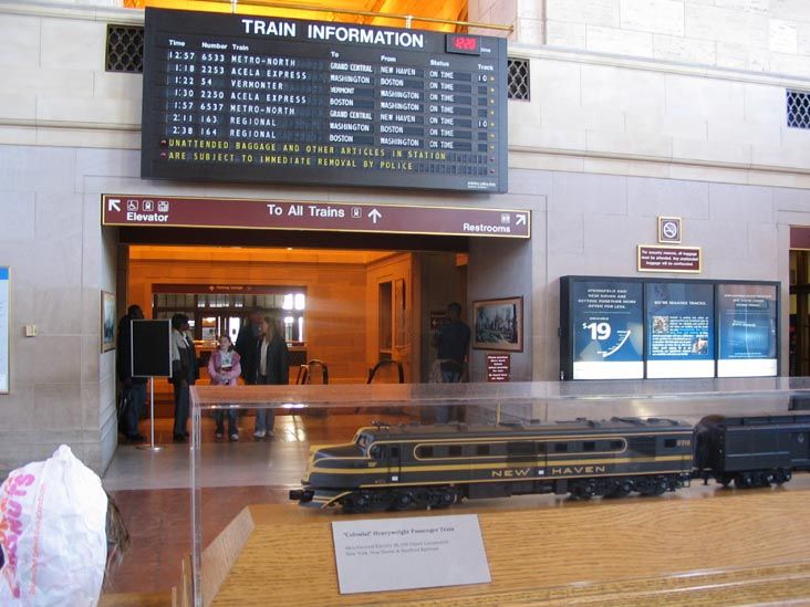
We’re in the lobby of Union Station in New Haven, CT (reference), looking towards the departure board (reference) from a low angle. There are people milling around, some drinking coffee, and there are people sitting on the benches in the middle of the lobby, holding tight to their luggage. Everyone looks tired, and the people with coffee all look like businesspeople. (Why is it only business people drink coffee? Why assume that it’s coffee?) (Nit…)It’s early in the morning on a Monday. (Why specify a day of the week?) (Nit…)In the foreground, Alex (our protagonist)’s legs and shoes are visible, such that he’s standing facing the departure board. (Just how low is your camera? I ask because I’m having trouble visualizing anything short of a floor level shot. Is that what you were going for?) He’s wearing functional dark shoes, not overly dressy or flashy. Think Rockports (reference). (Why do you have this as a splash page? There’s nothing of major interest nor is there a hook to encourage the reader to turn the page. This doesn’t work as a first page as it stands now.)
CAPTION: (no box, military-ish) (Right now, with your format of this caption being stacked vs. the following captions and text being side by side, it’s showing a lack of consistency in formatting. Use one or the other.)
Union Station
New Haven, CT
0750 (Is this a time? Shouldn’t this read 0750 Hours ?)
So, we have P1 down, and I’m already unimpressed.
Here’s the thing: there’s no incentive at all to turn the page. There are no visual cues to tell what’s going on, or to even give a hint of the story to come. The overall problem here, is that this is one big waste of a page. It’s padding, of the ultimate order.
If you’re going to open with a splash page, folks, then the story that page is telling has to be worth it. It has to be dramatic (or comedic) in some sense. It has to affect the reader. This doesn’t do that at all. This is shrug-worthy. I’m indifferent, and that’s a terrible thing to be as a reader.
Also, the fact that this is basically a silent page isn’t helping your storytelling cause, either. This is a great opportunity to get the reader invested, and you waste it by only giving a caption with the place and time.
This should have been a single panel on a four- or five-panel page. What you have here, Fred, is not acceptable.
Page Two (You really need to learn how to create page breaks between script pages. If you’ve been reading any of our previous TPG’s, you know it’s a major point of contention with us as editors. Find out how to do it. It’s easy.)
Panel One:
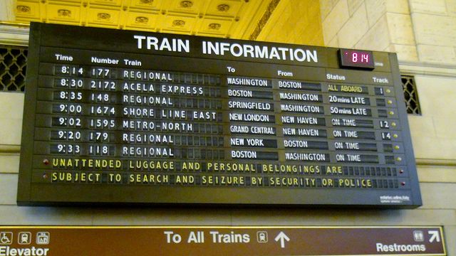
Closer in on the departure board. A few of the lines are spinning, changing the information they show to more updated information. (I’d actually use this as your opening panel on Page One. It grabs me more than the shot you’ve established as your opening image, which is actually quite dull and uninteresting.)(This is a very good idea.)
SFX: Chitchitchitchitchitchit! (I’d take out the exclamation mark on this sound effect.)
Panel Two:
We’re looking up at the cover of a small notebook that Alex has open in his hands. The cover of the notebook has the initials C.T.O. on it in (presumably the owner’s) handwriting. (We don’t really need to wonder whose handwriting it is, do we? It’s unimportant. (Something of a nit.) Also, it took me a few times looking at your panel description to figure out that you have the camera in a low angle looking up at the cover of the open book in a character’s hands. You need to be clearer in your description. Finally, I’d have this as the last panel on your first page, as it provides more of a hook to your next page than what you’ve got with the splash. (Another good idea.) As well, the text across the departure board and the text on the cover of the book would visually balance out the first page.)
CAPTION: The facts that made the last twenty-four hours mean something were in this book.
CAPTION: It was a risk to come here and get it, but I had to. It had to mean something (Missing ending punctuation.)
The dialogue you have in this panel is long and drawn out. Get to the point. One way you could rewrite this is as It was a risk coming here to get this book, but the facts contained in it just made the last twenty-four hours mean something.
Panel Three: (Here’s where I’d start your second page.)
We’re behind Alex as he reaches the ticket window. A smiling, attractive young lady is on the other side of the glass. Alex puts the small notebook in his back left pocket. If you look closely, you can see he has a pistol in his waistband, but you have to look REALLY closely. (This direction of looking REALLY closely for the pistol in his waistband could have been written as something like There’s a pistol in his waistband that is mostly covered up by the jacket he is wearing, but we can see a glimpse of its existence. Otherwise, you’re basically telling your artist to draw a magnifying glass to place a focus on it.)
TICKET WOMAN: Good morning! (She must be in a really good mood to warrant an exclamation mark here.)(This isn’t even a nit to pick.)How can I help you today, sir?
ALEX: Hey. One ticket to Detroit, please.
Panel Four:
We’re inside the ticket booth now, and Alex has slid a credit card under the partition, and the ticket woman reaches for it. (So, here’s what doesn’t make sense: You have him sliding a credit card under the partition and she’s asking him if it’s debit or credit. Can’t she see the card? By writing it this way, you’re encouraging the need for two separate panels, one for the request, the second for the giving of the card. Take a look below to see how you can correct this.) (There’s no need. The timing on this is fine. The action of the panel is reflecting the last thing said. The real question is simple: why the dropsies of the internal monologue/narrative captions already? It’s way too soon for that. Your character doesn’t have enough to say, so there’s a problem either with the story or with the character telling the story. Find that problem and you’ll find more story to tell, and you won’t bore the reader. Trust me, they’re wondering when the story is going to start in earnest.)
(Panel Four cont.) (What’s with this?)
TICKET WOMAN: All right that’ll be $190, debit or credit?
ALEX: (from beneath the divider) Credit’ll do fine, thanks.
Simplify the dialogue and it will allow a more natural exchange. For example, have the TICKET WOMAN say That will be $190 , to which the man responds On credit, please. Yes, it reduces the amount of dialogue in the panel, but it also gets to the point without being wordy for nothing.
Panel Five:
The woman swipes Alex’s credit card.
SFX: Snickt! (Again, this shouldn’t have an exclamation mark, and by the way, I had to laugh out loud when I saw the way you wrote this SFX. It’s the way they’ve been writing Wolverine’s release of his claws for decades, except without the c . Seeing it applied elsewhere seems unnatural to me, somehow.)
CAPTION: (security personnel) Sir!
CAPTION: (security personnel) We’ve got a hit on a credit card registered to Alex Mendoza!
Here’s an example of cause and effect in the same panel. The cause for the alert is the swiping of the card [one panel], which leads to the [very excited] security personnel [isn’t this used as a plural?] reacting to it. This requires a second panel. It’s two actions following each other. What you could do is have a security monitor set up in a second panel with a security guard watching it with the camera over his shoulder. This would then make this a ballooned dialogue instead of a caption. See what I mean? (Steve is right in that this should have at least been two panels, but really, it should be more like three: the swipe, a panel showing electrical signals traveling through cyberspace (when’s the last time you saw that word?!), and then the reaction of a person somewhere. That would have worked better.)
Panel Six:
Similar shot as Panel Three, as the ticket vendor slides Alex’s credit card, train ticket, and receipt back under the partition.
TICKET WOMAN: Thank you very much, have a nice trip! (That’s a lot of thanks and thank yous going back and forth. Can’t you just change this to Here you go, sir. Have a great trip. ?)
ALEX: Thank you (Again, missing ending punctuation.)
CAPTION: (security personnel leader/Head of Security, different color/font?) Where is he?
P2 down, and there has been a disturbing trend…
First, let’s talk about the pacing. It’s somewhat off, even though you have six panels on this page. Really, you have less than that on this page, with two pages that would be moved to the first page in order to get readers interested faster. So, there are four panels on this page, but then I added another two panels in order to give a more accurate account of the pacing. So, there really are six panels on this page. It just wasn’t thought through well.
I’m happy that the dialogue is matching the action in the panel descriptions, and I’m happy that the characters are acting.
What I’m concerned about, though is the dialogue.
First, the elephant in the room: the missing ending punctuation. That’s terrible. It’s one thing to have it missing in the panel description—no one is ever going to see that. But to have it missing from the dialogue? That’s terrible and inexcusable.
Here is what I know: I know that everyone is taught to write at a young age. I know that everyone is taught that a punctuation mark (usually a period) is at the end of every sentence. This is what we’re taught, from an extremely early age. I know that writers are also generally readers, so they’ve seen the period in the wild, so to speak. They’ve seen them being used. How these have disappeared, I don’t know, but the trend has to stop. It’s terrible.
Notice, I’m not coming down on the dialogue itself. It needs a polish (really, an editor), but I’m not coming down on it. It is generally doing its job. There should just be more of it. Don’t mistake not giving the reader enough story to care for intrigue. The two are not the same. Intrigue has to be built. You’re not doing the most effective job of doing that here.
Page Three (Again, another page break. As I scan this document, I can’t clearly see the distinction between one page and another, not only because of lack of page breaks, but also due to the fact you write the header for the page the same way you write it for a panel. Not good on both levels. Hitting ENTER twice doesn’t cut it.)
Panel One: (top half of the page)
Alex walks away from the camera, towards the archway that leads to the platforms. The departure board continues to rotate overhead. (You’re writing this as if it’s a film, with more than one action per panel and things like this departure board changing again. You’ve already established the departure board, so let it be and get on with the story.)
CAPTION: (security personnel) New Haven, he’s at Union Station, he just bought a ticket! (I have an issue with your obvious misuse of punctuation. This is supposed to be three separate sentences, and yet you use a comma to continue it into one. That, and your overuse of exclamation marks in almost every piece of text, whether spoken, captioned, or SFX (The sfx is a nit.). This seriously needs to be worked on. A bigger problem I’m seeing is the fact that your security team isn’t on site at Union Station. You didn’t name them as FBI or CIA or Homeland Security, but rather as a simple security team. I’m not going to blast you for having the information on the use of his card get to them so fast, but why would they be looking for that information vs. a federal agency watching for it?)
CAPTION: (security personnel) He’s headed to Detroit on the 8:15 to D.C., track 3! (Steven, does this dialogue make sense to you? It doesn’t sound right to me, but then again, I don’t live in the States.)(It makes sense.)
CAPTION: (security personnel leader) He’s getting sloppy. Notify all local LEOs (Spell this out instead of relying on the reader to guess what you mean by LEO’s, which I can only guess is short for Law Enforcement Organizations.) and Homeland, and lock that station down! (No, spelling it out doesn’t help. An editorial caption would help.)
SFX: Chitchitchitchitchitchit!
Panel Two:
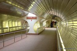
Alex walks through the tunnel towards the platform (reference).
CAPTION: (security personnel) We’ve got the FBI and SWAT two minutes out, the New Haven PD is setting up a two mile perimeter and closing, and the officers posted at Union Station are starting to evacuate the lobby. (And these are simple security personnel setting this all up?)
(Panel Two cont.) (What is with this [second time it’s been added] and what’s with not adding spaces between lines?)
CAPTION: (security personnel leader) Good. I want SWAT to block all cell signals when they get there. I don’t want Mendoza calling anybody. (First off, take out the bolding. Where you have them doesn’t read properly. (I disagree. I think the stress reads fine where it is, but I’d still remove them so that the reader can make up their own mind about where the stress goes. And use underlines instead of bolding. They’re harder to miss when lettering.) Second, I’d like Steven to answer whether or not he knows if SWAT does this or if they have to get some other division of the police organization to do it.) (No idea at all. Not in my bailiwick of information without looking it up, however, I don’t think that’s really part of SWAT’s job. That’s more of an intelligence person’s job, not SWAT. I could be wrong, but that’s what my gut is telling me.)
CAPTION: (security personnel) I’m on it.
Panel Three:
Back in the lobby, police officers are evacuating the people still there. Slightly organized chaos would be a good way to describe the scene.
CAPTION: (security personnel leader) We cannot lose him here, people!
I’m sorry, but I have to stop here, something I really hate doing after only three pages. Your last line is a perfect dropping off point, as that’s exactly what you’ve done: You’ve lost me. A few things drove me insane, such as the use of the terms security personnel and security personnel leader to describe the men in charge of the situation, the slow nature of the story so far, the poor use of punctuation (and even lack of closing punctuation), and especially the very bad formatting. Too many things distracting my attention. It literally took me hours over the course of three days to get as far as I did because I wanted to pull the eyes out of my head.
Something you need to realize: You could have the greatest story ever told being presented in your script (which, unfortunately, isn’t the case), but as soon as an editor hits the first road block of improper formatting, bad punctuation, incorrect spelling, and the myriad other mistakes a writer can make, it turns them off immediately and into the trash (real or virtual) goes your submission. Now, our jobs as editors (all volunteer, mind you) of THE PROVING GROUNDS is to guide you in how to write and present the best stories you can give to a publisher, all in the hopes of getting that green light. Think of us as the publisher or editor of your target company. Would you send this to them? If you did, it would be thrown away right off the bat.
Another thing to realize is this: You’ve had 147 editions of THE PROVING GROUNDS to learn some of the mistakes that other writers make so that you don’t do them yourself. I feel like you haven’t done your research and that you didn’t bother putting the effort into this submission.
I’d like to revisit your work at a later date. Right now, you aren’t showing me, as an editor, anything that would make me want to view your work. I’ll let Steven have his say.
I’m not seeing the extreme problems that Steve had, but I’m going to run it down.
Format: You could have had a Flawless Victory here, but for two things—the first is the lack of page breaks, which are simple enough to learn to do in any word processing program. The second thing is the continuation of the panels. It’s like you had a panel description, and then had dialogue, but I’m not understanding what the continuation was. There’s never any reason to continue a panel description. There may be a reason to continue a page, but never a panel description.
Panel Descriptions: These need some work. Steve was doing some nitpicking, but there were some valid things being said, as well.
The characters were acting, and I was very happy about that. There are cleaner ways to get what you were reaching for in some instances, though. Nothing I found maddening, but for the most part, I thought that the panel descriptions were doing their job. Generally, they could be drawn, and the characters moved well within them. The panel descriptions aren’t your problem.
Pacing: This is your problem. This is wrongly paced. The first page could have had so much more done with it than what you used it for. Get the reader invested, get them involved, get them interested. You didn’t do that on the first page, basically because you didn’t give yourself an opportunity to.
What you did was go for the opening splash page, which can be effective when done right, but this wasn’t. There wasn’t anything I would consider right about this splash. It wasn’t dramatic, it didn’t tell the reader anything about the story, it just kinda laid there, extremely limp. This is a terribly wasteful use of comic book real estate.
Then the second page continues with the reader disinterest, not getting that spark until near the end of the page. Then, you cause a minor mystery with the as-yet unnamed people looking for this gentleman, whom we presume to be dangerous due to the acronymed law-enforcement officials that were called up for what we presume to be the gentleman’s apprehension. Kinda reminds me of The Black List. (Good show, btw.)
The problem with the pacing is that you could have done more with these three pages. Part of that is adding more dialogue. Don’t forget that it is a part of pacing, too. You have a terrible case of the dropsies going on here, which is a real detriment to the story. It’s probably interesting, but we won’t know because you started something and didn’t come anywhere near close to finishing it. Terrible.
Dialogue: The dropsies were killing me. As I said, you have to keep reader interest, and the way to do that is through dialogue. You could have done a lot to enhance the story you were telling by having the book give a lot more information than it did. You could even have done something special like have the pen make a line run off the paper to indicate a pause in the narrative. Instead, you drop the narrative altogether, opting instead for voice-over captions. Not good. Only part of your story resides in the voice-overs. You have to give the rest through the written narrative of the diary, as well as the art. Those three were not working with each other at all.
As for the lack of punctuation, that’s inexcusable. Wrong punctuation, I can understand to an extent. Missing punctuation? That I can’t forgive. Not missing ending punctuation.
Content: I was starting to get interested. It wasn’t ultimately slow, as Steve contests. You had some action going on (albeit in captions) at the end there. If this were paced a bit better, that would be more than enough to make me turn the page again.
No, the biggest mistake, from a reader standpoint, was the wasted splash page. It starts there, and tries to pick up, just about getting there. If you had more of the narration going on that either explained or deepened the mystery, that would have gone a long way for a reader.
Editorially, this needs some direction, and some polish on the dialogue. Nothing too deep. The editor’s job, in this case, would be more to make sure you’re telling a compelling story. This wasn’t as compelling as it could have been.
And that’s it for this week! Check the calendar to see who’s next!
Like what you see? Steve and Sam are available for your editing needs. You can email Steve here, and Sam here. My info is below.
Click here to discuss in the forum!
Related Posts:
Category: Columns, The Proving Grounds


