Workshopping a Logo: THE RED TEN
In last week’s Comix Counsel, I wrote about the importance of having a strong logo for your independent comic properties. The fact is, in comics, people DO judge a book by its cover, and often the first thing people see on a cover is the title logo. So, creating a strong, legible, attractive logo should be taken very seriously.
Often, that’s easier said than done, though. Strong logo design (and graphic design in general) is an iterative process. Very rarely will you nail it on the first swing. To illustrate, in this article, I’m going to share the many iterations I went through before coming to a finished logo I was happy with for THE RED TEN, a new book I’m working on with artist Cesar Feliciano.
The Property
THE RED TEN is a 10 issue comic book mini-series. It’s a super-hero murder mystery, playing with both murder mystery tropes AND superhero archeotypes, in what I hope turns out to be a killer read. Art on the first issue is underway, I’m finishing the second issue now, and we’ll debut an ashcan preview this August at ComiCONN, with the first issue slated to be completed this fall.
Initial Ideas for Logo
I had a rough idea for the logo of this book in my mind shortly after conceiving the project. What I wanted was something clear, iconic, and ominous. I also knew the colors red and white would have story significance (specifically red splatters of blood on white), and wanted to see if I could work that into the logo.
So, I took a first pass on the logo and came up with this:
The concept here is pretty straightforward. Clear, block capital letters in white, with a serious red blood splatter stain originating in the center of the word red, and a thick black drop shadow outline.
This was essentially the design I had in my head from the outset. Having now brought it from my head to screen, I felt the design looked okay, but was somewhat underwhelming.
Variations
I then decided to do a number of variations on this general logo approach, limiting myself to the colors of Red, Black, White, and Gray. Here are the results:
While this was done in an attempt to try some variations to see if any one in particular jumped out at me, it really just muddied the water for me. I think doing these variations pointed out the fact that the base logo design simply wasn’t quite there.
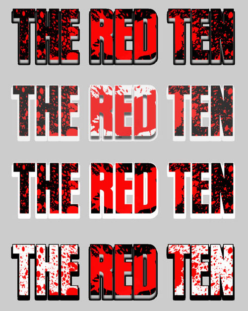 First of all, my base did not score very high in my legibility test. Have a look again at these logos, only small. I’d argue only the third logo down (Black, Red, White Outline) is truly legible at this size. (On the top logo, you can’t make out any of the words, and the bottom, you can’t read RED.)
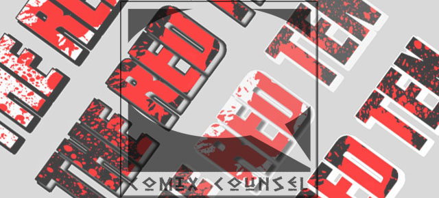
Also, varying the dropshadow on different letters wasn’t working visually for myself or others I asked feedback on. (It’s worth noting, that at this point, I posted these on Facebook and Twitter for feedback, and the fact that not one of these logo’s was a clear favorite was a sign that I had more work to do.)
Around that time, however, I needed to put out the Free Comic Book Day Special (Now read by 7,000+! Thanks for spreading!) and I wanted to include a teaser for THE RED TEN in that book. So, I did another slight variation on the logo and slapped it on a quick pinup I created. The results are here:
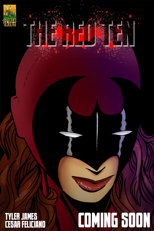 Again, I don’t know that this logo would pass my legibility test at small sizes. (In fact, I’m pretty sure it’d fail it…logos are REALLY small when browsing comics on my iPad.) Also, while the splatter effect behind the letters added a cool cohesive element to the logo, I wasn’t happy with the with the opacity variations.
Calling in a Pro
So, at this point, I was pretty much stumped. I felt my logo was a solid 75% there, but wasn’t sure I was going to be able to bring it all the way home. Now, in the past, this might have been where I’d have stopped. But, I think the longer you do comics, and the more serious you are about treating them as a business, not a hobby, the more your realize that good enough isn’t good enough.
So, I called in a pro.
I asked graphic designer and pal Ty Tyner (color artist on EPIC #0 and the EPIC/DG one-shot) to take a look at what I’d done so far and to take a crack improving on it. I gave him a few design directions and requirements:
– Logo needs to work well on both a light and dark background.– Let’s limit colors to red, white, and black. (Doesn’t necessarily need to include all three, but let’s not move outside that palette.)– Big emphasis on the title being legible small/ from far away. (Think small cover icons/images on Comixology…logo needs to legible at 150 pixels wide or so.)– Red on white does have story significance, so I’d like it if that could work.
Now, there were some things I liked about Ty’s logo design, and some things I didn’t. It certainly gave the logo more of a fast-paced, edgy feel. However I was concerned about two things:
1.) I just did’t think it was going to be legible at a small size. (Broken record, much?) Worse, I think it would be misread when small, read as “The Redoo” or something like that. The Italic and the mushing of the the words together make it tough to read small.
Three New Design Approaches
“This one looks really cool to me. Its readable at 150 px wide but the red splatter hurts the readability at such a tiny size, but makes it look pretty damn cool at regular size.”
“This one is sort of an atomic age / Dr. Who looking attempt. I left off the splatter which helps its readability at smaller sizes but without the splatter it seems to lack a bit of that pop factor. The splatter really lets you know what type of story your getting into.”
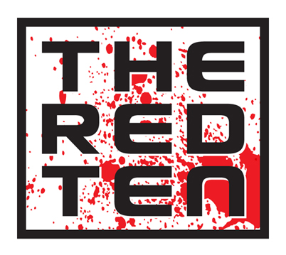
“On this one I thought i’d break the mold and try a square concept. Its got an eye chart feel to it but it keeps its readability at small size and really plays up the three, three letter words thing.”
Again, I appreciated Ty taking the time to try some different approaches, in order to hit on something that was going to work. Of course, I had my opinions. I didn’t love the asymmetric font chosen for the first two designs. I didn’t love the stretching at the top of the letters, squished at the bottom. And while the square logo was interesting, I thought it was going to be less flexible for a comic book title head than a more traditional, rectangular logo design. So, I conferred with Cesar, and then went back to Ty with some additional notes:
“Getting close! Maybe try another font, one a little more serious, but keep the big RED centered, with smaller words The and Ten at equal size. What if we tried the style of the third logo with the oval connectivity. But, made the background oval black, with white letters (black outline.) And then put the red blood splatter effect in there for the word RED, but we went lighter on the effect carrying throughout the other letters.”
Bringing the Logo Design to the Finish Line
Shortly after, Ty came back with a revised design based on the notes above:
So close! I asked for two small changes:
- Knock the size of RED down just a bit, maybe 10% or so.
- The RED splotch looks off center. Can we center it up a bit?
Again, these are small things, but if you’re at 98%, might as well take it all the way home, right?
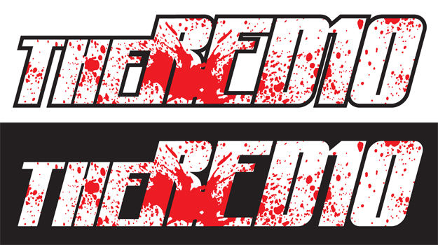
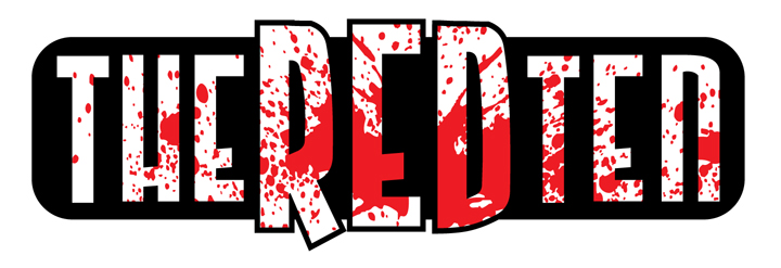
The Red Ten Logo – Final
And there you have it. A final, finished logo design for THE RED TEN. Wait, what about my tiny legibility test? Does it pass? You tell me:
The logo design process isn’t an easy one, but again, the logo is going to be the most reused, re-purposed piece of art you’ll have for your comic series. Put the time in to get it right.
***
![]() Tyler James is a comics creator, game designer, and educator residing in Newburyport, MA. He is the writer and co-creator of EPIC, a superteen action comedy, and Tears of the Dragon, a swords and sorcery fantasy, and writer of the upcoming superhero murder mystery mini-series THE RED TEN. His past work includes OVER, a romantic comedy graphic novel, and Super Seed, the story of the world’s first super powered fertility clinic. His work has been published by DC and Arcana comics.
Tyler James is a comics creator, game designer, and educator residing in Newburyport, MA. He is the writer and co-creator of EPIC, a superteen action comedy, and Tears of the Dragon, a swords and sorcery fantasy, and writer of the upcoming superhero murder mystery mini-series THE RED TEN. His past work includes OVER, a romantic comedy graphic novel, and Super Seed, the story of the world’s first super powered fertility clinic. His work has been published by DC and Arcana comics.
Tyler is the publisher and co-creator of ComixTribe, a new website empowering creators to help each other make better comics.
Contact Tyler via email (tylerjamescomics@gmail.com), visit his website TylerJamesComics.com, follow him on Twitter, or check him out on Facebook
Related Posts:
Category: Comix Counsel












Good article with very useful and relevant information. It was good to work with you on getting the process together for the logo final. It’s information like this that will help independent creators take their work to another level and stand side by side with the mega publishers. Btw, I really like the final version of the logo.
Cesar
I thought this one was the strongest:
https://www.comixtribe.com/wp-content/uploads/2011/06/theredten02.jpg
It’s mainly the splatter that is being used is kinda cheap looking, not as frayed as it could be.
There are definitely things I like about that logo, as well.